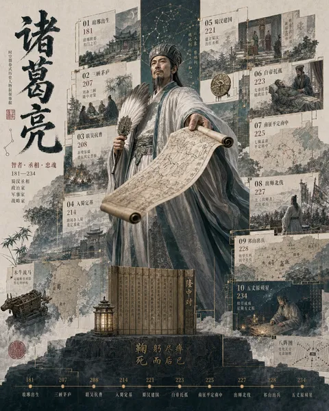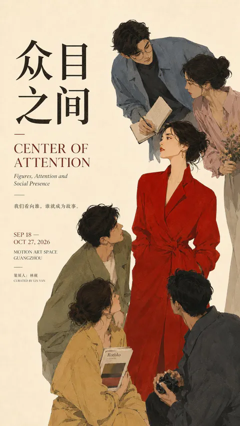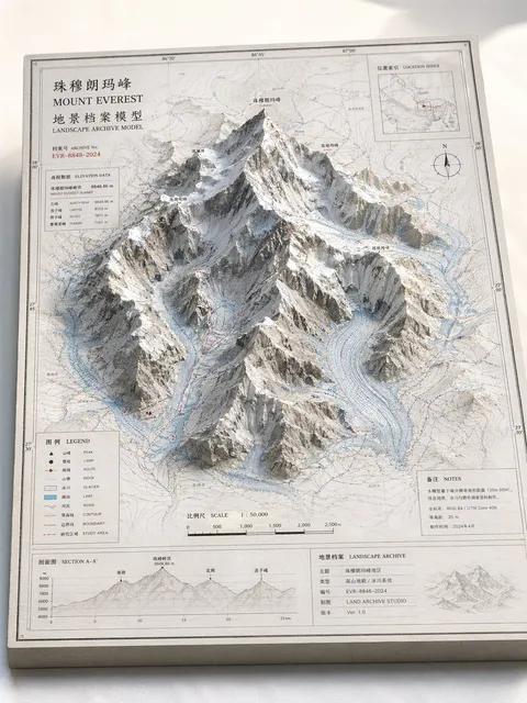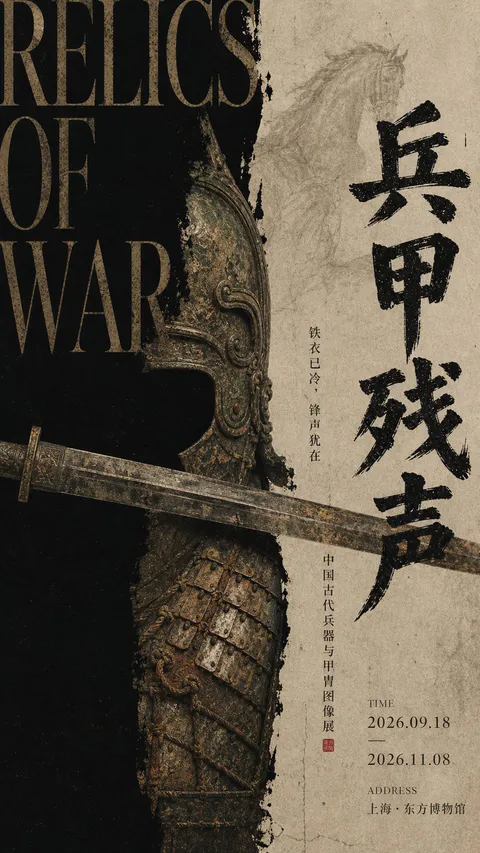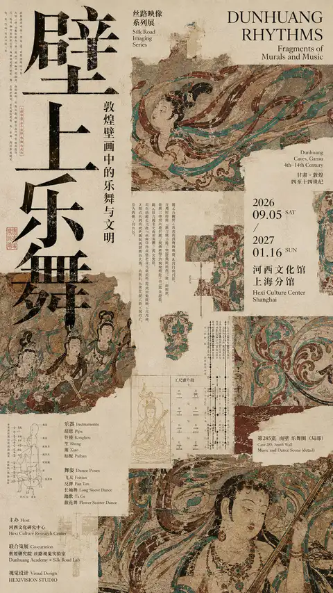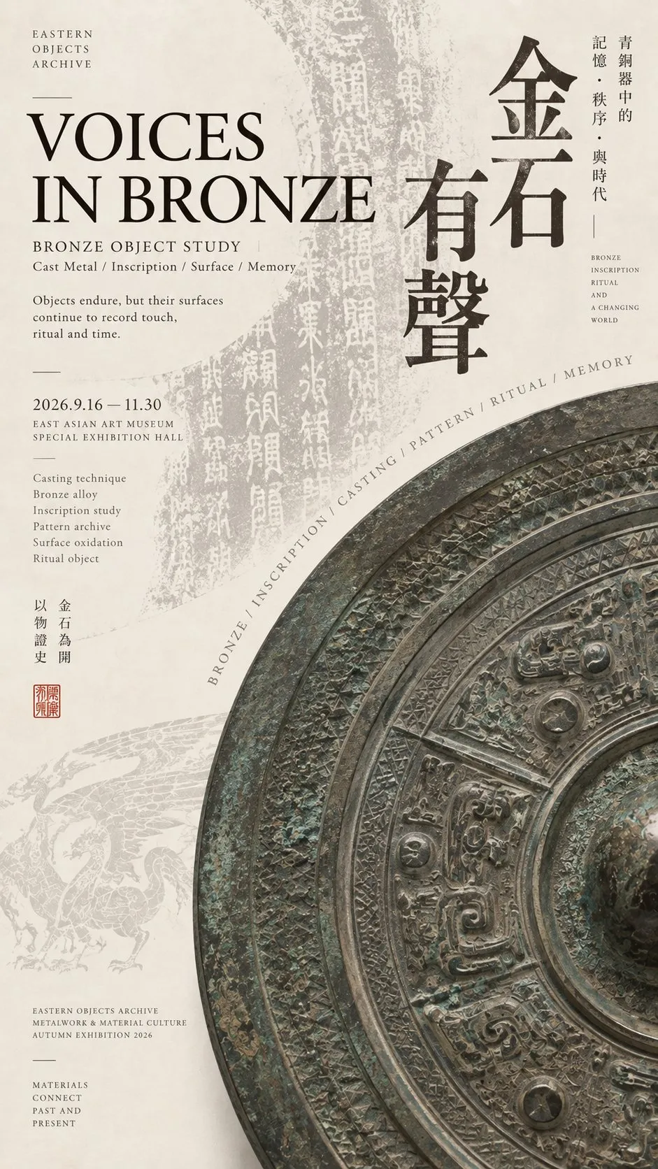
东方文博展览排版海报设计
【主题】:{例如:漆器 / 青铜 / 砚台 / 古琴 / 玉器 / 陶瓷}
【中文标题】:{4–6 字主题名称}
【英文标题】:{对应英文展览标题}
【核心器物】:{具体器物}
【辅助档案元素】:{古画 / 拓片 / 琴谱 / 线稿 / 铭文 / 材质研究等}
【主色调】:{例如:朱砂红+墨黑 / 青铜灰绿 / 黑灰 / 深木褐}
【构图机制】:{巨字穿插 / 巨大圆弧 / 黑白块面 / 斜向长轴等}
【画幅比例】:9:16

设计一张高级东方文博编辑海报,将传统东方器物重新组织进当代博物馆展览与艺术出版物的视觉系统中。

整体使用温润干净的暖象牙白艺术纸背景,保留极轻微真实纸纤维,不做旧、不脏、不泛黄。采用低饱和东方材质色系、大面积留白、非对称编辑网格,以及现代宋体 / 明朝体与高对比 Serif 英文字体混排。

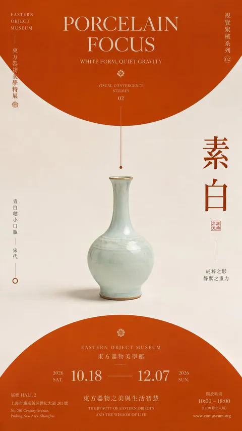
核心器物使用真实、具有材质重量的博物馆级摄影表现,不做普通产品展示。根据【构图机制】将器物进行大胆裁切、放大、斜向穿插或局部超出画面,使器物本身成为版式结构的一部分。

中文标题使用大尺度 Typography,形成强视觉锚点;英文标题作为第二层级;边缘与留白区域加入极小字号的展览说明、材质研究、年代、工艺、档案信息,形成“巨大标题 × 微型信息”的强烈尺度反差。

加入与【核心器物】真实相关的【辅助档案元素】,例如古画局部、铭文拓片、器物线稿、琴谱、材料研究图等。所有档案元素应低对比、半透明、局部裁切,只作为第二层信息,不抢主体。

画面必须具有明确的三级阅读层级:

远看:器物大形 + 大标题首先成立;
中距离:看到器物、文字和档案图层之间的穿插关系;
近距离:才能阅读微型说明、材质信息与研究细节。
所有文字都应具有真实文化展览和博物馆出版物语气,不使用 Lorem Ipsum 或随机无意义英文。

信息丰富但不拥挤,主体高密度、背景低密度,保留约 40%–55% 的有效留白。

最终效果像亚洲顶级美术馆、文化研究机构或独立设计工作室制作的东方文博展览主视觉:传统内容,当代排版,安静、克制、高级,同时具有明显的视觉冲击和完整作品感。
[Theme]: {e.g., Lacquerware / Bronze / Inkstone / Guqin / Jade / Ceramics}
[Chinese Title]: {4-6 Chinese characters theme name}
[English Title]: {Corresponding English exhibition title}
[Core Artifact]: {Specific artifact}
[Supporting Archival Elements]: {Ancient paintings / Rubbings / Qin score / Line drawings / Inscriptions / Material study, etc.}
[Main Color Palette]: {e.g., Cinnabar red + ink black / Bronze grayish-green / Black and gray / Deep wood brown}
[Composition Mechanism]: {Interspersed giant characters / Huge circular arc / Black-and-white color blocks / Diagonal long axis, etc.}
[Aspect Ratio]: 9:16
Design a sophisticated Eastern cultural museum editorial poster, reorganizing traditional Eastern artifacts into the contemporary visual system of museum exhibitions and art publications.
The overall background uses warm, clean ivory art paper, preserving subtle real paper fibers without making it look aged, dirty, or yellowed. Incorporate a low-saturation Eastern material color palette, generous negative space, an asymmetrical editorial grid, and a mix of modern Songti/Mincho with high-contrast Serif English typography.
The core artifact is rendered with authentic, weighty museum-grade photography, avoiding generic product display styles. Boldly crop, enlarge, diagonally intersect, or partially extend the artifact off-canvas according to the [Composition Mechanism], making the object itself an integral structural component of the layout.
The Chinese title uses large-scale typography to establish a strong visual anchor; the English title serves as the secondary hierarchy. The margins and negative space feature micro-sized exhibition notes, material studies, eras, craftsmanship techniques, and archival information, creating a striking scale contrast of "giant headlines × micro information".
Integrate [Supporting Archival Elements] genuinely related to the [Core Artifact], such as details of ancient paintings, inscription rubbings, artifact schematics, musical notations, or material study diagrams. All archival elements must be low-contrast, translucent, and partially cropped, functioning only as a second-tier layer without overpowering the primary subject.
The layout must possess three distinct reading hierarchies:
From afar: the large silhouette of the object + headline reads immediately;
Mid-distance: the interwoven interplay among artifact, typography, and archival layers becomes apparent;
Close-up: fine micro-text notes, material data, and research details can be studied.
All text should convey an authentic tone suited for cultural exhibitions and museum publications, without using Lorem Ipsum or random meaningless English.
Rich in detail yet never cluttered, high density in the subject and low density in the background, preserving approximately 40%-55% effective negative space.
The final impression resembles key visuals crafted by top Asian art museums, cultural research institutes, or independent design studios: traditional heritage meets contemporary layout—quiet, restrained, premium, and delivering strong visual impact as a cohesive artistic work.负面提示词
普通中国风海报、器物居中产品照、电商广告、传统边框、祥云堆叠、金色特效、满屏书法、过度做旧、脏污纹理、高饱和配色、随机装饰、信息过少、模板化极简、编号、No.、Vol.、四角星芒。
提示词出处:@Larus Canus (@MrLarus) 的原帖评论 ↗
| 模型 | GPT Image 2 |
|---|---|
| 比例 | 9:16 |
| 风格 | 海报设计 |
| 作者 | Larus Canus (@MrLarus) |
| 原帖 | 查看 X 原文 |
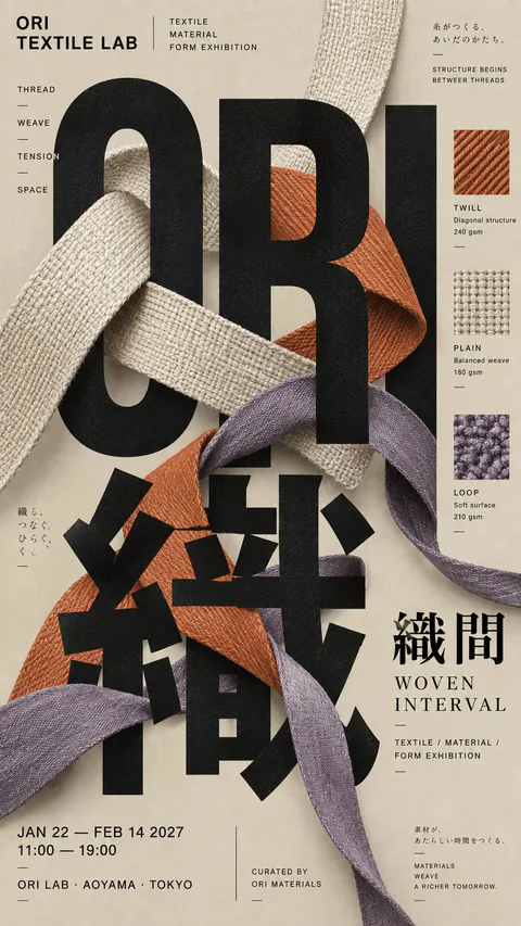
以东方传统器物(青铜镜、折扇、古琴、漆器等)为核心的当代文博展览排版海报。采用暖象牙白艺术纸质感底色、非对称网格、巨幅标题与微型研究档案文字混排,具有高级典雅的博物馆策展视觉风格。
怎么用这条提示词
- 复制上面的原文提示词。
- 粘贴到 GPT Image 2。
- 按 9:16 生成。
图片与提示词由 @MrLarus 发布于 X,本站仅做收录整理,版权归原作者。