【古诗词】{填写诗词标题、作者和原文}
【核心意象】{填写或由 AI 提取}
【主色调】{填写主色与辅助色}
【情绪氛围】{填写或由 AI 提取}
【画幅比例】9:16

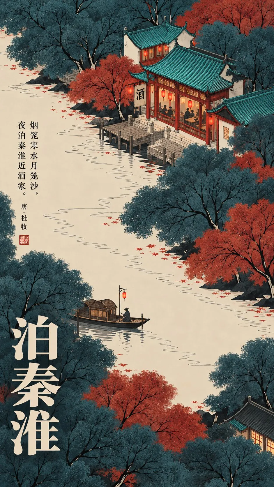
根据古诗词创作一张新中式细线设色装饰插画海报,将诗中的景物、空间与情感转化为完整的东方诗意场景。

采用高位俯瞰、东方散点透视与现代平面构成。树冠呈柔软蓬松的云团状色块,具有细腻粉末点染质感,内部穿插纤细连续的墨黑枝条。传统建筑使用精细工笔线描、规整青绿瓦片、白墙朱柱。地面与水面采用大面积暖米白留白,搭配少量不规则墨黑阴影。

配色采用饱满、干净、哑光的东方传统色系,以主色形成视觉重量,辅以石青、石绿、朱砂、赭红等颜色,保持细腻统一的纸本装饰插画质感。

画面突出核心意象,通过自然曲线、色块包围和疏密对比建立视觉层次。构图随诗词内容变化,不强行加入无关建筑或树木。

融入大幅暖白色中文标题、小型纵排诗句、作者署名与少量朱印,形成完整的古诗词艺术海报。

避免写实山水、厚重水墨、3D、油画、动漫风、复杂远景、过度颗粒及人工做旧。保持教科书级的精细线条、柔和设色与东方装饰美学。
[Classical Poetry] {Fill in poem title, author, and text}
[Core Imagery] {Fill in or extract via AI}
[Main Color Palette] {Fill in primary and secondary colors}
[Mood & Atmosphere] {Fill in or extract via AI}
[Aspect Ratio] 9:16

Create a Neo-Chinese decorative illustration poster with fine lines and delicate coloring based on classical Chinese poetry, transforming the scenery, space, and emotions of the poem into a complete poetic oriental scene.

Use a high-angle bird's-eye view, traditional oriental dispersed perspective, and modern graphic composition. The tree canopies are soft and fluffy cloud-like color blocks with a fine powdered stippling texture, intertwined with delicate, continuous ink-black branches. Traditional architecture features fine gongbi linework, neat turquoise roof tiles, white walls, and vermilion pillars. The ground and water surfaces use extensive warm cream-white negative space, complemented by a few irregular ink-black shadows.

The color palette uses rich, clean, matte traditional Chinese pigments, establishing visual weight with the dominant color, accented by azurite blue, malachite green, cinnabar, and ochre red, maintaining a refined and unified decorative paper illustration texture.

Highlight core imagery in the frame, creating visual hierarchy through natural curves, color-block encirclement, and contrast between density and emptiness. The composition adapts to the poetry without forcing irrelevant buildings or trees.

Integrate large warm-white Chinese titles, small vertical lines of poetry, author signature, and red cinnabar seals to form a complete classical poetry art poster.

Avoid realistic landscapes, heavy ink wash, 3D renders, oil painting styles, anime styles, complex deep backgrounds, excessive grain, and artificial aging effects. Maintain textbook-grade delicate line art, gentle coloring, and oriental decorative aesthetics.
【Title】[TITLE]
【Subtitle】[SUBTITLE]
【Landscape】[canyon / river / cloud mountains / glacier / desert / coast]
【Main Palette】[PRIMARY COLORS]
【Scale Anchor】[tiny traveler / canoe / boat / small building]
【Visual Destination】[moon / distant light / horizon / mountain pass]
【Aspect Ratio】9:16

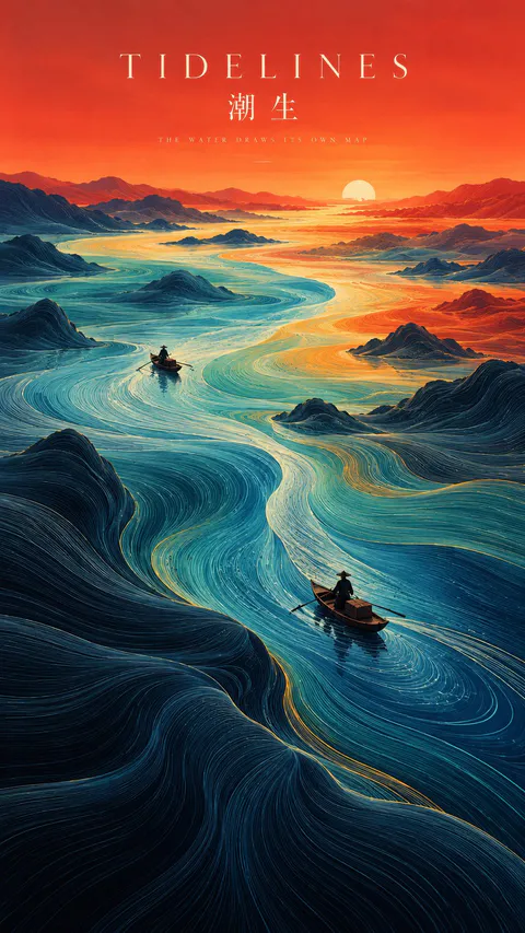
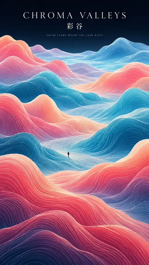
Create a refined vertical art poster that transforms a natural landscape into a flowing topographic world.

Build the terrain from hundreds of long, smooth, continuous contour lines that follow the shape, depth, and movement of the land. The lines should feel like a fusion of topographic maps, silk threads, and abstract Chinese landscape painting — directional, elegant, and highly organized rather than random decorative waves.

Use one strong visual path, such as a river, valley, ridge, cloud road, or negative-space corridor, to guide the eye from foreground to distance.

Keep the natural environment monumental and place only one or two extremely small human figures, boats, or architectural elements as scale anchors.

Use clear spatial hierarchy:
dense flowing lines in the main terrain,
calmer negative space around the visual path,
simpler and softer details in the distance.

Control the palette with 2–4 dominant colors rather than evenly distributed rainbow tones. Use large, clean color fields and let color changes reinforce depth and movement.

Add minimal editorial typography:
[TITLE]
[SUBTITLE]
[SHORT POETIC LINE]

Typography should feel like a contemporary exhibition poster or art-book cover — elegant, widely spaced, restrained, and secondary to the landscape.

The final image should feel poetic, monumental, calm, and highly designed, combining Eastern landscape aesthetics, contour-line abstraction, negative space, and modern editorial composition.
SOURCE & OUTPUT
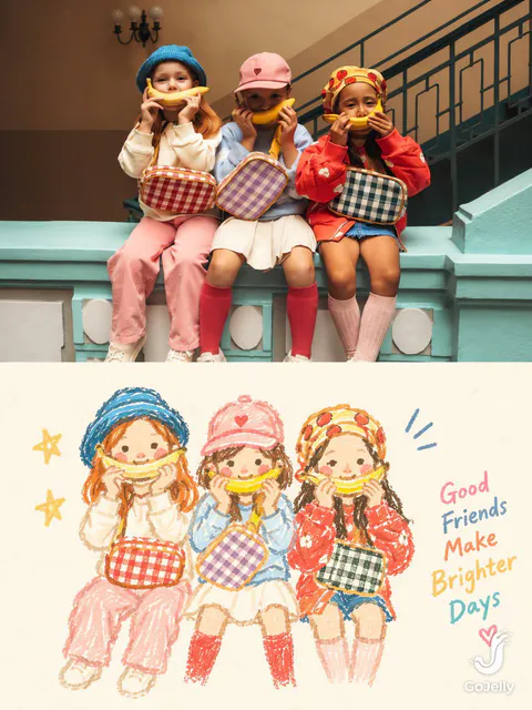
Use each uploaded photo as the sole visual reference. Create one independent, high-end editorial poster per photo and output each separately. Never combine images or create a collage.

FORMAT & LAYOUT
Use a strict vertical 3:4 composition divided into two exactly equal horizontal halves (50/50).

UPPER HALF — ORIGINAL PHOTOGRAPH
Preserve the original photograph faithfully, including the subject’s identity, facial features, structure, pose, proportions, natural texture, lighting, and color atmosphere. Apply only subtle premium editorial color grading for an art-magazine or exhibition-photography aesthetic. If necessary, extend only the surrounding background naturally to fit the frame. Never distort, replace, or redesign the subject.

LOWER HALF — PASTEL CRAYON MEMORY
Reinterpret the photograph as a minimalist, retro paper-texture pastel crayon doodle. Identify the scene’s most memorable subject, pose, relationships, direction, emotional tone, and visual essence. Reconstruct only these defining elements rather than copying every object or illustrating the entire scene.

Use thick, loose, grainy, hand-drawn chalk-and-crayon outlines with dry pigment texture, subtle breaks, faded patches, imperfect edges, slight hand wobble, and naturally rounded stroke endings. Add only a few simple pastel color blocks, stripes, dots, or scribbles to suggest essential details. Avoid realistic volume, detailed rendering, and excessive shading.

COMPOSITION & NEGATIVE SPACE
Keep the illustration small and visually balanced within the lower half, surrounded by generous empty space. Position the subject naturally according to the original photograph, allowing asymmetry, off-center placement, suspended elements, or partial cropping where appropriate.

Include only a few tiny environmental clues or abstract doodles, drawn in the same rough, simplified crayon style. Keep them minimal, imperfect, and contour-based. Prioritize breathing room, scale contrast, visual rhythm, and intentional emptiness. Never overcrowd the composition.

BACKGROUND & COLOR PALETTE
Use a bright, near-white paper background: ivory, cream white, pale off-white, soft apricot white, or very light gray-white. Add only subtle paper fibers and fine grain. Keep the background clean, bright, and clearly lighter than the illustration. Avoid dirty gray, dark yellow, or aged brown paper.

Extract 2–4 defining colors from the original photograph and reinterpret them as fresh, soft pastel crayon tones, such as peach pink, apricot orange, cream yellow, mint green, sky blue, or pale lavender. Use sufficiently distinct coral, blue, blue-green, warm orange, or violet outlines for clear contrast. Maintain a gentle, playful, emotionally warm, and refined palette.

OPTIONAL TEXT
Add only a tiny handwritten note if it genuinely enhances the composition. Keep it sparse, legible, secondary, and unobtrusive. Never use decorative text as filler.

FINAL AESTHETIC
Create a sophisticated editorial poster combining authentic photography above with a reduced, recognizable, hand-drawn memory of the same scene below. The illustration should feel airy, naive without being childish, playful without looking cheap, and minimal without losing the photograph’s identity or emotional meaning. Emphasize expressive linework, selective color, paper texture, asymmetry, and negative space.
【Landscape】[LANDSCAPE]
【Line Structure】[LAYERED / FLOWING / RADIATING / DIRECTIONAL]
【Palette】[COLORS]
【Scale Anchor】[TINY FIGURE / FLAG / BOAT / TENT]
【Aspect Ratio】9:16

Create a refined vertical art poster that transforms the landscape into an abstract **contour-line world**.

Build the terrain primarily from long, smooth, continuous lines that follow its volume, direction, elevation, and movement.

The lines should become the landscape itself, not simply decorate its surface.

Use one clear structural system and strong line-density variation, with dense lines around major forms and more breathing room in calmer areas.

Use 2–5 related colors and let the colors flow naturally along the contour structure.

Keep the landscape monumental and use only one tiny scale anchor.

Add minimal editorial typography:

[TITLE]
[SUBTITLE]
[SHORT POETIC LINE]

High-end exhibition-poster aesthetic, abstract Eastern landscape feeling, strong thumbnail readability, large graphic forms, controlled negative space, and highly visible contour-line structure.