 通用 / 未注明
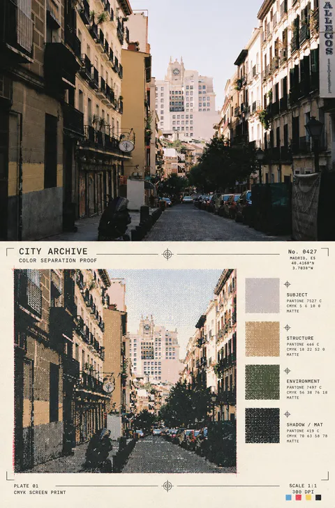
将上半部完整保留为真实摄影,下半部把同一照片重组为艺术家印前校样与像素索引档案页。提取照片中的4–6种语义色层,制作像素化形体、细线轮廓和四格色彩索引,分别对应主体、结构、环境、阴影/材质;加入十字定位线、裁切线、编号、纸张压印、轻微套印错位和丝网颗粒。适用于人物、动物、建筑、城市、自然、食物和物件,禁止左右并排、九宫格、普通滤镜和角标。
88 with prompts
复古 AI images. Posts with a prompt come first. The rest stay available with author credit.
通用 / 未注明将上半部完整保留为真实摄影,下半部把同一照片重组为艺术家印前校样与像素索引档案页。提取照片中的4–6种语义色层,制作像素化形体、细线轮廓和四格色彩索引,分别对应主体、结构、环境、阴影/材质;加入十字定位线、裁切线、编号、纸张压印、轻微套印错位和丝网颗粒。适用于人物、动物、建筑、城市、自然、食物和物件,禁止左右并排、九宫格、普通滤镜和角标。
 GPT Image 24
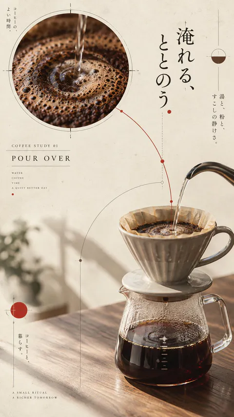
请创作 4 张相互独立的「日式编辑咖啡海报」,四张图属于同一个系列,但每张必须拥有不同的主体表现、构图路径和视觉事件,不得只更换颜色或品牌名。 四张图共同采用现代日本博物馆出版物、独立设计展览海报与克制编辑设计的视觉语言。画幅统一为 9:16 竖版,每张独立输出,不拼图。背景统一为暖象牙色纸张,带有非常细微的真实纸纤维和低强度印刷颗粒。统一使用暖象牙、墨黑、咖啡棕和少量暗朱红,禁止霓虹、高饱和渐变和商业化光泽。 所有海报都使用少量圆形视觉锚点、细测量线、弧线、定位点与结构标记。线条必须服务于主体和阅读路径,不得变成随机装饰。文字只使用短小、可读的英文标签,不生成长篇伪文字、随机 Logo、二维码或水印。 图 1:手冲咖啡。陶瓷滤杯与玻璃分享壶采用平静的三分之四桌面视角,左上放置一个展示咖啡绽放和同心涟漪的大圆形局部切片,右下为真实器具;水流被转译为一条测量弧线。加入短标签 “COFFEE STUDY 01 / POUR OVER”。 图 2:冰滴咖啡。透明高杯冰咖啡位于左侧,画面加入一条纵向切片,展示咖啡、冰块和反光的层次;使用细密的垂直线建立冷静节奏。加入短标签 “COFFEE STUDY 02 / COLD BREW”。 图 3:拿铁。手工陶瓷杯位于右下,背后放置被画面边缘裁切的偏置圆盘,圆盘呼应奶泡旋纹;加入两个小型材质细节圆。加入短标签 “COFFEE STUDY 03 / MILK FORM”。 图 4:咖啡豆与器具。烘焙咖啡豆、手摇磨豆机、金属量勺和折叠纸袋组成一组斜向物件地图,以等距三分之四视角排列;细轮廓线与路线节点连接对象,保留大面积留白。加入短标签 “COFFEE STUDY 04 / ORIGIN / TOOL / ROAST”。 四张图都必须保持真实咖啡、玻璃、陶瓷、金属、纸张和木质纹理;主体清晰、光线自然、编辑排版成熟。禁止普通咖啡店菜单、杂乱拼贴、固定四宫格、平均排布、廉价塑料 3D、复杂 UI、乱码、过多道具和水印。 最终输出 4 张独立的 9:16 海报,保持系列统一性,同时让四张图在主体、构图、视觉焦点和互动机制上明显不同。
 GPT Image 23
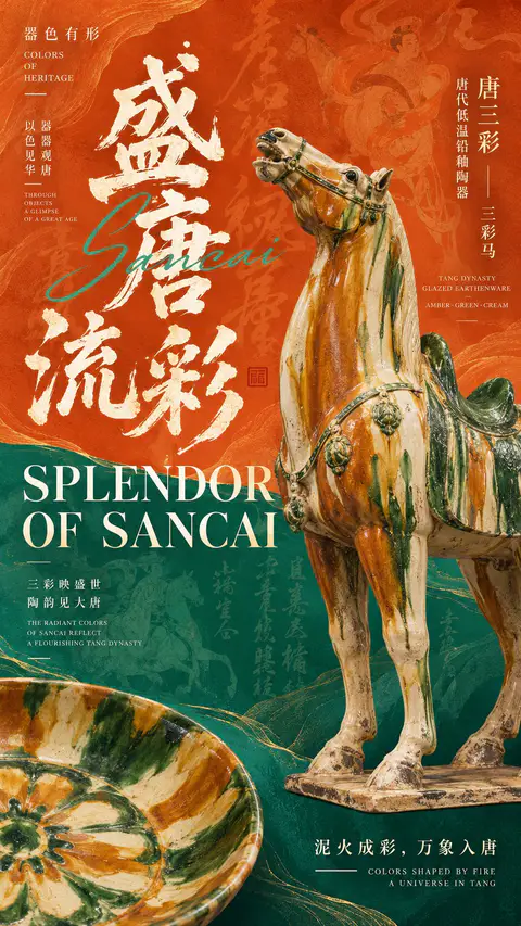
【文化主题】:填写,如唐三彩、青花瓷、钧窑、建盏 【核心器物】:填写名称、器型及材质特征 【中文主标题】:填写 【英文主标题】:填写 【文化短句】:填写 【系列名称】:器色有形 / COLORS OF HERITAGE 【主色与辅助色】:填写 【视觉模式】:深色矿物 / 高饱和撞色 / 渐变光栅 【画幅比例】:9:16 创作一张高完成度的东方文博实验字体艺术海报,融合中国传统美学、博物馆展览视觉、复古编辑设计与现代实验 Typography。 一、器物与构图 以一件具有真实文化特征的器物作为核心主视觉,大比例展示,具备准确的器型、精致的材质纹理、自然釉面或表面质感,以及博物馆藏品摄影般的光影层次。 允许器物局部放大、边缘出框,与文字产生前后遮挡。加入一件局部裁切或半透明的辅助器物,利用大小、虚实、方向与形态差异建立空间层次。 二、字体与排版 中文主标题使用巨大而富有力量的毛笔书法,具有自然的笔锋、飞白与粗细变化,成为画面的重要视觉图形。 英文主标题采用高品质大写复古衬线字体,通过放大、分行、错位与叠压,与中文书法及器物产生互动。可加入少量优雅的英文连笔字作为辅助。 画面必须具有完整的编辑式信息层级,包括系列名称、器物名称、文化分类、工艺说明、中英文短句及少量精致标注线。信息密度中高,但保持明确的主次关系。 三、色彩与背景 根据选择的视觉模式设计: - 深色矿物: 墨黑、深蓝、铜金等色彩,融合矿物纹理、局部金属色细节、半透明书法底纹,呈现深邃厚重的文化气质。 - 高饱和撞色: 使用两种鲜明的主色进行大面积分区,搭配有机曲线、器物错位出框、巨大字体与低对比文化纹样,形成复古编辑设计感。 - 渐变光栅: 使用具有空间深度的青蓝、靛紫等渐变色场,叠加连续细密的纵向光栅。线条在器物边缘产生轻微弯曲、疏密变化和前后遮挡,形成器物若隐若现的现代光学艺术效果。 背景融入与主题相关的传统书法、装饰纹样、釉色流动或历史文化肌理,透明度较低,丰富画面但不干扰主要信息。 四、视觉层级与完成度 以巨大中文书法、核心器物和英文大标题构建三个主要视觉锚点。 通过器物局部出框、文字叠压、色彩对比、背景虚影和精细线条,形成丰富的空间层次与阅读节奏。 远看具有强烈的视觉冲击和清晰的大形,近看能发现精致的材质、书法肌理、文化信息与图形细节。 整张海报应具有专业文博展览、艺术出版和文化品牌设计的完成度,成为一件具有独立主题表达的完整作品,而不是普通的器物展示模板。 确保器物造型准确、文字清晰、排版精密、色彩成熟。避免乱码、虚构展讯、无意义英文、廉价3D、过度科技特效、随机编号、四角星芒及水印。 最终输出一张9:16竖版高清艺术海报。
 通用 / 未注明
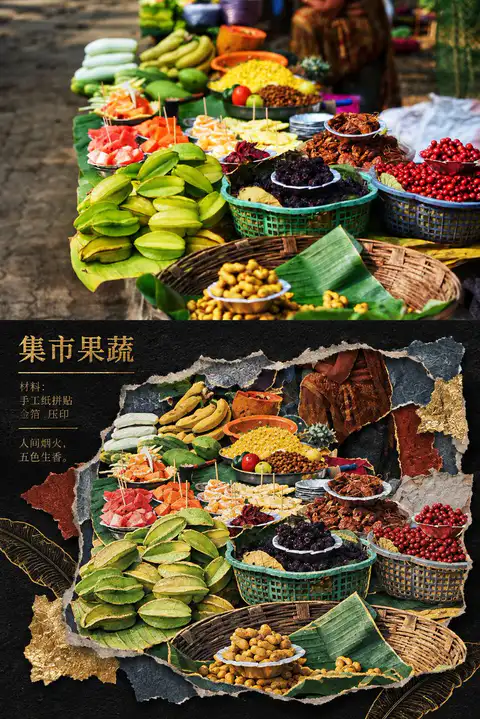
Primary request: 将输入照片转化为“鎏金古迹纸雕拼贴风”,同时保留照片事实与主体身份。 Input images: 输入照片是唯一内容来源;上半部作为真实摄影区,下半部作为同一照片的风格化重组区。 Scene/backdrop: 下半部使用深黑或近黑的粗纤维纸底,围绕原照片主体建立不规则撕纸窗口、错层纸片与局部留白;若照片中有天空、水面、植物、街道或室内空间,将这些真实元素提炼成低饱和的靛青、烟灰、灰绿、赭红纸片,不强行加入东方建筑或异地地标。 Subject: 保留原照片中的主体数量、身份、姿态、动作方向、关键轮廓与空间关系;把主体拆成多层手工剪纸与浅浮雕纸片,边缘略有手工不齐、切口和纸层投影。 Style/medium: 博物馆展签感的东方纸雕、剪纸、纸片拼贴和金箔压印海报;局部使用古金色细线、金箔边缘、压凹/压凸纹理和暗红、墨蓝、烟灰色块。金色只强调主体轮廓、关键结构和少量装饰,不覆盖全部画面。 Composition/framing: 画面严格上下分区,约上半真实照片、下半风格转绘,水平边界清晰;下半不要复刻原照片的完整取景,采用缩小提炼、分层裁切和局部放大,形成一块或数块错落的纸雕窗口;保留明显黑底呼吸空间,在左上或边缘加入小型展签式标题、材料字段和一句极短观察。 Lighting/mood: 黑底吸收环境光,纸层边缘有克制的侧向暖光和柔和投影,整体庄重、静谧、考古档案般;不要做霓虹、塑料、金属3D或普通滤镜。 Color palette: 以黑、炭灰、骨白为底,颜色从原照片提取并压缩为深靛、烟灰绿、赭红、暗琥珀与少量古金;不固定任何地点的色盘。 Materials/textures: 可见粗纤维纸、撕裂边、剪刀切口、叠层厚度、压凹线、金箔不均匀反光和细小纸屑;材料必须成为空间结构,而不是叠加颗粒滤镜。 Text (verbatim): 只生成与输入照片事实相符的短标题、材料字段和一句不超过八个词的观察;文字像金箔压印或旧展签印刷,禁止虚构品牌、网址、二维码和长段落。 Constraints: 上半完整保留真实照片的摄影质感、主体、数量、姿态、构图方向和关键结构;下半必须能追溯到同一照片,并在主体尺度、裁切、信息密度或空间组织上明显改变;不生成“原图/AI图”角标。
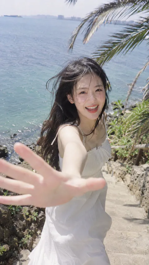 通用 / 未注明
9:16,VHS travelogue 成像,泛白高光与轻微朦胧,韩系海岛旅拍写真,明亮低对比,旅行记录感,不过分锐化。 成年年轻女性 20 岁上下,韩国女团级高颜值 K-idol visual,小脸短中庭、流畅下颌线、微下垂杏眼、饱满卧蚕、直挺鼻梁、浅橘果冻唇、冷白通透肤色;青苹果氧气妆,面中晒后微红,真实皮肤纹理,长发被海风吹乱。 穿白色棉质细肩带连衣裙,站在沿海石阶上,身后大面积蓝色海面,右上方棕榈叶进入画面。人物刚跑下几级台阶又转身冲回镜头,张嘴开心笑,一只手大幅伸向镜头形成明显近大远小透视。 近距离跟拍,略俯视广角感,正午强光从头顶偏侧进入,海面从下方补光,高光微微泛白溢出,手掌轻微运动虚化,强烈两人旅行抓拍感。
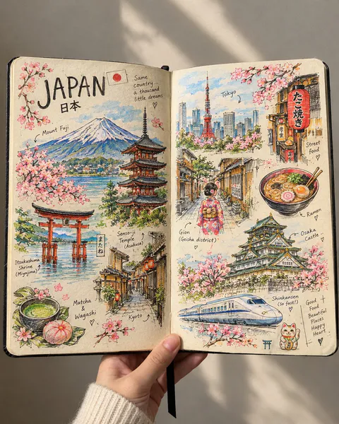 GPT Image 22
Create a beautiful, highly detailed, handmade travel sketchbook spread inspired by an artist’s personal travel journal. Show an open sketchbook with warm ivory paper, slightly imperfect edges, and visible paper texture, filled with intricate hand-drawn illustrations of [COUNTRY / CITY]. The two-page spread should feel like a collection of little memories gathered during a journey, with famous landmarks, traditional architecture, charming streets, cultural symbols, local food, nature, and tiny everyday details arranged organically across both pages. Use fine black ink linework, delicate cross-hatching, loose pencil strokes, architectural doodles, handwritten labels, tiny arrows, and small notes pointing toward the illustrated places. Let the drawings feel authentic and handmade, like a real artist sketched them while travelling. 🌈 The Special Touch — Selective Beautiful Colors Keep most of the artwork in elegant black-and-white ink, but bring selected elements to life with beautiful, carefully placed splashes of color. 🗻 Mountains and landscapes with soft watercolor blues, sage greens, and snowy whites. 🏯 Famous landmarks with subtle terracotta, warm beige, and muted golden tones. 🌸 Flowers and leaves with delicate pinks, coral, and fresh greens. 🍜 Local food illustrated in appetizing, vibrant colors. 🏮 Traditional lanterns, cultural objects, or street signs highlighted with rich reds and warm amber. 🌊 Rivers, lakes, or ocean views accented with dreamy turquoise and soft blue. 🚌 Tiny travel details featuring unexpected pops of mustard yellow, dusty orange, and pastel colors. Important: The colors should appear selectively, as if the artist used watercolor and colored pencils to highlight their favorite memories. Some illustrations should remain completely monochrome, while others should be partially or beautifully colored. The contrast between black ink and colorful details should make the artwork visually captivating without overwhelming the page. ✍️ Composition & Atmosphere Include the country name in large, artistic handwritten lettering, accompanied by a tiny national flag. Add a mixture of large landmark sketches and smaller doodles, creating a rich yet balanced composition. Allow some drawings to overlap slightly or extend toward the edges of the pages. Include spontaneous pencil marks, unfinished outlines, tiny stars, handwritten location names, and subtle artistic imperfections. Show the sketchbook as a real physical object, opened in someone's hand against a simple, softly lit background. Use a close-up perspective, natural daylight, realistic paper texture, and gentle shadows. Art style: Travel journal meets architectural ink illustration meets selective watercolor sketching. Sophisticated, cozy, artistic, nostalgic, and irresistibly beautiful. Aspect ratio: 4:5 vertical composition. Final result: A stunning, realistic travel sketchbook that looks handmade rather than digitally designed, with intricate black ink drawings and strategically placed bursts of beautiful color that make every page feel like a treasured travel memory.
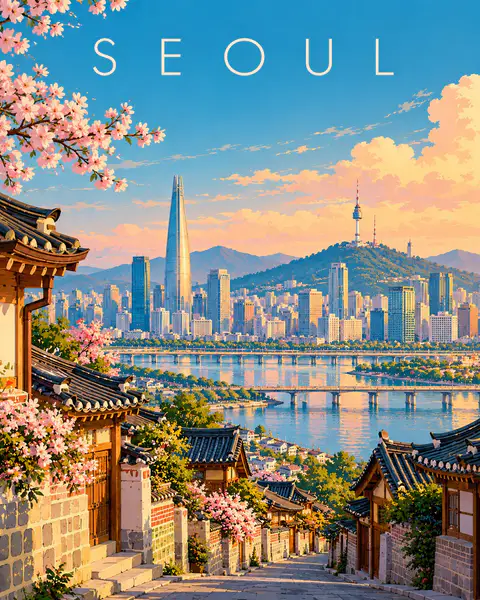 GPT Image 23
Create a premium FULL-FRAME 4:5 vertical contemporary travel illustration for [COUNTRY / CITY / LOCATION / SUBJECT]. TEXT-TO-IMAGE ONLY — generate everything from the destination name alone. No reference image required. CORE CONCEPT: Create an elegant modern European editorial travel poster featuring the destination’s most recognizable landmark, authentic architecture, and surrounding landscape. Use one coherent viewpoint with a clear foreground, beautifully simplified central scene, and spacious background. STYLE: Sophisticated geometric illustration, clean architectural shapes, smooth color fields, minimal details, flat shadows, and refined composition. Preserve recognizable local character while simplifying complex scenery into elegant visual forms. COLOR PALETTE: Luminous turquoise, powder blue, warm ivory, soft peach, muted coral, sage green, and deep teal. Adapt naturally to the destination. TYPOGRAPHY: Place only “[DESTINATION NAME]” near the top in refined, widely spaced contemporary sans-serif lettering. FINAL AESTHETIC: Understated elegance, luminous colors, architectural rhythm, generous negative space, and premium collectible travel-poster design. AVOID: Photorealism, 3D, fantasy architecture, clutter, heavy outlines, metallic effects, borders, mockups, extra text, logos, and watermarks. FORMAT: Exact 4:5 vertical aspect ratio, full-bleed artwork, high resolution.
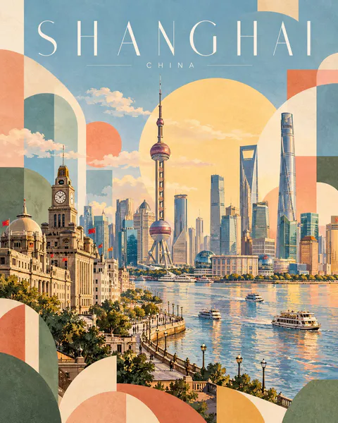 GPT Image 24
Create a premium 4:5 vertical geometric travel-art poster for [COUNTRY / CITY / LOCATION / SUBJECT]. TEXT-TO-IMAGE ONLY — generate the entire artwork from the written destination or subject alone. Do not request, upload, use, or depend on any reference image. Automatically identify the destination’s iconic landmarks, distinctive architecture, landscape, and cultural identity. CORE CONCEPT: Create an elegant travel poster combining approximately 70% recognizable destination illustration with 30% abstract geometric shapes. The landmark and surrounding scenery remain the main focus, while geometric forms add a playful, modern editorial character. COMPOSITION: Feature one iconic landmark prominently, surrounded by authentic local architecture, rooftops, hills, mountains, trees, or coastal scenery as appropriate. Arrange the scene in layered depth with simplified architectural details and a clear visual focal point. Integrate abstract geometric forms into the landscape: overlapping circles, arches, triangles, semicircles, curved blocks, and soft rectangular shapes. Let these forms complement the architecture and scenery rather than obscure the landmark. TYPOGRAPHY: Place the destination name prominently across the top in thin, elegant, widely spaced uppercase lettering. Main title: [LOCATION NAME] Subtitle: [COUNTRY NAME] Use refined minimalist typography, generous letter spacing, and a small understated subtitle. Ensure accurate spelling and balanced alignment. COLOR PALETTE: Powder blue, muted sage green, soft apricot, dusty blush pink, butter yellow, warm ivory, and light terracotta. Adapt the balance naturally to the destination while maintaining a harmonious, low-saturation palette. ART STYLE: Contemporary Scandinavian editorial travel illustration, soft gouache texture, matte painted surfaces, delicate watercolor grain, simplified geometric architecture, clean silhouettes, gentle shadows, and subtle handcrafted imperfections. LIGHTING & ATMOSPHERE: Bright, airy daylight with soft atmospheric depth, a pale open sky, warm sunlight, and a calm, optimistic mood. Keep the overall composition light and spacious. NEGATIVE SPACE: Preserve generous breathing room around the landmark and title. Avoid excessive detail, dense compositions, harsh outlines, oversaturated colors, glossy effects, photorealism, 3D rendering, unnecessary text, logos, and watermarks. FINAL AESTHETIC: Recognizable destination landmarks × modern geometric abstraction × pastel gouache illustration × Scandinavian design × premium collectible travel poster. FORMAT: 4:5 vertical portrait, landmark-led composition, approximately 70% destination illustration and 30% geometric abstraction, elegant typography, soft matte texture, ultra-high definition.
 GPT Image 23
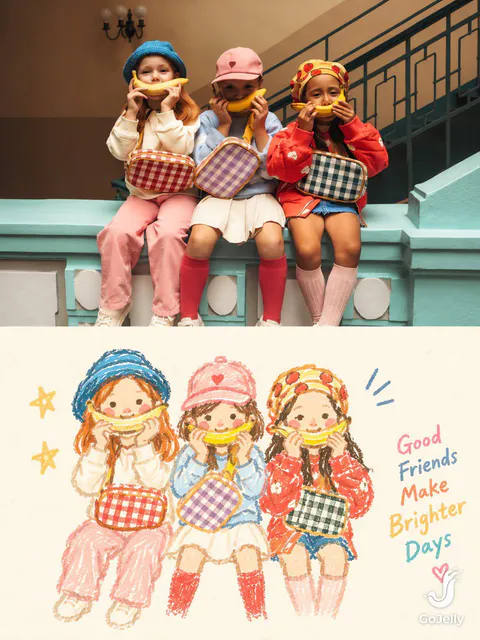
SOURCE & OUTPUT Use each uploaded photo as the sole visual reference. Create one independent, high-end editorial poster per photo and output each separately. Never combine images or create a collage. FORMAT & LAYOUT Use a strict vertical 3:4 composition divided into two exactly equal horizontal halves (50/50). UPPER HALF — ORIGINAL PHOTOGRAPH Preserve the original photograph faithfully, including the subject’s identity, facial features, structure, pose, proportions, natural texture, lighting, and color atmosphere. Apply only subtle premium editorial color grading for an art-magazine or exhibition-photography aesthetic. If necessary, extend only the surrounding background naturally to fit the frame. Never distort, replace, or redesign the subject. LOWER HALF — PASTEL CRAYON MEMORY Reinterpret the photograph as a minimalist, retro paper-texture pastel crayon doodle. Identify the scene’s most memorable subject, pose, relationships, direction, emotional tone, and visual essence. Reconstruct only these defining elements rather than copying every object or illustrating the entire scene. Use thick, loose, grainy, hand-drawn chalk-and-crayon outlines with dry pigment texture, subtle breaks, faded patches, imperfect edges, slight hand wobble, and naturally rounded stroke endings. Add only a few simple pastel color blocks, stripes, dots, or scribbles to suggest essential details. Avoid realistic volume, detailed rendering, and excessive shading. COMPOSITION & NEGATIVE SPACE Keep the illustration small and visually balanced within the lower half, surrounded by generous empty space. Position the subject naturally according to the original photograph, allowing asymmetry, off-center placement, suspended elements, or partial cropping where appropriate. Include only a few tiny environmental clues or abstract doodles, drawn in the same rough, simplified crayon style. Keep them minimal, imperfect, and contour-based. Prioritize breathing room, scale contrast, visual rhythm, and intentional emptiness. Never overcrowd the composition. BACKGROUND & COLOR PALETTE Use a bright, near-white paper background: ivory, cream white, pale off-white, soft apricot white, or very light gray-white. Add only subtle paper fibers and fine grain. Keep the background clean, bright, and clearly lighter than the illustration. Avoid dirty gray, dark yellow, or aged brown paper. Extract 2–4 defining colors from the original photograph and reinterpret them as fresh, soft pastel crayon tones, such as peach pink, apricot orange, cream yellow, mint green, sky blue, or pale lavender. Use sufficiently distinct coral, blue, blue-green, warm orange, or violet outlines for clear contrast. Maintain a gentle, playful, emotionally warm, and refined palette. OPTIONAL TEXT Add only a tiny handwritten note if it genuinely enhances the composition. Keep it sparse, legible, secondary, and unobtrusive. Never use decorative text as filler. FINAL AESTHETIC Create a sophisticated editorial poster combining authentic photography above with a reduced, recognizable, hand-drawn memory of the same scene below. The illustration should feel airy, naive without being childish, playful without looking cheap, and minimal without losing the photograph’s identity or emotional meaning. Emphasize expressive linework, selective color, paper texture, asymmetry, and negative space.
 通用 / 未注明
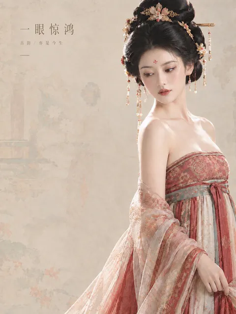
新中式高级时尚商业人像海报,竖版构图,真人电影级超写实摄影与中国古典工笔画美学融合,整体采用东方极简主义设计、古典仕女图的含蓄意境、高端时尚杂志Editorial排版与高级国风品牌广告的视觉语言。画面比例约为3:4,整体色彩低饱和、柔和、温润,主色调为米杏色、暖象牙白、浅烟灰、胭脂红、灰青色与淡香槟金,呈现精致克制、轻盈通透、古典而现代的视觉气质。画面右侧是一位年轻成年东方女性,采用胸部以上至腰部的三分之二身人像构图,人物占据画面右侧约45%的宽度,头部靠近画面上方,身体自然向侧面微微转动,肩颈线条流畅优雅,头部轻轻低垂并略微转向画面左下方,目光温柔地望向下方,神情安静、清冷、含蓄,带有古典东方美人的柔美与疏离感。女性拥有精致小巧的鹅蛋脸,流畅柔和的下颌线,白皙细腻、具有自然真实皮肤纹理的肌肤,柔和的眉眼轮廓,细长自然的眉毛,微微上扬的眼尾,清澈深邃的棕黑色眼睛,纤长自然的睫毛,精致挺拔的鼻梁,柔软饱满的淡豆沙色嘴唇,面部妆容采用清透的古典中式淡妆,眼尾轻扫细腻的棕色眼线,眼下带有若有若无的淡粉色晕染,双颊呈现自然的浅玫瑰色,额头中央点缀一枚极小的朱红色传统花钿,整体妆容精致而不浓艳。人物发型采用盛唐仕女风格的乌黑高耸盘发,浓密顺滑的黑色长发经过精细梳理,顶部形成层次丰富、饱满立体的高髻结构,发丝具有真实的光泽与细节,发髻间点缀精巧的古金色镂空花丝发饰、米白色花朵、淡粉色花瓣、珍珠与细小红色宝石,配有横向金色发簪、垂落的细金链、珍珠流苏与精致的花形耳饰,金属饰品呈现细腻的香槟金反光,珍珠拥有柔和的乳白色光泽,所有发饰精致华丽但不过度堆叠。女性身穿一套精美的唐风改良汉服礼裙,上身为胭脂豆沙红色抹胸式古典衣身,面料带有细密繁复的金色传统缠枝花卉与团花纹样,织物呈现高级提花丝绸的柔和光泽,胸衣上沿采用精致的暗金色织锦滚边;腰部系有一条灰青色与古金色相间的宽幅织锦腰带,腰带上具有细腻的传统花纹,中央以胭脂红色丝带打结,垂下两条自然飘落的长丝带;裙身采用象牙白、浅香槟色与胭脂红色拼接的高腰长裙,具有层叠丰富的丝绸褶皱、细腻的织锦纹理与低调的金色花卉暗纹。肩臂披覆一层轻薄透明的淡粉杏色纱罗披帛,披帛自然垂落于手臂和身体两侧,表面绣有细致的花卉纹样,半透明材质能够隐约透出内层服饰的色彩与纹理,边缘具有细密精致的刺绣装饰,布料轻盈柔软,呈现自然的垂坠感与微妙的透光效果。人物身体姿态自然舒展,一只手轻柔地捏住裙侧的丝绸面料,手指纤细修长,动作含蓄优雅,手部结构真实自然。背景采用温暖的浅米杏色宣纸质感,融合中国古代工笔仕女画、淡彩花鸟画与传统古典屏风的装饰元素,背景中隐约浮现古代仕女的淡墨轮廓、柔化的花枝、浅灰青色花卉、淡粉色花朵以及极淡的传统建筑纹样,所有图案经过高度弱化与低对比度处理,如同历经岁月的古画残影,若隐若现地融入纸张肌理之中,不抢夺主体人物的视觉焦点。背景整体采用浅米白、灰青、淡杏与微弱的灰粉色,保留细腻的天然纸张纤维、轻微的水墨晕染和柔和的复古颗粒感,呈现古画与现代摄影叠加的独特质感。画面左侧约60%的区域保留大面积干净的负空间,背景纹理在左侧尤为轻淡,保证中文文案具有清晰的阅读空间。左上区域设计极简高级的中文标题排版,主标题为“一眼惊鸿”,使用纤细优雅的现代宋体或具有古典韵味的高对比中文衬线字体,文字采用低饱和深灰褐色,字距适度拉开,横向排列,尺寸克制,不使用厚重书法字或夸张装饰;主标题下方以明显更小的字号排布副标题“古韵 / 亦是今生”,使用细体中文字体,字距均匀,颜色比主标题更浅,整体左对齐。副标题下方增加一条极细的深灰褐色短横线作为视觉分隔,线条简洁克制,与标题形成精致的几何关系。所有文案集中在左上角,不出现多余文字、英文、Logo、水印、边框或装饰性符号。摄影采用大型柔光箱般的柔和侧前方光线与自然漫射环境光相结合,人物面部、锁骨、肩部和丝绸衣料呈现细腻的高光过渡,发髻边缘具有轻微的轮廓光,阴影柔和、通透而富有层次,避免强烈硬光与过度磨皮。采用中长焦人像镜头的视觉效果,浅景深但人物面部、眼睛、发饰、刺绣细节均清晰锐利,背景轻微柔化,真实的皮肤毛孔、细小发丝、珍珠光泽、金属纹理、丝绸纤维与薄纱透明度均得到精细呈现。整体画面具有高级时尚摄影的真实质感,同时保留东方古典绘画的柔美与朦胧意境,构图疏密有致,人物与文字互不干扰,留白充足,色彩统一,视觉重心明确,呈现国际高端东方美学品牌的季节广告海报品质,8K细节,电影级色彩分级,真实摄影质感,精致、典雅、温柔、空灵、克制、高级。
 通用 / 未注明3
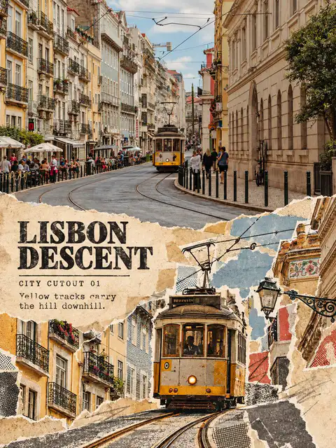
请将上传的城市旅行照片制作成一张3:4竖版“城市剪贴记忆拼构”旅行对照海报。 上半部分保留清楚、完整、具有实质面积的原始城市照片,只做轻微出版物调色。保持城市主体、建筑结构、道路或水系、观察角度、人物数量、光线与真实色彩关系不变。 下半部分只能从同一张照片中提取4–8个真实形体:锁定一个主地标或城市轴线,再提取建筑轮廓、道路、车辆、树木、招牌或人群剪影。将它们重新制作成撕纸、旧印刷片、复印网点和少量纸面线条,允许主地标放大、错位、前后叠压和局部出画,但必须保留原照片的空间方向和地点识别度。不要把它们排成等大的素材板、九宫格或独立小卡片。 使用从原图提取的3–5种纸色和油墨色,加入纸纤维、撕裂毛边、套印偏移、缺墨和粗网点。构图可以密集,但主动保留20%–30%连续旧纸空场,让标题、CITY CUTOUT字段和一句短观察落在安静区域。文字像旧印刷铅字或压印纸片,不要使用悬浮的光滑数字排版。 所有建筑、道路、车辆和人物都必须能追溯到同一张原图。禁止补入其他城市的地标、通用旅游图标、品牌、作者名、Logo、网址、水印、乱码或虚构文字。
 通用 / 未注明
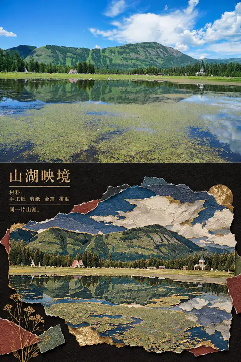
Primary request: 将输入照片转化为“鎏金古迹纸雕拼贴风”,同时保留照片事实与主体身份。 Input images: 输入照片是唯一内容来源;上半部作为真实摄影区,下半部作为同一照片的风格化重组区。 Scene/backdrop: 下半部使用深黑或近黑的粗纤维纸底,围绕原照片主体建立不规则撕纸窗口、错层纸片与局部留白;若照片中有天空、水面、植物、街道或室内空间,将这些真实元素提炼成低饱和的靛青、烟灰、灰绿、赭红纸片,不强行加入东方建筑或异地地标。 Subject: 保留原照片中的主体数量、身份、姿态、动作方向、关键轮廓与空间关系;把主体拆成多层手工剪纸与浅浮雕纸片,边缘略有手工不齐、切口和纸层投影。 Style/medium: 博物馆展签感的东方纸雕、剪纸、纸片拼贴和金箔压印海报;局部使用古金色细线、金箔边缘、压凹/压凸纹理和暗红、墨蓝、烟灰色块。金色只强调主体轮廓、关键结构和少量装饰,不覆盖全部画面。 Composition/framing: 画面严格上下分区,约上半真实照片、下半风格转绘,水平边界清晰;下半不要复刻原照片的完整取景,采用缩小提炼、分层裁切和局部放大,形成一块或数块错落的纸雕窗口;保留明显黑底呼吸空间,在左上或边缘加入小型展签式标题、材料字段和一句极短观察。 Lighting/mood: 黑底吸收环境光,纸层边缘有克制的侧向暖光和柔和投影,整体庄重、静谧、考古档案般;不要做霓虹、塑料、金属3D或普通滤镜。 Color palette: 以黑、炭灰、骨白为底,颜色从原照片提取并压缩为深靛、烟灰绿、赭红、暗琥珀与少量古金;不固定任何地点的色盘。 Materials/textures: 可见粗纤维纸、撕裂边、剪刀切口、叠层厚度、压凹线、金箔不均匀反光和细小纸屑;材料必须成为空间结构,而不是叠加颗粒滤镜。 Text (verbatim): 只生成与输入照片事实相符的短标题、材料字段和一句不超过八个词的观察;文字像金箔压印或旧展签印刷,禁止虚构品牌、网址、二维码和长段落。 Constraints: 上半完整保留真实照片的摄影质感、主体、数量、姿态、构图方向和关键结构;下半必须能追溯到同一照片,并在主体尺度、裁切、信息密度或空间组织上明显改变;不生成“原图/AI图”角标。
 GPT Image 24
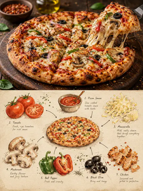
Create a premium 3:4 vertical editorial food-art poster for [COUNTRY / CITY / LOCAL DISH / FOOD SUBJECT]. TEXT-TO-IMAGE ONLY. Generate the entire composition from the written dish or food subject alone. Do not request, upload, use, or depend on any reference image or existing photograph. Automatically identify the dish’s authentic appearance, ingredients, textures, and cultural identity. CORE CONCEPT: Create one elegant travel-food editorial poster combining realistic food photography in the upper section with a handmade ingredient-observation sketchbook in the lower section. Feature ONE recognizable plate or bowl containing a single dish, with at least three visually distinct ingredients. UPPER SECTION — REALISTIC FOOD PHOTOGRAPHY: Occupy approximately 48% of the canvas height. Create a beautifully composed, authentic photographic view of the specified local dish, preserving believable ingredient textures, natural lighting, realistic proportions, and culturally accurate presentation. Use subtle food-magazine color grading and extremely light film grain. Keep the entire plate or bowl visible. SECTION DIVIDER: Separate both sections with a straight, clean horizontal boundary. A very thin warm-ivory paper strip is optional. No gradients, blending, or elements crossing the divider. LOWER SECTION — INGREDIENT OBSERVATION SHEET: Use warm ivory drawing paper with visible fibers, fine grain, faint smudges, and subtle handmade irregularities. Create a sparse, asymmetrical food-field-note composition rather than repeating the full photographic dish. Place ONE small, simplified but recognizable illustration of the complete dish near the center. Keep it secondary and compact, occupying approximately one-third of the lower section’s width. Around it, illustrate 3–6 individually selected ingredients inferred from the dish. Use small watercolor specimens, cut-surface studies, herb sketches, grain clusters, sauce swatches, or distinctive ingredient shapes. Arrange them at varied sizes and angles with generous breathing room. DRAWING STYLE: Matte gouache, delicate black-ink outlines, slightly hesitant hand-drawn strokes, dry-brush gaps, uneven pigment coverage, soft watercolor edges, visible paper texture, and restrained natural colors. Keep ingredients recognizable without excessive detail. Add a few fine arrows and small handwritten numbers connecting specimens to the miniature dish. TYPOGRAPHY: Use minimal, understated editorial annotations only when helpful. Short ingredient names or tiny handwritten notes are acceptable. Keep all text small and secondary; avoid unnecessary titles or decorative lettering. COLOR PALETTE: Derive the colors naturally from the dish, balanced by warm cream, muted earth tones, and subtle ink details. FINAL AESTHETIC: Authentic local food photography × handmade ingredient studies × refined travel-food editorial × collectible culinary field notebook. AVOID: Multiple dishes, duplicate plates, mixed meals, inaccurate ingredients, excessive garnish, crowded layouts, gradients, bleeding transitions, glossy digital painting, flat vector infographics, 3D rendering, commercial menu styling, excessive text, logos, watermarks, and interface elements. FORMAT: 3:4 vertical portrait, approximately 48% photographic food scene above and 52% illustrated ingredient-observation sheet below, crisp horizontal separation, generous negative space, premium publication quality, ultra-high definition.
 GPT Image 23
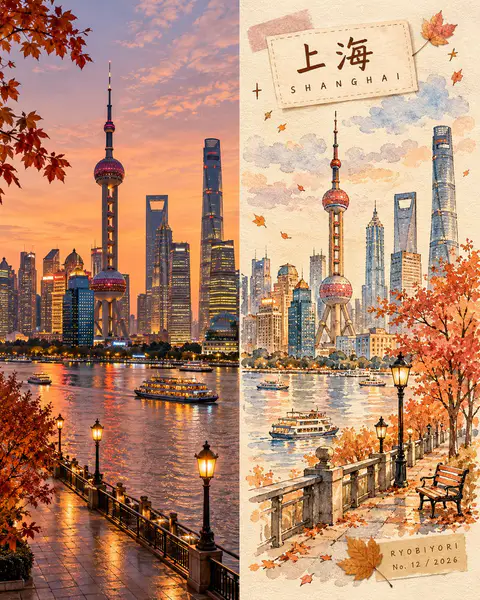
Create a premium 4:5 vertical autumn travel-journal artwork for [COUNTRY / CITY / LOCATION / SUBJECT]. TEXT-TO-IMAGE ONLY — generate every element from the written destination or subject alone. Do not request, upload, use, or depend on any reference image, existing photograph, or source image. MASTER STYLE LOCK: Hand-painted autumn watercolor on warm ivory paper, minimalist travel-editorial illustration, transparent watercolor washes mixed with soft gouache, delicate imperfect ink outlines, visible paper grain, natural pigment blooms, soft edges, muted autumn colors, generous negative space, warm nostalgic atmosphere, premium handcrafted art-book aesthetic. COMPOSITION: Divide the vertical canvas into two equal halves using a precise 50/50 left-right split. LEFT HALF — REALISTIC DESTINATION: Generate an original, natural-looking photograph-style scene of [COUNTRY / CITY / LOCATION / SUBJECT]. Automatically determine its recognizable architecture, scenery, atmosphere, and natural lighting. Preserve realistic textures, authentic colors, and believable perspective. Keep this entire half clean, with no text, labels, illustrations, borders, or decorative elements. RIGHT HALF — AUTUMN WATERCOLOR JOURNAL: Reimagine the same destination as a delicate, handmade autumn watercolor illustration. Use simplified rounded architecture, warm glowing windows, a small tree with dusty rose, apricot, and amber foliage, a few drifting leaves, and subtle watercolor clouds. Include only a few meaningful local details, keeping the composition airy and uncluttered. COLOR PALETTE: Caramel brown, dusty rose, apricot orange, creamy yellow, muted maple red, warm ivory, and faint lavender-grey shadows. Use soft, low-saturation afternoon light. No neon colors or harsh black. HANDMADE DETAILS: Add one or two narrow kraft-brown or dusty-pink washi tape strips, a small pressed autumn leaf, and a few delicate hand-drawn stars or arrows. Integrate these details naturally without overcrowding the illustration. DESTINATION LABEL: Place a small cream-colored paper label near the upper-left corner of the RIGHT HALF. Main title: [LOCATION NAME] Subtitle: [ENGLISH LOCATION NAME] Use rounded, handwritten Japanese-inspired lettering for the main title and smaller, widely spaced handwritten English lettering for the subtitle. Keep spelling accurate and typography legible. SIGNATURE LABEL: Near the bottom-right corner of the RIGHT HALF, add a small kraft-paper label with exactly this text: RYOBIYORI No. [NUMBER] / [YEAR] Use subtle, fine dark-brown lettering. STRICT LAYOUT RULES: All text, labels, washi tape, and decorative elements must remain entirely within the right half. The left half must contain only the original generated realistic destination scene. Never reproduce or modify an existing photograph. PAPER & FINISH: Warm ivory watercolor-paper texture, delicate fibers, subtle grain, organic pigment edges, and a carefully assembled travel-journal feeling. FINAL AESTHETIC: Realistic destination imagery × autumn watercolor illustration × handmade travel journal × nostalgic seasonal palette × premium editorial design. AVOID: Reference-image requests, image-editing instructions, existing-photo preservation, unequal panel widths, text crossing the center divider, excessive decoration, oversaturated colors, glossy digital painting, 3D rendering, misspelled text, extra logos, watermarks, and interface elements. OUTPUT: 4:5 vertical portrait, exact 50/50 left-right composition, realistic generated destination scene on the left, watercolor travel-journal illustration on the right, ultra-high definition.
 通用 / 未注明4
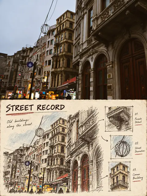
Use case: style-transfer Asset type: 竖版上下对比风格转绘海报 Primary request: 将输入的任意真实照片制作成一张“档案卡现场手绘记录风”的上下对比转绘图。 Input images: 输入照片是唯一事实来源,只使用照片中的主体、姿态、数量、结构、空间关系和可确认的色彩。 Scene/backdrop: 画面为竖版约3:4比例;上半部完整保留输入照片的真实摄影质感、原始构图和自然光线,作为清晰的照片记录区;下半部变成一张米白色、略有纤维和旧纸毛边的复古档案卡。 Subject: 不限主体,可以是人物、动物、建筑、街景、自然、交通工具、室内、食物或普通物件;从原照片提取最具识别度的主体和两三个细节,不把主题固定为船或港口。 Style/medium: 下半部使用黑褐色钢笔/签字笔勾线、轻微干墨擦痕、少量蜡笔或旧丝网印刷色块,像旅行档案卡、现场勘察卡、老式明信片背面的手绘观察记录;线条保留手绘抖动、局部重复描线和不完全均匀的墨色,不要做成光滑矢量插画或普通滤镜。 Composition/framing: 下半部重新组织原照片信息,不等比例照抄原取景:把主体缩小或局部放大成档案插图,周围安排少量局部细节小框、箭头、编号、图例或材料字段;留出明确的米白呼吸空间,版面像一张完整的实体卡片。可加入一个短英文标题、一个与照片事实相关的短字段和一句极短观察,但不要大段文字。 Lighting/mood: 上半部自然真实;下半部是柔和纸面光、克制的复古记录感、安静而有观察意味。 Color palette: 以米白、黑褐、灰蓝或暗红为基础,只从原照片提取一至两种低饱和强调色;不要套用固定黄蓝配色。 Materials/textures: 可见纸纤维、旧卡片边缘、轻微印刷错位、干墨断线、手写字段、细小编号和局部色块;材质必须参与构图,不能只加颗粒滤镜。 Text (verbatim): 只生成提示词明确指定的短标题/字段/观察句;若无法确认地点,不编造地名、日期、坐标、品牌、网址或长段落。 Constraints: 上半部必须是可辨认的真实原图;下半部必须是同一照片内容的手绘档案重构;严格上下分区,不要左右并排,不要九宫格,不要多张不同照片,不要“原图/AI图”角标,不要水印;保持主体身份、数量、姿态、建筑结构、地形关系和观察角度;下半部至少改变主体尺度、裁切、信息密度或空间组织中的两项;下半部不得只是原图的同构临摹。 Avoid: 纯调色、普通照片滤镜、3D渲染、卡通模板、无关旅游图标、凭空新增人物或地标、假中文、二维码、长段落、过度拥挤的贴纸拼贴。
 GPT Image 2
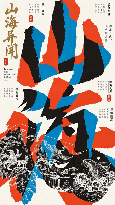
【主题】{如:岭南醒狮、昆曲游园、武侠江湖、山海异兽}
【核心汉字】{两个中文大字}
【书法题名】{四字文化主题}
【英文副标题】{英文主题名称}
【文化线描元素】{3–5个相关人物、建筑、器物或自然景观}
【辅助题跋】{3–5组中文短句,可自动创作}
【配色】{默认朱红、青蓝、墨黑、暖米白、少量古金}
【比例】9:16 竖版
创作一张高完成度的东方实验字体艺术海报,融合巨型书法汉字解构、复古套色印刷、传统文化白描与现代编辑式排版,呈现大胆、浓烈、富有文化底蕴的视觉风格。
一、巨型汉字解构
将两个核心汉字放大至占据画面约80%的高度,采用粗壮、奔放、富有力量感的书法笔画。字形夸张拉伸、交错重叠、局部越界裁切,形成强烈的抽象几何构图,同时保留基本辨识度。笔画走势根据主题变化,具有自然的书法韵律与视觉动势。
二、三色套色穿插
以朱红、青蓝、墨黑构成巨大的有机色块,三种颜色在汉字笔画内部互相穿插、切割、遮挡和嵌套,利用米白负空间形成丰富的图底关系。
色彩鲜明饱满、边缘利落,具有平面丝网印刷与传统书法结合的质感。避免简单的彩色文字叠层和立体阴影。
三、东方文字排版
画面左上安排古金色纵向书法题名,旁边搭配精细的英文副标题。
顶部、两侧及局部留白区域分布多组微型竖排中文题跋,采用宋体、明朝体与少量书法字,搭配2–4枚朱红印章、细线分隔和局部英文竖排。
强调巨型书法与微型文字的尺度反差,文字具有真实文化意义,排版丰富、错落有致,呈现成熟的东方编辑设计美学。
四、精密文化白描
在画面下方约三分之一区域,将主题相关的传统人物、建筑、动物、植物及器物融入巨型汉字内部。
采用精致的白色传统线描,刻画丰富的服饰纹样、建筑结构与自然细节,形成具有叙事性的古典版画效果。
加入少量白色几何细线框架,将不同场景自然连接。插画与红蓝黑色块互相穿插,而非独立排列,呈现复杂而统一的视觉结构。
五、整体视觉要求
采用非对称、高张力的自由构图。巨型汉字主导视觉,微型题跋散布边缘,精密白描嵌入下方,形成鲜明的信息层级。背景为干净暖米白,整体保持平面、哑光、强对比的套色印刷美学。
远看具有强烈图形冲击力,近看拥有丰富的文化细节。每张海报都应具备完整主题、真实文案和独立的艺术表达,同时保持统一系列风格。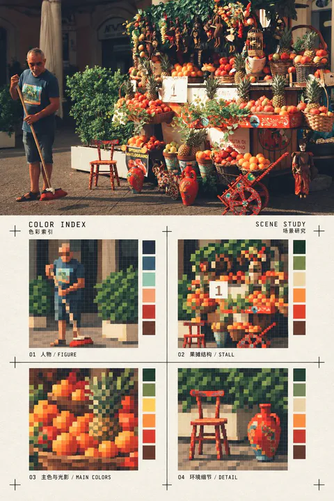 通用 / 未注明2
使用一张真实照片作为唯一内容来源,制作一张竖版上下对比编辑海报。上半部完整保留输入照片的真实摄影质感、主体身份、数量、姿态、空间关系、光线和构图,不把照片画成插画;下半部为同一照片的风格化转绘区:在暖白纸面上,把画面提炼成四个等大的方形像素色块索引,分别对应照片中最有辨识度的主体轮廓、建筑或物体结构、主色与光影关系、一个环境细节。每格使用有限色数的硬边像素块和低分辨率网格感,保留可追溯的形体,不做随机马赛克。四格排列为2×2,周围留出充足纸面;用细黑色十字裁切/定位标记框住索引区域,加入极少量小型双语标题与字段,例如“COLOR INDEX / SCENE STUDY”,文字克制、清晰、像印刷校样标注,不喧宾夺主。下半区必须像一张经过设计的色彩索引卡,而不是滤镜、普通像素化或重复照片;不增加无关物件,不改变照片主题。上下区域约各占一半,水平边界清楚;禁止左右并排、禁止多图拼贴、禁止“原图/AI图”角标、禁止水印和品牌标志。所有颜色从输入照片提取并压缩,四格内容随照片主体变化,适用于人物、动物、建筑、街景、自然、室内、食物和物件等任何照片。
 GPT Image 2
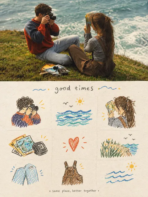
Create a vertical cozy travel scrapbook poster inspired by the reference images. Combine a cinematic realistic travel photograph on the top half with a hand-drawn memory journal collage on the bottom half. Top section: Show two young travelers relaxing together on a grassy coastal cliff overlooking a beautiful ocean. One person is taking photographs with a vintage camera while the other is looking through a travel guide/map. Include small travel items such as photographs, postcards and camera accessories on the grass. Warm golden-hour sunlight, soft ocean waves, natural candid poses, nostalgic film photography, muted warm colors, cinematic depth of field, authentic peaceful travel atmosphere. Bottom section: On warm textured cream paper, create a charming 3×3 illustrated scrapbook grid inspired by the scene. Draw individual hand-drawn elements: a person with a camera, ocean waves and sun, traveler with a map, vintage photographs, a heart symbol, coastal grass and sea, folded jeans/clothing, overalls/backpack, and ocean waves. Use loose colored-pencil and watercolor strokes with dark brown sketch outlines, muted blue, orange, yellow and green accents. Add tiny hearts, stars, birds, sunshine and decorative doodles. At the top of the illustrated section, add a handwritten title “Good Times” and at the bottom a small handwritten phrase “Same place, better together.” Style: nostalgic travel diary, vintage film photography, handmade scrapbook, watercolor + colored-pencil illustration, textured recycled paper, warm cozy tones, imperfect hand-drawn details, emotional friendship/travel memories, premium editorial poster, clean composition, vertical 4:5, highly detailed, no watermark.
 通用 / 未注明2
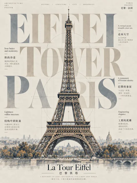
以【建筑】作为核心视觉元素,创作一张极致简约的高端艺术海报。画面中央放置建筑的插画图形,背景以超大加粗的英文字体呈现,字体造型与建筑轮廓形成呼应,突出主建筑,字体淡化处理。环绕主体布置小号文字,阐释它的设计理念与哲思,并配以中文注解。整体调性典雅克制,色彩选择与建筑气质相契合一一部分文字或图形可巧妙延展为建筑的构件或外轮廓的延伸,营造浑然一体的构图。最终呈现一张高级感十足、极简且富有张力的艺术海报。
 GPT Image 24
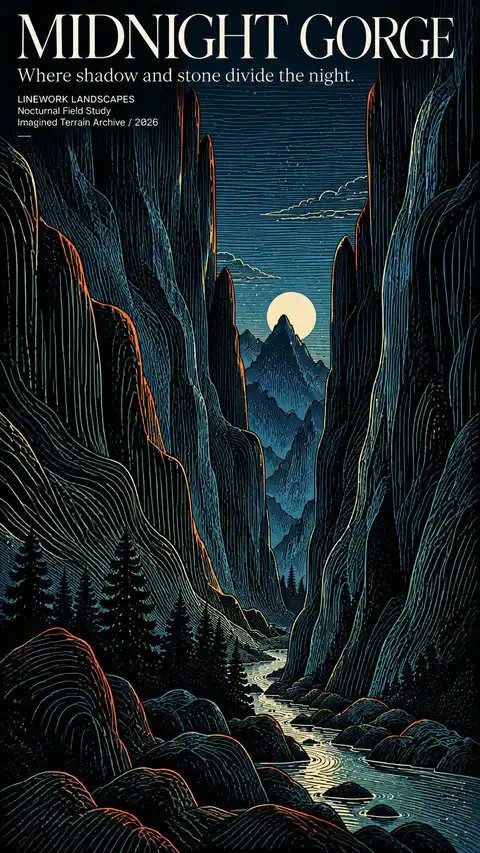
【POSTER TITLE】{e.g. RIVER OF LIGHT}
【SUBTITLE】{short poetic sentence}
【LANDSCAPE】{mountain valley / gorge / river / basin / cliffs}
【MOOD】{twilight / moonlit / quiet / monumental / mysterious}
【COLOR PALETTE】{deep blue, black, teal, warm ivory, burnt orange}
【SMALL TEXT】{series name / field study / archive / year}
Create a 9:16 vertical English landscape poster built primarily through flowing contour linework and bold color.
Design the landscape first with strong, simple, readable landforms: monumental mountains, cliffs, valleys, rivers, ridges, forests or open terrain. The composition must remain visually powerful even at thumbnail size.
Use long, continuous lines to describe the structure and volume of the landscape. Mountain lines should follow slopes, ridges and geological folds; rivers and paths should create natural visual movement; sky lines should be calmer, longer and more horizontal. The linework must feel directional and intentional rather than random hatching or decorative noise.
Use a bold but controlled palette. Combine deep ink black and dark blue landforms with glacier blue, muted teal and warm ivory linework. Add small areas of burnt orange or copper along selected ridges, terrain edges or vegetation to create strong contrast and visual energy.
Keep the main shapes dark and graphic, then use line density and color shifts to create depth. Avoid excessive micro-detail, distressed texture, messy cross-hatching, neon effects or generic fantasy lighting.
Integrate refined editorial typography directly into the composition. Use an elegant high-contrast serif for the main title, supported by smaller modern text. The typography should feel like an art publication or exhibition poster, not a travel advertisement.
Use only meaningful text related to the poster concept. Do not add random slogans, filler copy, fake coordinates, meaningless labels, logos, Chinese characters or watermarks.
The final result should feel like a complete collectible artwork — part topographic drawing, part printmaking, part contemporary editorial poster design.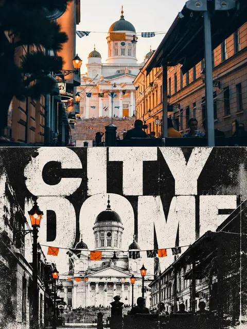 通用 / 未注明3
将输入的城市旅行照片制作成一张竖向3:4上下对比转绘海报,上半约50%保留真实照片中的城市建筑、街道、车辆、行人和地标透视;下半约50%转译为“MONOCHROME TYPE CITY|黑白巨字城市构成风”。下半用高反差黑白建筑剪影、炭黑暖白、粗半调复印颗粒、碳粉不均和旧纸磨损,提取照片中最准确的城市地标,并用巨大裁切英文标题“CITY / STREET”作为构图骨架,让字母与建筑穿插、出画、遮挡部分笔画。只保留最多一至两种来自照片的专色,不做渐变或全图染色;下半必须改变主体尺度与信息密度并保留连续低信息空场。中线水平清晰,不要普通双色滤镜、照片拼贴、无关地标、Logo、水印、假中文、乱码或原图/AI图角标。
 GPT Image 2
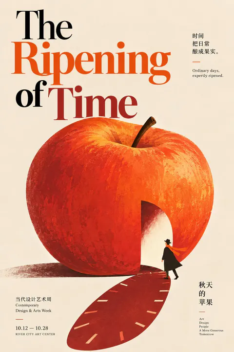
【主题:秋天的苹果(The Ripening of Time) 业务场景:当代设计艺术周海报 / 人文杂志秋季号封面 / 城市文化沙龙视觉 受众:设计师、媒体人、都市文艺思考者与创意群体 内容密度:极低 情感基调:克制、幽默、机智、洗练 主题色:主色 C-26 柿橙(Persimmon Orange) + 辅助色 C-18 庞贝红(Pompeian Red) editorial风格:Bold Minimalist Conceptual Graphic Editorial 风格 画风:风格名称: Minimal Visual-Pun Editorial。参考作者/风格名称:Christoph Niemann。【如果主题直白包含画面元素那就按主题出图,文案由你来升华,但是不要直接描述画面。 如果主题比较概念化,那么文案和主题尽量保持一致,如果文案较长由你提炼,由你先设计画面隐喻(人类和非人类都行)再出图 。 文字参与构图,图文一体】
 GPT Image 24
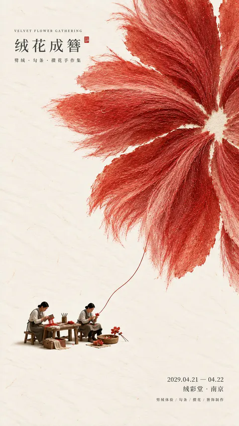
【海报主题】 【主标题】 【核心大色域】 【结构方式】 【主色调】 【微型文化场景】 【人物动作】 【文化器物】 【活动信息】 【画幅比例】 设计一张现代东方文化活动海报,以「纸纤维 + 大色域 + 主动留白 + 微型文化场景」为核心。 背景使用温润的暖象牙白手工纸,保留约 45%–60% 大面积留白。使用【核心大色域】建立第一视觉,根据【结构方式】形成清楚、有方法感的大形关系,可以通过纤维放射、纸面镂空、裂缝连接、正负形转换或拓印痕迹表达主题,但不要直接做成普通写实物体。 大色域具有明显天然纸纤维、纸浆颗粒、水彩或矿物颜料沉积、自然毛边和哑光质感。整体采用【主色调】,颜色低饱和但完整、有浓度,远看首先看到大形和色彩关系,近看才发现材料细节。 在大色域附近加入尺度很小的【微型文化场景】,人物正在真实完成【人物动作】,人物、工具和【文化器物】整体只占约 3%–5%,不做摆拍或商品陈列。 人物统一采用二维纸本淡彩插画画法:五官简洁、轻体积、完整平面色块、少量连续衣褶线,与纸张和色域属于同一个视觉世界。避免摄影真人感、3D 微缩模型、CGI 光影、强投影和真实景深。 微型场景与巨大主视觉之间建立一处真实的尺度连接,例如纤维、纸屑、裂隙、锔钉、墨迹、工具轨迹或材料本身,让“小手工动作”自然延展成“大色域结构”。 主标题【主标题】使用小尺度现代宋体或明朝体,放在留白区域;日期、地点和【活动信息】使用更小字号克制排版。文字不抢主视觉,不加入无意义占位词。 整体阅读顺序为: 留白与大色域 → 结构关系 → 纸纤维质感 → 微型文化场景 → 工艺动作 → 标题与活动信息。 最终呈现远看抓眼、近看有纸感、有细节、有文化故事的东方编辑海报。
 通用 / 未注明
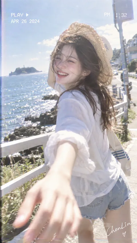
9:16,VHS 家用录像机 summer travelogue,成年韩系女性海边旅行快照,明亮奶白调、低对比,太阳光晕明显,高光泛白,轻微 VHS 颗粒与色散。 成年韩系女性,淡粉微醺妆,双颊鼻尖自然粉红,浅珊瑚果汁唇,裸妆肌理,中长黑发被海风吹乱。头戴自然草编宽檐帽,帽檐也被风轻微掀起。 人物边走边转头看镜头,露齿大笑,一只手伸向镜头仿佛牵住摄影者,前景手掌与手臂明显虚化;另一只手抬到草帽附近轻扶帽檐。白色 T 恤与轻薄半透明防晒衬衫,浅蓝毛边牛仔短裤,肩侧带白色帆布包。 海边栏杆斜向延伸,背景是蓝色海面、黑色礁石、远方小岛和灯塔,天空大面积浅蓝接近白色。 手持近距离跟拍,略低于眼睛的平视广角,前景手明显近大远小,身体和发丝带少量移动虚焦。午后逆光将帽檐、头发和衣服边缘照成柔亮白线。 左上加入“PLAY ▶ / APR 26 2024”式老式录像字符,右上加入时间“PM 1:32”一类小型显示,右下角艺术手写“ChenLin”。
Obras etiquetadas como 复古 que traen el prompt completo. El texto se conserva y se acredita al autor.