Esta página reúne obras de este modelo que incluyen el prompt completo. El texto del prompt no se traduce: se copia el original, y los nombres de modelo y parámetros como --ar se conservan.
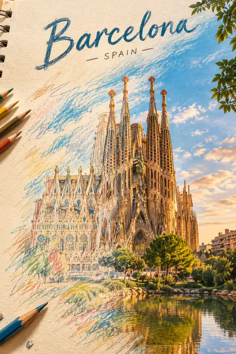
Create a breathtaking artistic composition of [REAL LANDMARK] in [CITY, COUNTRY], where a hand-drawn colored-pencil illustration seamlessly transforms into a beautifully detailed, realistic scene.

On one side, the landmark appears as an intricate drawing on textured ivory sketchbook paper, featuring visible pencil strokes, wax-crayon shading, delicate crosshatching, and imperfect hand-drawn lines. Moving across the composition, the colored strokes gradually evolve into the real landmark, surrounded by its authentic streets, architecture, and recognizable local environment.

Tiny pencil marks transform into real trees, sketchy rooftops become actual buildings, and loose strokes of color turn into the natural sky. The transition must feel fluid and artistic, as if the entire city is being brought to life by an invisible artist.

Preserve the landmark’s exact real-world architecture, proportions, and recognizable details. Use a sophisticated palette of warm terracotta, muted turquoise, golden yellow, deep cobalt blue, and natural earthy tones.

Add subtle paper grain, expressive colored-pencil textures, wax-crayon details, imperfect outlines, and beautiful natural lighting. Keep the composition clean, visually striking, and professionally art-directed, with the landmark as the unmistakable focal point.

Place the real name of the city in elegant, hand-lettered typography at the top, integrated naturally into the artwork.

Style: Contemporary editorial illustration meets realistic colored-pencil and wax-crayon artwork, tactile textures, artistic transformation, premium art-book aesthetic, intricate details, visually captivating composition.
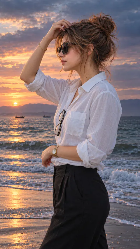
Hyper-realistic IMAX-level Netflix-style cinematic moody beach fashion portrait, 9:16 vertical. Use the uploaded image as the primary visual reference and preserve the exact facial identity, proportions, and defining features. Create a woman wearing a loose white button-up shirt with a classic collar, chest pocket and casually rolled sleeves, paired with dark trousers, oversized black sunglasses, a slim gold bracelet, a gold link wristwatch and a second pair of eyeglasses hanging from her shirt. Her entire body is turned sideways in a clear three-quarter side profile toward the left, with her shoulders, torso and hips aligned in the same direction rather than facing the camera; her upper body remains naturally upright. Her right arm bends upward over her forehead, with her fingertips lightly touching her wispy bangs, while her left forearm rests diagonally across her lower torso and her hand stays relaxed near her waist. Her head faces left toward the distant horizon, chin slightly lowered, with a composed, thoughtful expression and softly closed lips. Her dark brown hair is gathered into a loose, messy high bun, with fine flyaways around the temples, loose strands beside her cheeks and delicate bangs across her forehead. Fair luminous porcelain skin with a bright ivory to light beige tone and a neutral-cool undertone, realistic skin texture and subtle natural highlights. She stands beside the ocean as foamy waves wash across the wet shoreline, with two small boats in the distance and a faint mountain range along the horizon. The expansive sky transitions from muted peach and dusty gold near the setting sun to desaturated blue and slate grey above, with layered clouds adding a dramatic, moody atmosphere. Soft directional sunset light outlines her profile and catches the folds of her white shirt, while cool shadows shape the fabric and her silhouette. Apply cinematic moody colour grading with subdued saturation, steel-blue and charcoal shadows, muted lavender-grey clouds, restrained amber highlights and deep ocean tones. Maintain realistic photographic detail, natural skin tones, gentle atmospheric haze and balanced contrast for an elegant, contemplative editorial finish.
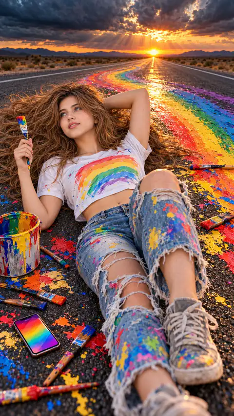
Hyper-realistic IMAX-level Netflix-style cinematic surrealist rainbow-paint photography, 9:16 vertical. Use the uploaded image as the primary visual reference and preserve the exact facial identity, proportions, and defining features. Create a woman wearing a white cropped T-shirt printed with a pastel rainbow, distressed blue jeans with large frayed knee openings and colourful paint splatters, and grey lace-up sneakers marked with traces of paint. She lies diagonally across the asphalt road, her upper body resting comfortably on the ground and her long hair spread widely around her head. One knee is raised prominently toward the camera, making the sneaker appear large in the foreground, while her other leg extends diagonally toward the lower edge. Her left arm bends above her head with the hand resting behind her hair, while her right hand holds a small paintbrush upright beside her face. Her face turns slightly upward toward the left, her blue eyes gazing dreamily toward the sunset, eyebrows relaxed and lips forming a gentle, playful smile. Her long, voluminous chestnut-brown hair fans out across the road, with loose waves and individual strands scattered naturally over the painted surface. Fair luminous porcelain skin with a bright ivory to light beige tone and a neutral-cool undertone, natural skin texture and soft rosy highlights. A long, straight desert highway stretches toward the distant horizon, where the setting sun sits directly above the vanishing point beneath dramatic dark storm clouds. A thick, glossy rainbow-coloured paint trail curves along the road behind and around her, transitioning through red, orange, yellow, green, blue, and violet. Paintbrushes of different sizes, colourful splashes, a paint-covered bucket and a smartphone with a vivid rainbow screen are scattered across the foreground. Warm golden sunbeams break through the clouds, illuminating the paint and creating a striking contrast against the dark asphalt and stormy sky. Apply rich cinematic colour grading with fiery amber highlights, deep charcoal shadows, vivid saturated rainbow pigments, subtle teal-blue atmospheric tones and controlled contrast. Emphasize the wet, glossy paint, realistic road texture, dimensional clouds, glowing sunset rays and crisp foreground details, with a polished surreal editorial finish.
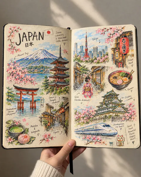
Create a beautiful, highly detailed, handmade travel sketchbook spread inspired by an artist’s personal travel journal. Show an open sketchbook with warm ivory paper, slightly imperfect edges, and visible paper texture, filled with intricate hand-drawn illustrations of [COUNTRY / CITY].
The two-page spread should feel like a collection of little memories gathered during a journey, with famous landmarks, traditional architecture, charming streets, cultural symbols, local food, nature, and tiny everyday details arranged organically across both pages.
Use fine black ink linework, delicate cross-hatching, loose pencil strokes, architectural doodles, handwritten labels, tiny arrows, and small notes pointing toward the illustrated places. Let the drawings feel authentic and handmade, like a real artist sketched them while travelling.
🌈 The Special Touch — Selective Beautiful Colors
Keep most of the artwork in elegant black-and-white ink, but bring selected elements to life with beautiful, carefully placed splashes of color.
🗻 Mountains and landscapes with soft watercolor blues, sage greens, and snowy whites.
🏯 Famous landmarks with subtle terracotta, warm beige, and muted golden tones.
🌸 Flowers and leaves with delicate pinks, coral, and fresh greens.
🍜 Local food illustrated in appetizing, vibrant colors.
🏮 Traditional lanterns, cultural objects, or street signs highlighted with rich reds and warm amber.
🌊 Rivers, lakes, or ocean views accented with dreamy turquoise and soft blue.
🚌 Tiny travel details featuring unexpected pops of mustard yellow, dusty orange, and pastel colors.
Important: The colors should appear selectively, as if the artist used watercolor and colored pencils to highlight their favorite memories. Some illustrations should remain completely monochrome, while others should be partially or beautifully colored. The contrast between black ink and colorful details should make the artwork visually captivating without overwhelming the page.
✍️ Composition & Atmosphere
Include the country name in large, artistic handwritten lettering, accompanied by a tiny national flag. Add a mixture of large landmark sketches and smaller doodles, creating a rich yet balanced composition.
Allow some drawings to overlap slightly or extend toward the edges of the pages. Include spontaneous pencil marks, unfinished outlines, tiny stars, handwritten location names, and subtle artistic imperfections.
Show the sketchbook as a real physical object, opened in someone's hand against a simple, softly lit background. Use a close-up perspective, natural daylight, realistic paper texture, and gentle shadows.
Art style: Travel journal meets architectural ink illustration meets selective watercolor sketching. Sophisticated, cozy, artistic, nostalgic, and irresistibly beautiful.
Aspect ratio: 4:5 vertical composition.
Final result: A stunning, realistic travel sketchbook that looks handmade rather than digitally designed, with intricate black ink drawings and strategically placed bursts of beautiful color that make every page feel like a treasured travel memory.
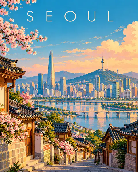
Create a premium FULL-FRAME 4:5 vertical contemporary travel illustration for [COUNTRY / CITY / LOCATION / SUBJECT].

TEXT-TO-IMAGE ONLY — generate everything from the destination name alone. No reference image required.

CORE CONCEPT:
Create an elegant modern European editorial travel poster featuring the destination’s most recognizable landmark, authentic architecture, and surrounding landscape. Use one coherent viewpoint with a clear foreground, beautifully simplified central scene, and spacious background.

STYLE:
Sophisticated geometric illustration, clean architectural shapes, smooth color fields, minimal details, flat shadows, and refined composition. Preserve recognizable local character while simplifying complex scenery into elegant visual forms.

COLOR PALETTE:
Luminous turquoise, powder blue, warm ivory, soft peach, muted coral, sage green, and deep teal. Adapt naturally to the destination.

TYPOGRAPHY:
Place only “[DESTINATION NAME]” near the top in refined, widely spaced contemporary sans-serif lettering.

FINAL AESTHETIC:
Understated elegance, luminous colors, architectural rhythm, generous negative space, and premium collectible travel-poster design.

AVOID:
Photorealism, 3D, fantasy architecture, clutter, heavy outlines, metallic effects, borders, mockups, extra text, logos, and watermarks.

FORMAT: Exact 4:5 vertical aspect ratio, full-bleed artwork, high resolution.
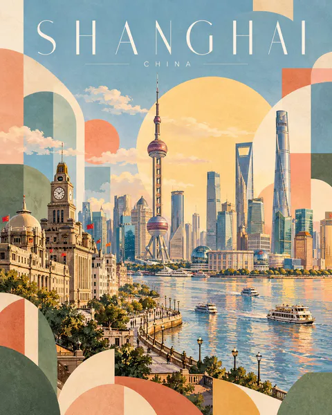
Create a premium 4:5 vertical geometric travel-art poster for [COUNTRY / CITY / LOCATION / SUBJECT].

TEXT-TO-IMAGE ONLY — generate the entire artwork from the written destination or subject alone. Do not request, upload, use, or depend on any reference image. Automatically identify the destination’s iconic landmarks, distinctive architecture, landscape, and cultural identity.

CORE CONCEPT:
Create an elegant travel poster combining approximately 70% recognizable destination illustration with 30% abstract geometric shapes. The landmark and surrounding scenery remain the main focus, while geometric forms add a playful, modern editorial character.

COMPOSITION:
Feature one iconic landmark prominently, surrounded by authentic local architecture, rooftops, hills, mountains, trees, or coastal scenery as appropriate. Arrange the scene in layered depth with simplified architectural details and a clear visual focal point.

Integrate abstract geometric forms into the landscape: overlapping circles, arches, triangles, semicircles, curved blocks, and soft rectangular shapes. Let these forms complement the architecture and scenery rather than obscure the landmark.

TYPOGRAPHY:
Place the destination name prominently across the top in thin, elegant, widely spaced uppercase lettering.

Main title: [LOCATION NAME]
Subtitle: [COUNTRY NAME]

Use refined minimalist typography, generous letter spacing, and a small understated subtitle. Ensure accurate spelling and balanced alignment.

COLOR PALETTE:
Powder blue, muted sage green, soft apricot, dusty blush pink, butter yellow, warm ivory, and light terracotta. Adapt the balance naturally to the destination while maintaining a harmonious, low-saturation palette.

ART STYLE:
Contemporary Scandinavian editorial travel illustration, soft gouache texture, matte painted surfaces, delicate watercolor grain, simplified geometric architecture, clean silhouettes, gentle shadows, and subtle handcrafted imperfections.

LIGHTING & ATMOSPHERE:
Bright, airy daylight with soft atmospheric depth, a pale open sky, warm sunlight, and a calm, optimistic mood. Keep the overall composition light and spacious.

NEGATIVE SPACE:
Preserve generous breathing room around the landmark and title. Avoid excessive detail, dense compositions, harsh outlines, oversaturated colors, glossy effects, photorealism, 3D rendering, unnecessary text, logos, and watermarks.

FINAL AESTHETIC:
Recognizable destination landmarks × modern geometric abstraction × pastel gouache illustration × Scandinavian design × premium collectible travel poster.

FORMAT:
4:5 vertical portrait, landmark-led composition, approximately 70% destination illustration and 30% geometric abstraction, elegant typography, soft matte texture, ultra-high definition.
SOURCE & OUTPUT
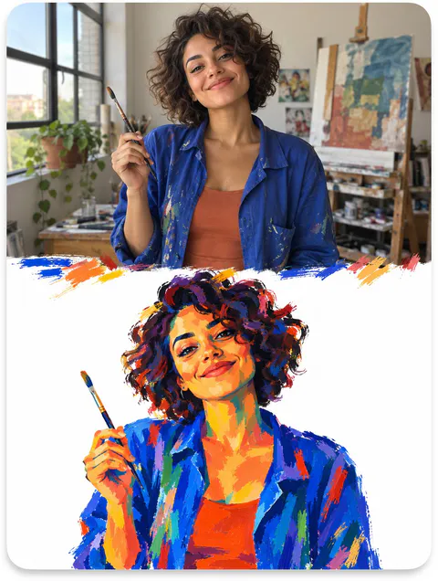
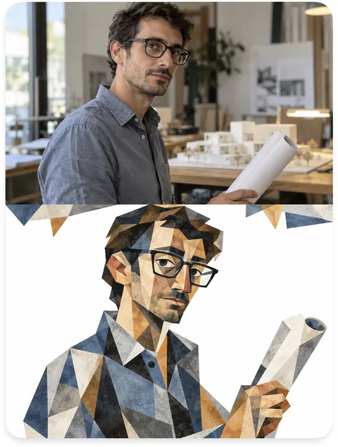
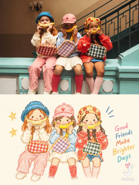
Use each uploaded photo as the sole visual reference. Create one independent, high-end editorial poster per photo and output each separately. Never combine images or create a collage.

FORMAT & LAYOUT
Use a strict vertical 3:4 composition divided into two exactly equal horizontal halves (50/50).

UPPER HALF — ORIGINAL PHOTOGRAPH
Preserve the original photograph faithfully, including the subject’s identity, facial features, structure, pose, proportions, natural texture, lighting, and color atmosphere. Apply only subtle premium editorial color grading for an art-magazine or exhibition-photography aesthetic. If necessary, extend only the surrounding background naturally to fit the frame. Never distort, replace, or redesign the subject.

LOWER HALF — PASTEL CRAYON MEMORY
Reinterpret the photograph as a minimalist, retro paper-texture pastel crayon doodle. Identify the scene’s most memorable subject, pose, relationships, direction, emotional tone, and visual essence. Reconstruct only these defining elements rather than copying every object or illustrating the entire scene.

Use thick, loose, grainy, hand-drawn chalk-and-crayon outlines with dry pigment texture, subtle breaks, faded patches, imperfect edges, slight hand wobble, and naturally rounded stroke endings. Add only a few simple pastel color blocks, stripes, dots, or scribbles to suggest essential details. Avoid realistic volume, detailed rendering, and excessive shading.

COMPOSITION & NEGATIVE SPACE
Keep the illustration small and visually balanced within the lower half, surrounded by generous empty space. Position the subject naturally according to the original photograph, allowing asymmetry, off-center placement, suspended elements, or partial cropping where appropriate.

Include only a few tiny environmental clues or abstract doodles, drawn in the same rough, simplified crayon style. Keep them minimal, imperfect, and contour-based. Prioritize breathing room, scale contrast, visual rhythm, and intentional emptiness. Never overcrowd the composition.

BACKGROUND & COLOR PALETTE
Use a bright, near-white paper background: ivory, cream white, pale off-white, soft apricot white, or very light gray-white. Add only subtle paper fibers and fine grain. Keep the background clean, bright, and clearly lighter than the illustration. Avoid dirty gray, dark yellow, or aged brown paper.

Extract 2–4 defining colors from the original photograph and reinterpret them as fresh, soft pastel crayon tones, such as peach pink, apricot orange, cream yellow, mint green, sky blue, or pale lavender. Use sufficiently distinct coral, blue, blue-green, warm orange, or violet outlines for clear contrast. Maintain a gentle, playful, emotionally warm, and refined palette.

OPTIONAL TEXT
Add only a tiny handwritten note if it genuinely enhances the composition. Keep it sparse, legible, secondary, and unobtrusive. Never use decorative text as filler.

FINAL AESTHETIC
Create a sophisticated editorial poster combining authentic photography above with a reduced, recognizable, hand-drawn memory of the same scene below. The illustration should feel airy, naive without being childish, playful without looking cheap, and minimal without losing the photograph’s identity or emotional meaning. Emphasize expressive linework, selective color, paper texture, asymmetry, and negative space.
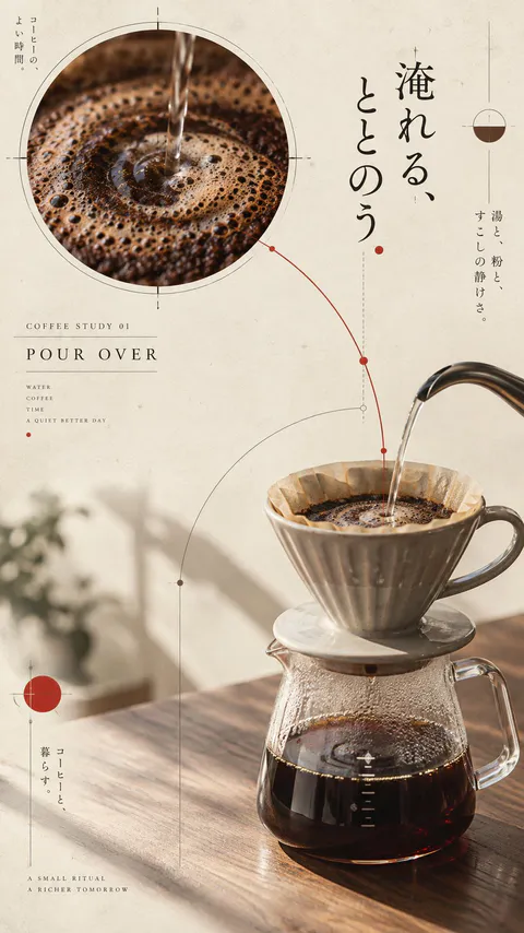
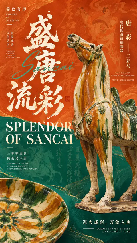
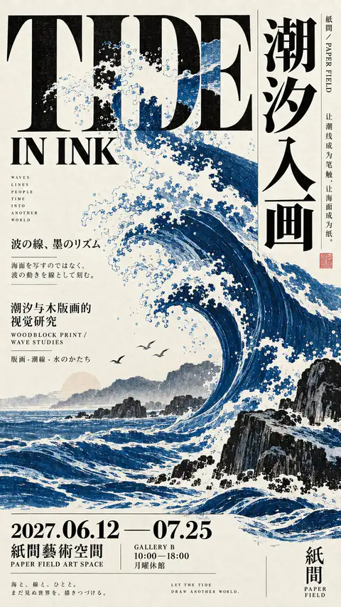
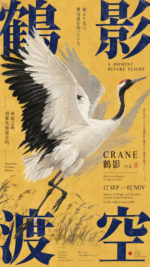
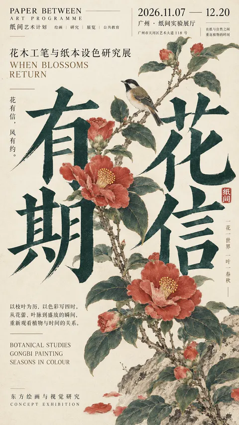
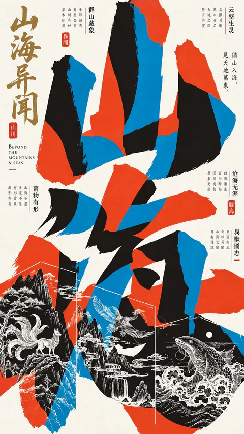
Create a premium 9:16 Japanese-inspired editorial poster using the following creative direction.

Theme: [Your exhibition, cultural event, or artistic concept]
Main Typography: [Large English, Chinese, or Japanese headline]
Visual Subject: [Wildlife, natural elements, printed materials, objects, or abstract forms]
Color Palette: [Choose 2–4 harmonious or contrasting colors]
Supporting Text: [Subtitle, dates, venue, and meaningful multilingual details]

Visual Style & Typography

Draw inspiration from Japanese cultural exhibition posters, experimental typography, independent publishing, and contemporary editorial graphic design. Make typography the main visual structure, using oversized letterforms, expressive Kanji, bold cropping, unconventional spacing, and a sophisticated mix of Chinese, Japanese, and English.

Explore dynamic relationships between text and imagery through overlapping, masking, fragmented layouts, negative space, and layered compositions. Depending on the theme, use calligraphic collage, large characters framing illustrations, typography interacting with natural objects, or dense editorial arrangements.

Composition & Information Hierarchy

Build a visually striking yet carefully organized composition. Combine dominant headlines with smaller vertical text columns, exhibition details, dates, poetic phrases, fine rules, and compact information blocks.

Maintain the rich visual density of authentic Japanese art posters. Every element should contribute to the concept, with clear hierarchy, intentional asymmetry, balanced negative space, and strong readability even at thumbnail size.

Imagery & Print Texture

Integrate illustrations, photography, archival fragments, or physical materials naturally into the typography. Objects should interact with letters through meaningful overlap and spatial relationships rather than appearing as separate decorations.

Use subtle paper fibers, offset printing textures, ink grain, restrained registration imperfections, and tactile printed surfaces. Keep colors rich and controlled, with authentic material details and refined editorial craftsmanship.

Final Art Direction

The result should feel like an original poster commissioned by a Japanese art museum, independent publisher, cultural gallery, or design exhibition. Each composition should have its own distinctive visual concept while maintaining a cohesive Japanese editorial aesthetic.
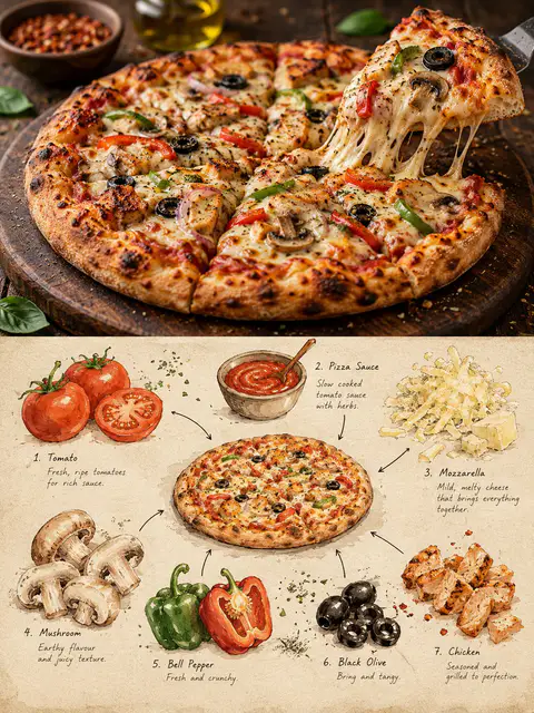
Create a premium 3:4 vertical editorial food-art poster for [COUNTRY / CITY / LOCAL DISH / FOOD SUBJECT].

TEXT-TO-IMAGE ONLY.
Generate the entire composition from the written dish or food subject alone. Do not request, upload, use, or depend on any reference image or existing photograph. Automatically identify the dish’s authentic appearance, ingredients, textures, and cultural identity.

CORE CONCEPT:
Create one elegant travel-food editorial poster combining realistic food photography in the upper section with a handmade ingredient-observation sketchbook in the lower section. Feature ONE recognizable plate or bowl containing a single dish, with at least three visually distinct ingredients.

UPPER SECTION — REALISTIC FOOD PHOTOGRAPHY:
Occupy approximately 48% of the canvas height. Create a beautifully composed, authentic photographic view of the specified local dish, preserving believable ingredient textures, natural lighting, realistic proportions, and culturally accurate presentation. Use subtle food-magazine color grading and extremely light film grain. Keep the entire plate or bowl visible.

SECTION DIVIDER:
Separate both sections with a straight, clean horizontal boundary. A very thin warm-ivory paper strip is optional. No gradients, blending, or elements crossing the divider.

LOWER SECTION — INGREDIENT OBSERVATION SHEET:
Use warm ivory drawing paper with visible fibers, fine grain, faint smudges, and subtle handmade irregularities. Create a sparse, asymmetrical food-field-note composition rather than repeating the full photographic dish.

Place ONE small, simplified but recognizable illustration of the complete dish near the center. Keep it secondary and compact, occupying approximately one-third of the lower section’s width.

Around it, illustrate 3–6 individually selected ingredients inferred from the dish. Use small watercolor specimens, cut-surface studies, herb sketches, grain clusters, sauce swatches, or distinctive ingredient shapes. Arrange them at varied sizes and angles with generous breathing room.

DRAWING STYLE:
Matte gouache, delicate black-ink outlines, slightly hesitant hand-drawn strokes, dry-brush gaps, uneven pigment coverage, soft watercolor edges, visible paper texture, and restrained natural colors. Keep ingredients recognizable without excessive detail. Add a few fine arrows and small handwritten numbers connecting specimens to the miniature dish.

TYPOGRAPHY:
Use minimal, understated editorial annotations only when helpful. Short ingredient names or tiny handwritten notes are acceptable. Keep all text small and secondary; avoid unnecessary titles or decorative lettering.

COLOR PALETTE:
Derive the colors naturally from the dish, balanced by warm cream, muted earth tones, and subtle ink details.

FINAL AESTHETIC:
Authentic local food photography × handmade ingredient studies × refined travel-food editorial × collectible culinary field notebook.

AVOID:
Multiple dishes, duplicate plates, mixed meals, inaccurate ingredients, excessive garnish, crowded layouts, gradients, bleeding transitions, glossy digital painting, flat vector infographics, 3D rendering, commercial menu styling, excessive text, logos, watermarks, and interface elements.

FORMAT:
3:4 vertical portrait, approximately 48% photographic food scene above and 52% illustrated ingredient-observation sheet below, crisp horizontal separation, generous negative space, premium publication quality, ultra-high definition.
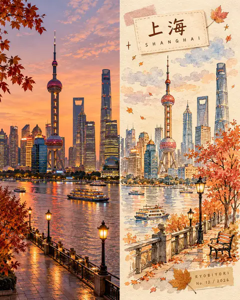
Create a premium 4:5 vertical autumn travel-journal artwork for [COUNTRY / CITY / LOCATION / SUBJECT].

TEXT-TO-IMAGE ONLY — generate every element from the written destination or subject alone. Do not request, upload, use, or depend on any reference image, existing photograph, or source image.

MASTER STYLE LOCK:
Hand-painted autumn watercolor on warm ivory paper, minimalist travel-editorial illustration, transparent watercolor washes mixed with soft gouache, delicate imperfect ink outlines, visible paper grain, natural pigment blooms, soft edges, muted autumn colors, generous negative space, warm nostalgic atmosphere, premium handcrafted art-book aesthetic.

COMPOSITION:
Divide the vertical canvas into two equal halves using a precise 50/50 left-right split.

LEFT HALF — REALISTIC DESTINATION:
Generate an original, natural-looking photograph-style scene of [COUNTRY / CITY / LOCATION / SUBJECT]. Automatically determine its recognizable architecture, scenery, atmosphere, and natural lighting. Preserve realistic textures, authentic colors, and believable perspective. Keep this entire half clean, with no text, labels, illustrations, borders, or decorative elements.

RIGHT HALF — AUTUMN WATERCOLOR JOURNAL:
Reimagine the same destination as a delicate, handmade autumn watercolor illustration. Use simplified rounded architecture, warm glowing windows, a small tree with dusty rose, apricot, and amber foliage, a few drifting leaves, and subtle watercolor clouds. Include only a few meaningful local details, keeping the composition airy and uncluttered.

COLOR PALETTE:
Caramel brown, dusty rose, apricot orange, creamy yellow, muted maple red, warm ivory, and faint lavender-grey shadows. Use soft, low-saturation afternoon light. No neon colors or harsh black.

HANDMADE DETAILS:
Add one or two narrow kraft-brown or dusty-pink washi tape strips, a small pressed autumn leaf, and a few delicate hand-drawn stars or arrows. Integrate these details naturally without overcrowding the illustration.

DESTINATION LABEL:
Place a small cream-colored paper label near the upper-left corner of the RIGHT HALF.

Main title: [LOCATION NAME]
Subtitle: [ENGLISH LOCATION NAME]

Use rounded, handwritten Japanese-inspired lettering for the main title and smaller, widely spaced handwritten English lettering for the subtitle. Keep spelling accurate and typography legible.

SIGNATURE LABEL:
Near the bottom-right corner of the RIGHT HALF, add a small kraft-paper label with exactly this text:

RYOBIYORI
No. [NUMBER] / [YEAR]

Use subtle, fine dark-brown lettering.

STRICT LAYOUT RULES:
All text, labels, washi tape, and decorative elements must remain entirely within the right half. The left half must contain only the original generated realistic destination scene. Never reproduce or modify an existing photograph.

PAPER & FINISH:
Warm ivory watercolor-paper texture, delicate fibers, subtle grain, organic pigment edges, and a carefully assembled travel-journal feeling.

FINAL AESTHETIC:
Realistic destination imagery × autumn watercolor illustration × handmade travel journal × nostalgic seasonal palette × premium editorial design.

AVOID:
Reference-image requests, image-editing instructions, existing-photo preservation, unequal panel widths, text crossing the center divider, excessive decoration, oversaturated colors, glossy digital painting, 3D rendering, misspelled text, extra logos, watermarks, and interface elements.

OUTPUT:
4:5 vertical portrait, exact 50/50 left-right composition, realistic generated destination scene on the left, watercolor travel-journal illustration on the right, ultra-high definition.
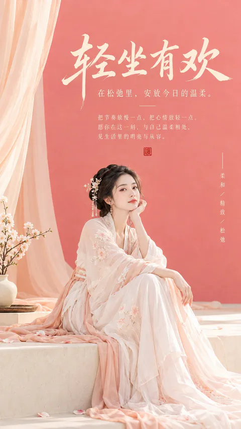
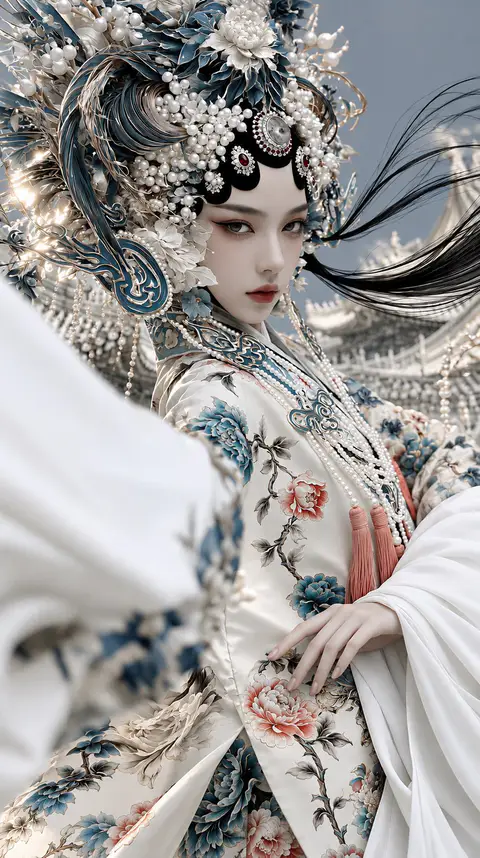
An extraordinarily beautiful young East Asian woman, ethereal Chinese imperial opera goddess, delicate porcelain face, refined facial anatomy, melancholic almond-shaped eyes, subtle smoky eyeliner, soft muted rose lips, cold and distant expression, elaborate monumental Chinese phoenix crown adorned with intricate blue enamel filigree, antique silver ornaments, countless luminous white pearls, sculpted ivory flowers, flowing metallic botanical structures, luxurious traditional Chinese ceremonial robes in ivory white silk, exquisite hand-embroidered peonies in dusty teal blue, muted coral pink and antique gold, cascading pearl necklaces, delicate coral tassels, graceful slender feminine hand resting naturally against embroidered silk, five anatomically accurate fingers, elegant finger proportions, realistic joints, natural perspective, flowing oversized white silk sleeves, long black hair blowing dramatically in the wind, ancient Chinese palace architecture softly blurred in the background, dramatic close-up fashion portrait, slightly low camera angle, sophisticated asymmetrical composition, shallow depth of field, foreground silk softly out of focus, Chinese mysticism meets European Rococo ornamentation, Old Master painting color harmony, cinematic chiaroscuro, cool blue-gray atmosphere, delicate warm highlights, realistic porcelain skin texture, intricate textile details, restrained HDR, photorealistic fine art fashion photography, 85mm portrait lens, f/1.8, extraordinary craftsmanship, museum-quality visual aesthetics, elegant and haunting beauty --ar 9:16 --v 8.2 --stylize 250 --chaos 8
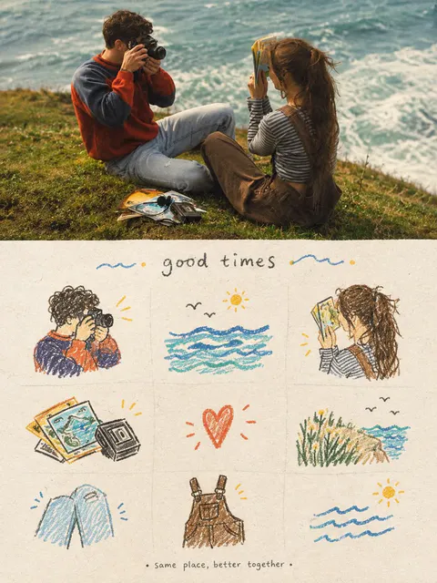
Create a vertical cozy travel scrapbook poster inspired by the reference images. Combine a cinematic realistic travel photograph on the top half with a hand-drawn memory journal collage on the bottom half.

Top section: Show two young travelers relaxing together on a grassy coastal cliff overlooking a beautiful ocean. One person is taking photographs with a vintage camera while the other is looking through a travel guide/map. Include small travel items such as photographs, postcards and camera accessories on the grass. Warm golden-hour sunlight, soft ocean waves, natural candid poses, nostalgic film photography, muted warm colors, cinematic depth of field, authentic peaceful travel atmosphere.

Bottom section: On warm textured cream paper, create a charming 3×3 illustrated scrapbook grid inspired by the scene. Draw individual hand-drawn elements: a person with a camera, ocean waves and sun, traveler with a map, vintage photographs, a heart symbol, coastal grass and sea, folded jeans/clothing, overalls/backpack, and ocean waves. Use loose colored-pencil and watercolor strokes with dark brown sketch outlines, muted blue, orange, yellow and green accents. Add tiny hearts, stars, birds, sunshine and decorative doodles.

At the top of the illustrated section, add a handwritten title “Good Times” and at the bottom a small handwritten phrase “Same place, better together.”

Style: nostalgic travel diary, vintage film photography, handmade scrapbook, watercolor + colored-pencil illustration, textured recycled paper, warm cozy tones, imperfect hand-drawn details, emotional friendship/travel memories, premium editorial poster, clean composition, vertical 4:5, highly detailed, no watermark.
Create a premium 4:5 vertical architectural travel artwork for [COUNTRY / CITY / LOCATION / LANDMARK].

TEXT-TO-IMAGE ONLY — generate the entire scene creatively from [COUNTRY / CITY / LOCATION / LANDMARK] alone. No reference image required.

CORE CONCEPT

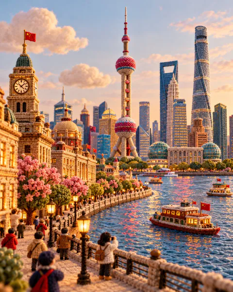
Transform the destination into a charming handcrafted miniature world made entirely from knitted yarn, soft felt, embroidery, and plush textile materials. Reimagine its architecture, streets, nature, transportation, and local atmosphere as a sophisticated collectible textile diorama.

LANDMARK & COMPOSITION

Automatically select ONE unmistakable landmark representing [COUNTRY / CITY / LOCATION / LANDMARK] and make it the central hero.

Build a complete miniature environment around it using authentic local architecture, streets, gardens, trees, shops, landscape, and a few tiny generic yarn characters. Keep the landmark’s recognizable silhouette and defining architectural features while translating everything into rounded handmade textile forms.

MATERIAL LANGUAGE

Every element should visibly feel handmade:
- chunky knitted yarn
- soft felt
- embroidered details
- woven fabric
- stitched edges
- wool fibers
- plush textile surfaces
- tiny handcrafted imperfections

Architecture should look carefully constructed from layered fabric and yarn rather than plastic, clay, or CGI.

ATMOSPHERE

Create a warm, playful, cozy travel atmosphere with soft natural lighting, gentle shadows, tactile fibers, rounded forms, and subtle depth. Add small destination-specific details such as local food, transportation, plants, signs, or cultural objects where they naturally enhance the scene.

Keep the background simple and softly colored so the miniature world remains the focus.

STYLE

Architectural travel poster × knitted miniature diorama × handmade textile art × plush yarn world × sophisticated editorial illustration.

The result should feel like an elaborate handcrafted collectible discovered in a miniature museum — whimsical but visually refined and architecturally recognizable.

COLOR

Use a harmonious palette inspired by the destination itself, combining warm neutrals with a few distinctive local accent colors. Keep the colors soft, rich, and tactile rather than overly bright.

Avoid photorealism, plastic materials, smooth CGI, generic architecture, unrelated landmarks, hard geometric edges, excessive clutter, realistic humans, logos, watermarks, and flat vector illustration.

FORMAT

4:5 vertical, one cohesive miniature world, central landmark, rich textile detail, soft depth of field, premium handcrafted finish, highly detailed yarn and felt textures.
FAQ
¿Cómo escribo un prompt de retrato para GPT Image 2?
Sigue este orden: sujeto, expresión, ropa, escena, luz, cámara, textura y proporción. Los nombres de modelo y parámetros como --ar se quedan igual.
¿De dónde salen estos prompts de GPT Image 2?
Son posts públicos de X. El título y el resumen se traducen. El texto del prompt se conserva tal cual y se acredita al autor.
 GPT Image 23