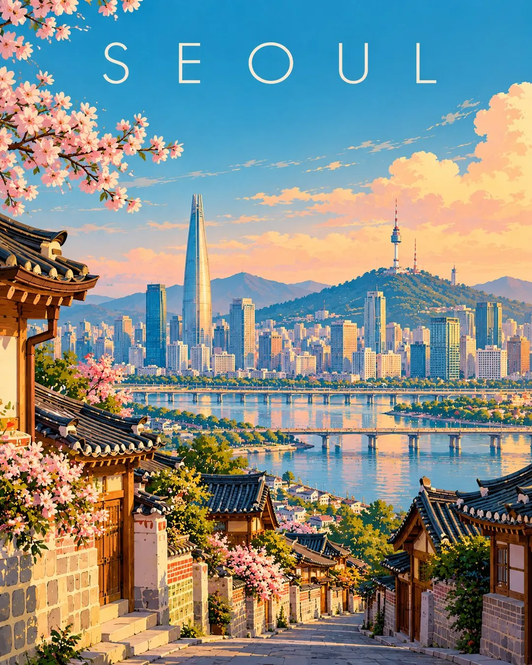
Create a premium FULL-FRAME 4:5 vertical contemporary travel illustration for [COUNTRY / CITY / LOCATION / SUBJECT].

TEXT-TO-IMAGE ONLY — generate everything from the destination name alone. No reference image required.

CORE CONCEPT:
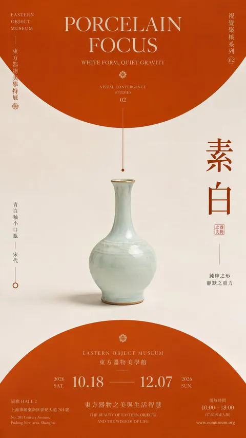
Create an elegant modern European editorial travel poster featuring the destination’s most recognizable landmark, authentic architecture, and surrounding landscape. Use one coherent viewpoint with a clear foreground, beautifully simplified central scene, and spacious background.

STYLE:
Sophisticated geometric illustration, clean architectural shapes, smooth color fields, minimal details, flat shadows, and refined composition. Preserve recognizable local character while simplifying complex scenery into elegant visual forms.

COLOR PALETTE:
Luminous turquoise, powder blue, warm ivory, soft peach, muted coral, sage green, and deep teal. Adapt naturally to the destination.

TYPOGRAPHY:
Place only “[DESTINATION NAME]” near the top in refined, widely spaced contemporary sans-serif lettering.

FINAL AESTHETIC:
Understated elegance, luminous colors, architectural rhythm, generous negative space, and premium collectible travel-poster design.

AVOID:
Photorealism, 3D, fantasy architecture, clutter, heavy outlines, metallic effects, borders, mockups, extra text, logos, and watermarks.

FORMAT: Exact 4:5 vertical aspect ratio, full-bleed artwork, high resolution.
【Title】[TITLE]
【Subtitle】[SUBTITLE]
【Landscape】[canyon / river / cloud mountains / glacier / desert / coast]
【Main Palette】[PRIMARY COLORS]
【Scale Anchor】[tiny traveler / canoe / boat / small building]
【Visual Destination】[moon / distant light / horizon / mountain pass]
【Aspect Ratio】9:16

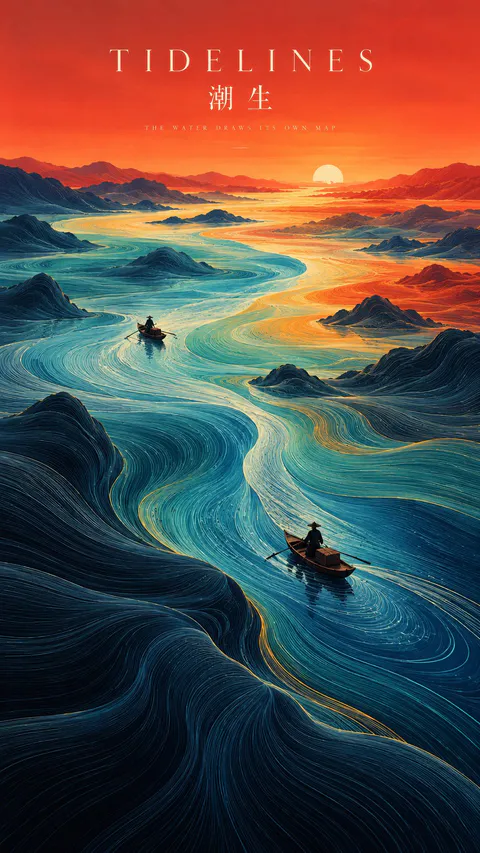
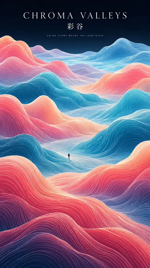
Create a refined vertical art poster that transforms a natural landscape into a flowing topographic world.

Build the terrain from hundreds of long, smooth, continuous contour lines that follow the shape, depth, and movement of the land. The lines should feel like a fusion of topographic maps, silk threads, and abstract Chinese landscape painting — directional, elegant, and highly organized rather than random decorative waves.

Use one strong visual path, such as a river, valley, ridge, cloud road, or negative-space corridor, to guide the eye from foreground to distance.

Keep the natural environment monumental and place only one or two extremely small human figures, boats, or architectural elements as scale anchors.

Use clear spatial hierarchy:
dense flowing lines in the main terrain,
calmer negative space around the visual path,
simpler and softer details in the distance.

Control the palette with 2–4 dominant colors rather than evenly distributed rainbow tones. Use large, clean color fields and let color changes reinforce depth and movement.

Add minimal editorial typography:
[TITLE]
[SUBTITLE]
[SHORT POETIC LINE]

Typography should feel like a contemporary exhibition poster or art-book cover — elegant, widely spaced, restrained, and secondary to the landscape.

The final image should feel poetic, monumental, calm, and highly designed, combining Eastern landscape aesthetics, contour-line abstraction, negative space, and modern editorial composition.
SOURCE & OUTPUT
Use each uploaded photo as the sole visual reference. Create one independent, high-end editorial poster per photo and output each separately. Never combine images or create a collage.

FORMAT & LAYOUT
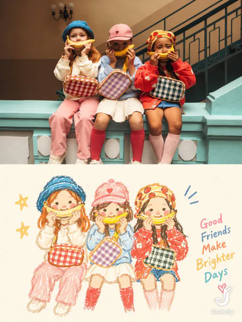
Use a strict vertical 3:4 composition divided into two exactly equal horizontal halves (50/50).

UPPER HALF — ORIGINAL PHOTOGRAPH
Preserve the original photograph faithfully, including the subject’s identity, facial features, structure, pose, proportions, natural texture, lighting, and color atmosphere. Apply only subtle premium editorial color grading for an art-magazine or exhibition-photography aesthetic. If necessary, extend only the surrounding background naturally to fit the frame. Never distort, replace, or redesign the subject.

LOWER HALF — PASTEL CRAYON MEMORY
Reinterpret the photograph as a minimalist, retro paper-texture pastel crayon doodle. Identify the scene’s most memorable subject, pose, relationships, direction, emotional tone, and visual essence. Reconstruct only these defining elements rather than copying every object or illustrating the entire scene.

Use thick, loose, grainy, hand-drawn chalk-and-crayon outlines with dry pigment texture, subtle breaks, faded patches, imperfect edges, slight hand wobble, and naturally rounded stroke endings. Add only a few simple pastel color blocks, stripes, dots, or scribbles to suggest essential details. Avoid realistic volume, detailed rendering, and excessive shading.

COMPOSITION & NEGATIVE SPACE
Keep the illustration small and visually balanced within the lower half, surrounded by generous empty space. Position the subject naturally according to the original photograph, allowing asymmetry, off-center placement, suspended elements, or partial cropping where appropriate.

Include only a few tiny environmental clues or abstract doodles, drawn in the same rough, simplified crayon style. Keep them minimal, imperfect, and contour-based. Prioritize breathing room, scale contrast, visual rhythm, and intentional emptiness. Never overcrowd the composition.

BACKGROUND & COLOR PALETTE
Use a bright, near-white paper background: ivory, cream white, pale off-white, soft apricot white, or very light gray-white. Add only subtle paper fibers and fine grain. Keep the background clean, bright, and clearly lighter than the illustration. Avoid dirty gray, dark yellow, or aged brown paper.

Extract 2–4 defining colors from the original photograph and reinterpret them as fresh, soft pastel crayon tones, such as peach pink, apricot orange, cream yellow, mint green, sky blue, or pale lavender. Use sufficiently distinct coral, blue, blue-green, warm orange, or violet outlines for clear contrast. Maintain a gentle, playful, emotionally warm, and refined palette.

OPTIONAL TEXT
Add only a tiny handwritten note if it genuinely enhances the composition. Keep it sparse, legible, secondary, and unobtrusive. Never use decorative text as filler.

FINAL AESTHETIC
Create a sophisticated editorial poster combining authentic photography above with a reduced, recognizable, hand-drawn memory of the same scene below. The illustration should feel airy, naive without being childish, playful without looking cheap, and minimal without losing the photograph’s identity or emotional meaning. Emphasize expressive linework, selective color, paper texture, asymmetry, and negative space.
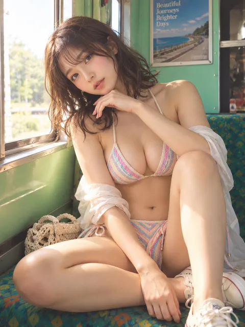
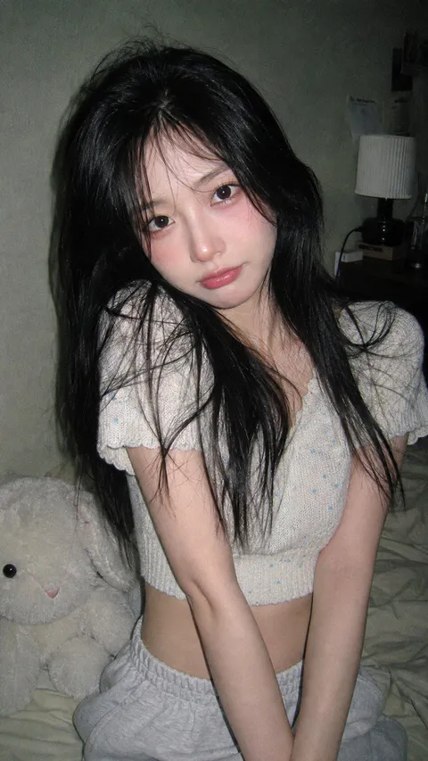
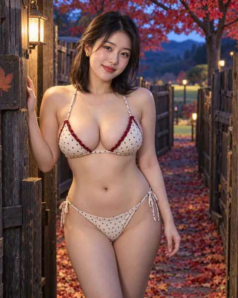
绝美23岁成年东亚美女,身材匀称丰满,胸部自然丰满,视觉约 F 杯,具有自然重量感与柔和圆润轮廓,纤细腰部与丰满胸部形成清晰而协调的胸腰对比,臀腿比例自然,气质时尚、自信、温柔。奶油底细小酒红波点三角罩杯比基尼,固定三角杯、细肩带与稳定下围,杯缘点缀柔和酒红色细窄花边,低腰双侧系带三角泳裤,两侧单层细带打成小结,光滑细腻弹力泳衣料搭配完整同色内衬,复古波点与简洁花边相互呼应。

干净柔光妆、轻浅玫瑰腮红与自然红唇;齐肩黑色短发向耳后轻拢,脸侧清爽;小巧金色圆耳钉。

她刚从枫园里的木栅迷宫走到出口,双脚稳稳停在落叶小径上,右手轻搭出口立柱、左手自然放在身侧,身体轻微转向镜头,嘴角先扬起一点笑意。人高的原木栅墙围出曲折路径,出口外是一株展开红色树冠的枫树与开阔草地,薄暮冷蓝天光和立柱上的暖白小灯共同照亮五官,像终于找到彼此后的短暂欢喜。

105mm人像摄影,轻微侧身、清晰正脸、头部至大腿构图,竖幅4:5,大光圈浅景深,原木立柱与红枫背景压缩成柔和色块,薄暮冷蓝环境光与出口暖白灯冷暖交织,真实皮肤纹理、自然血色与细腻面料细节,高级秋日度假写真,电影感,ultra realistic, masterpiece, best quality。
【Landscape】[LANDSCAPE]
【Line Structure】[LAYERED / FLOWING / RADIATING / DIRECTIONAL]
【Palette】[COLORS]
【Scale Anchor】[TINY FIGURE / FLAG / BOAT / TENT]
【Aspect Ratio】9:16

Create a refined vertical art poster that transforms the landscape into an abstract **contour-line world**.

Build the terrain primarily from long, smooth, continuous lines that follow its volume, direction, elevation, and movement.

The lines should become the landscape itself, not simply decorate its surface.

Use one clear structural system and strong line-density variation, with dense lines around major forms and more breathing room in calmer areas.

Use 2–5 related colors and let the colors flow naturally along the contour structure.

Keep the landscape monumental and use only one tiny scale anchor.

Add minimal editorial typography:

[TITLE]
[SUBTITLE]
[SHORT POETIC LINE]

High-end exhibition-poster aesthetic, abstract Eastern landscape feeling, strong thumbnail readability, large graphic forms, controlled negative space, and highly visible contour-line structure.
Create a premium 4:5 vertical minimalist illustrated travel artwork for [COUNTRY / CITY / LOCATION / SUBJECT].

TEXT-TO-IMAGE ONLY — generate the artwork creatively from [COUNTRY / CITY / LOCATION / SUBJECT] alone. No reference image required.

CORE CONCEPT

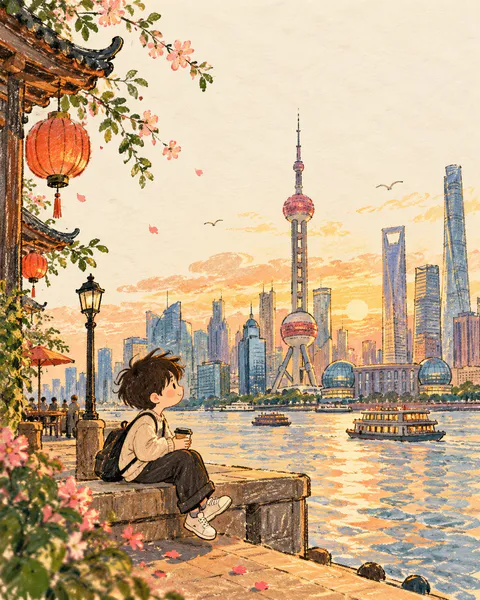
Create a warm, whimsical editorial illustration inspired by the mood, colors, atmosphere, and visual character of the destination. Reduce the scene into one charming hand-drawn moment with a simple, storybook-like composition.

MAIN SUBJECT

Feature a small, cute generic illustrated character naturally interacting with the destination environment. The character should have a simple rounded face, tiny expressive eyes, subtle rosy cheeks, and relaxed natural body language.

Automatically choose appropriate clothing, accessories, pose, and surrounding elements based on [COUNTRY / CITY / LOCATION / SUBJECT], while keeping the character completely original and non-identifiable.

SCENE

Build a minimal environment using a few recognizable destination-inspired elements — architecture, landscape, flowers, local objects, transportation, food, or cultural details.

Do not overcrowd the composition. Use only the strongest visual elements needed to communicate the location.

STYLE

Hand-drawn children's picture book × soft editorial postcard × crayon and gouache illustration.

Use slightly imperfect outlines, visible crayon strokes, soft gouache fills, simple organic shapes, gentle proportions, subtle paper texture, and charming handmade imperfections.

Keep the background predominantly warm off-white/cream with generous negative space. Add only a few delicate lines, small marks, clouds, leaves, or motion strokes where they improve the composition.

COLOR

Use a warm, cheerful palette naturally inspired by [COUNTRY / CITY / LOCATION / SUBJECT]. Combine soft cream with a few muted yet lively destination colors.

Keep the palette cohesive and avoid excessive saturation.

FINAL AESTHETIC

A charming handmade travel postcard that feels intimate, playful, warm, and artistic — like a tiny illustrated memory from the destination rather than a literal recreation of a photograph.

Avoid photorealism, recognizable real people, copyrighted characters, logos, commercial branding, excessive detail, complex backgrounds, glossy 3D rendering, harsh digital outlines, clutter, text, and watermarks.

FORMAT

4:5 vertical, single illustration, warm off-white paper, generous negative space, cute original character, simplified destination storytelling, premium children's-book/editorial finish.
Create a premium 4:5 vertical conceptual travel artwork for [COUNTRY / CITY / LOCATION / SUBJECT].

GENERATIVE IMAGE ONLY.
Create the complete artwork entirely from the written [COUNTRY / CITY / LOCATION / SUBJECT]. Do not use, request, require, inspect, modify, or reference any existing image. No source image is needed.

CORE CONCEPT:
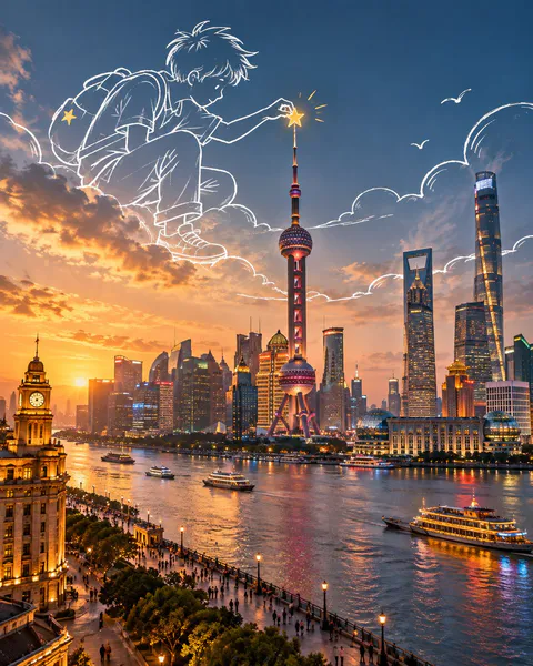
Create a highly realistic cinematic travel scene combined with oversized white hand-drawn doodle illustrations. The destination itself forms the complete visual foundation, while imaginative white sketch figures interact with the real architecture, landscape, objects, and atmosphere.

DESTINATION:
Automatically determine the most recognizable architecture, landscape, streets, structures, transportation, natural features, and cultural details associated with [COUNTRY / CITY / LOCATION / SUBJECT]. Build one coherent scene with accurate perspective, believable materials, natural lighting, and authentic local character.

DOODLE INTERACTION:
Introduce only one strong visual idea. Create oversized white hand-drawn figures that actively interact with something naturally present in the scene. They may climb, hold, repair, paint, pull, carry, explore, play with, or transform a real environmental element. Their hands, feet, props, and gestures must connect naturally with the surrounding architecture or landscape.

DOODLE STYLE:
Loose white marker/chalk line drawings, simple expressive figures, minimal facial features, imperfect hand-drawn strokes, varied line thickness, playful proportions, natural gestures, subtle whimsical character. The drawings should feel like elegant hand-drawn lines existing within the scene, never like stickers, clip-art, comic characters, or 3D cartoons.

COMPOSITION:
Keep the realistic destination as the dominant visual layer. Place the white drawings mainly within natural open areas such as sky, water, roads, walls, or atmospheric space. Allow creative scale differences between the drawings and the environment while maintaining believable perspective and spatial relationships.

COLOR:
Use the authentic colors and lighting of the chosen destination as the main palette. White linework is the primary graphic accent. Add only a small amount of warm mustard-gold/yellow to selected doodle details such as a prop, light, ribbon, flower, clothing detail, or small object.

VISUAL LANGUAGE:
Cinematic realism × hand-drawn illustration × surreal scale play × visual metaphor × conceptual travel art × premium editorial advertising.

MOOD:
Clever, imaginative, minimal, warm, playful, sophisticated, cinematic, and visually memorable. The concept should be immediately understandable but reveal additional details on closer inspection.

AVOID:
Existing-image editing, image references, source images, copied photographs, image recreation, photo manipulation, collage, altered landmarks, unrelated architecture, excessive characters, full-screen doodles, thick black outlines, sticker effects, 3D cartoon characters, generic cartoon scenery, clutter, excessive effects, text, logos, watermarks, UI elements.

OUTPUT:
4:5 vertical composition, ultra-detailed realistic environment, seamless white hand-drawn interaction, premium conceptual travel artwork, polished editorial quality.
Create a premium 4:5 vertical architectural travel artwork for [COUNTRY / CITY / LOCATION / LANDMARK].

TEXT-TO-IMAGE ONLY — generate the entire scene creatively from [COUNTRY / CITY / LOCATION / LANDMARK] alone. No reference image required.

CORE CONCEPT

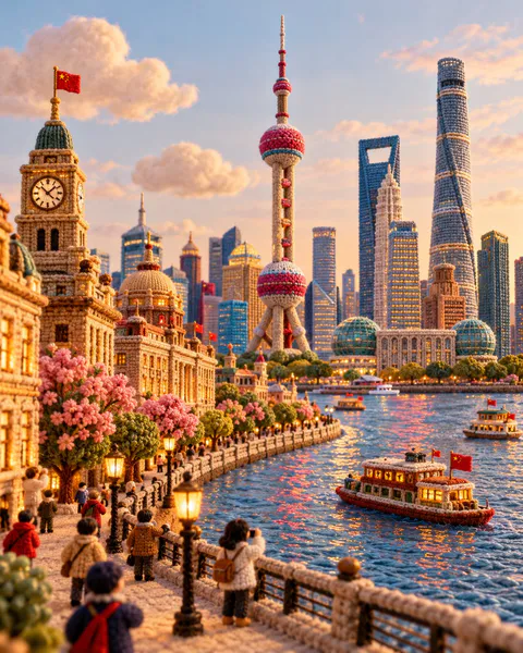
Transform the destination into a charming handcrafted miniature world made entirely from knitted yarn, soft felt, embroidery, and plush textile materials. Reimagine its architecture, streets, nature, transportation, and local atmosphere as a sophisticated collectible textile diorama.

LANDMARK & COMPOSITION

Automatically select ONE unmistakable landmark representing [COUNTRY / CITY / LOCATION / LANDMARK] and make it the central hero.

Build a complete miniature environment around it using authentic local architecture, streets, gardens, trees, shops, landscape, and a few tiny generic yarn characters. Keep the landmark’s recognizable silhouette and defining architectural features while translating everything into rounded handmade textile forms.

MATERIAL LANGUAGE

Every element should visibly feel handmade:
- chunky knitted yarn
- soft felt
- embroidered details
- woven fabric
- stitched edges
- wool fibers
- plush textile surfaces
- tiny handcrafted imperfections

Architecture should look carefully constructed from layered fabric and yarn rather than plastic, clay, or CGI.

ATMOSPHERE

Create a warm, playful, cozy travel atmosphere with soft natural lighting, gentle shadows, tactile fibers, rounded forms, and subtle depth. Add small destination-specific details such as local food, transportation, plants, signs, or cultural objects where they naturally enhance the scene.

Keep the background simple and softly colored so the miniature world remains the focus.

STYLE

Architectural travel poster × knitted miniature diorama × handmade textile art × plush yarn world × sophisticated editorial illustration.

The result should feel like an elaborate handcrafted collectible discovered in a miniature museum — whimsical but visually refined and architecturally recognizable.

COLOR

Use a harmonious palette inspired by the destination itself, combining warm neutrals with a few distinctive local accent colors. Keep the colors soft, rich, and tactile rather than overly bright.

Avoid photorealism, plastic materials, smooth CGI, generic architecture, unrelated landmarks, hard geometric edges, excessive clutter, realistic humans, logos, watermarks, and flat vector illustration.

FORMAT

4:5 vertical, one cohesive miniature world, central landmark, rich textile detail, soft depth of field, premium handcrafted finish, highly detailed yarn and felt textures.
Create a premium 4:5 vertical autumn travel-journal artwork for [COUNTRY / CITY / LOCATION / SUBJECT].

TEXT-TO-IMAGE ONLY — generate every element from the written destination or subject alone. Do not request, upload, use, or depend on any reference image, existing photograph, or source image.

MASTER STYLE LOCK:
Hand-painted autumn watercolor on warm ivory paper, minimalist travel-editorial illustration, transparent watercolor washes mixed with soft gouache, delicate imperfect ink outlines, visible paper grain, natural pigment blooms, soft edges, muted autumn colors, generous negative space, warm nostalgic atmosphere, premium handcrafted art-book aesthetic.

COMPOSITION:
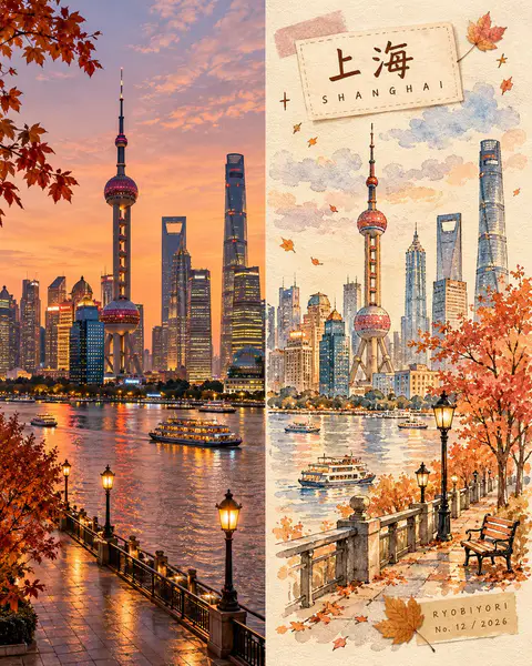
Divide the vertical canvas into two equal halves using a precise 50/50 left-right split.

LEFT HALF — REALISTIC DESTINATION:
Generate an original, natural-looking photograph-style scene of [COUNTRY / CITY / LOCATION / SUBJECT]. Automatically determine its recognizable architecture, scenery, atmosphere, and natural lighting. Preserve realistic textures, authentic colors, and believable perspective. Keep this entire half clean, with no text, labels, illustrations, borders, or decorative elements.

RIGHT HALF — AUTUMN WATERCOLOR JOURNAL:
Reimagine the same destination as a delicate, handmade autumn watercolor illustration. Use simplified rounded architecture, warm glowing windows, a small tree with dusty rose, apricot, and amber foliage, a few drifting leaves, and subtle watercolor clouds. Include only a few meaningful local details, keeping the composition airy and uncluttered.

COLOR PALETTE:
Caramel brown, dusty rose, apricot orange, creamy yellow, muted maple red, warm ivory, and faint lavender-grey shadows. Use soft, low-saturation afternoon light. No neon colors or harsh black.

HANDMADE DETAILS:
Add one or two narrow kraft-brown or dusty-pink washi tape strips, a small pressed autumn leaf, and a few delicate hand-drawn stars or arrows. Integrate these details naturally without overcrowding the illustration.

DESTINATION LABEL:
Place a small cream-colored paper label near the upper-left corner of the RIGHT HALF.

Main title: [LOCATION NAME]
Subtitle: [ENGLISH LOCATION NAME]

Use rounded, handwritten Japanese-inspired lettering for the main title and smaller, widely spaced handwritten English lettering for the subtitle. Keep spelling accurate and typography legible.

SIGNATURE LABEL:
Near the bottom-right corner of the RIGHT HALF, add a small kraft-paper label with exactly this text:

RYOBIYORI
No. [NUMBER] / [YEAR]

Use subtle, fine dark-brown lettering.

STRICT LAYOUT RULES:
All text, labels, washi tape, and decorative elements must remain entirely within the right half. The left half must contain only the original generated realistic destination scene. Never reproduce or modify an existing photograph.

PAPER & FINISH:
Warm ivory watercolor-paper texture, delicate fibers, subtle grain, organic pigment edges, and a carefully assembled travel-journal feeling.

FINAL AESTHETIC:
Realistic destination imagery × autumn watercolor illustration × handmade travel journal × nostalgic seasonal palette × premium editorial design.

AVOID:
Reference-image requests, image-editing instructions, existing-photo preservation, unequal panel widths, text crossing the center divider, excessive decoration, oversaturated colors, glossy digital painting, 3D rendering, misspelled text, extra logos, watermarks, and interface elements.

OUTPUT:
4:5 vertical portrait, exact 50/50 left-right composition, realistic generated destination scene on the left, watercolor travel-journal illustration on the right, ultra-high definition.