[Theme]: ____
[Core Object]: ____
[Main Title]: ____
[Subtitle]: ____
[Primary Color]: ____
[Through Linear Element]: Branches / Water Ripples / Diagonal Lines / Freeform Curves / ____
[Accent Color]: ____

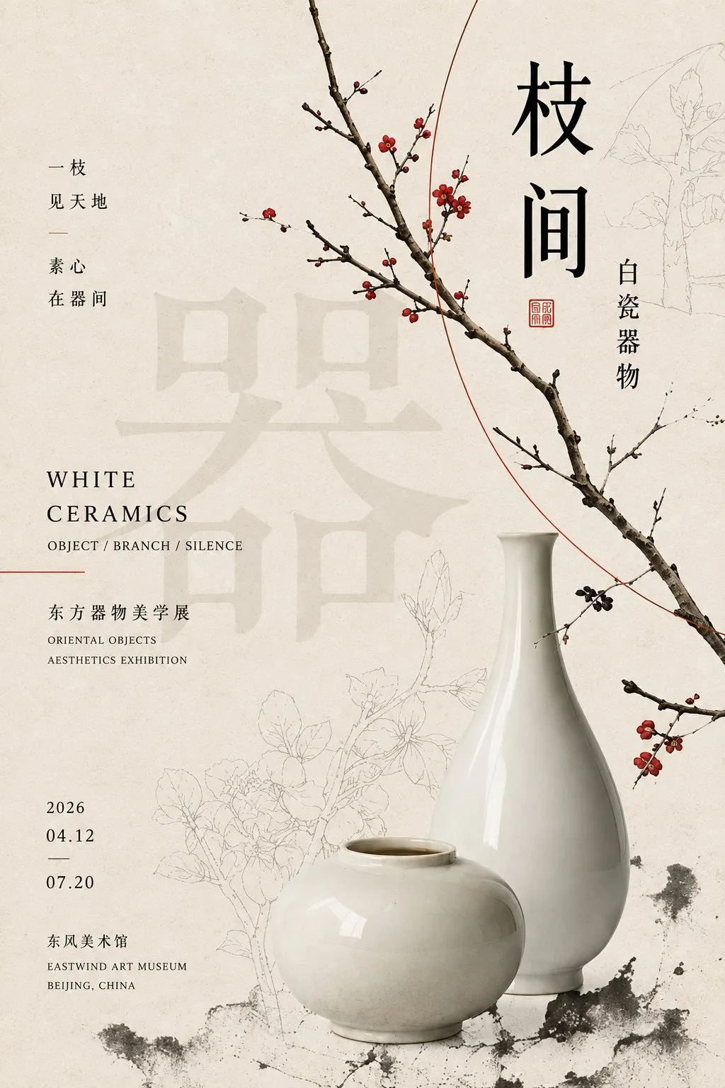
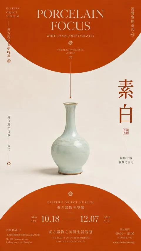
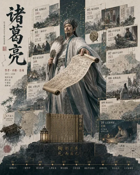
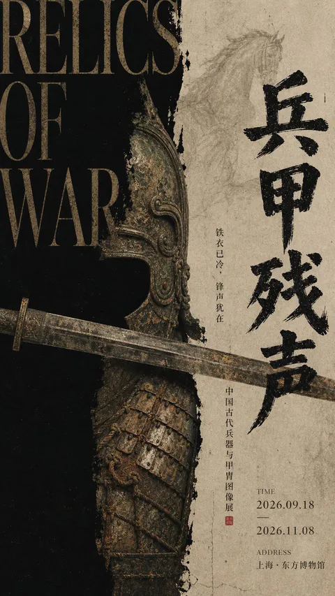
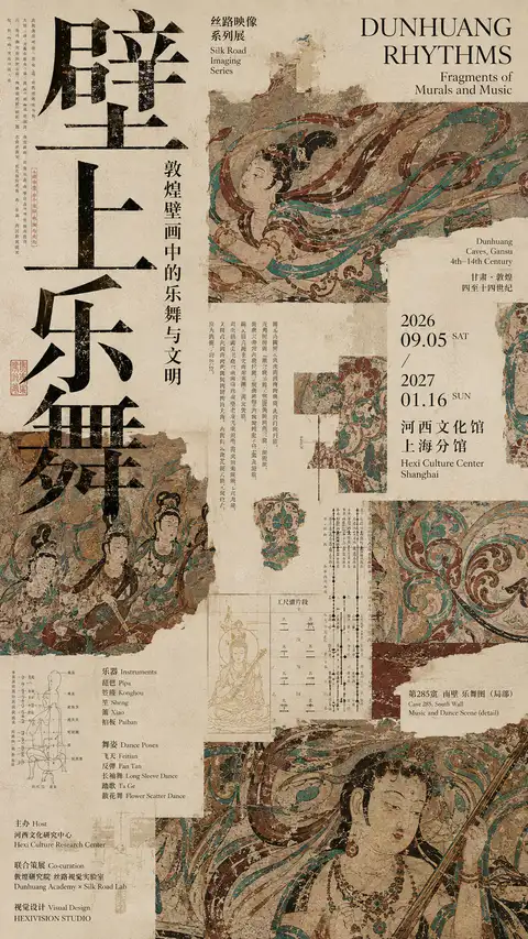
Design a 2:3 vertical Oriental artifact editorial poster. Use warm ivory paper texture with subtle fibers and print grain as the background, combining realistic artifact photography, Chinese typography, small English text, line drawings, and minimal Oriental graphic elements.

Maintain medium-to-high information density without clutter. Organize the layout with 2-3 primary visual clusters, designing a continuous 'visual vein' traversing the composition to link titles, artifacts, and auxiliary graphics: text partially overlaid by objects, lines wrapping around subjects, decorative patterns extending across the canvas, and faint oversized characters embedded in the background.

Typography establishes a clear four-tier hierarchy: oversized visual glyphs / medium Chinese headers / small English subtitles / tiny informational text, composed in horizontal, vertical, and staggered arrangements within an invisible grid for an organized-chaos editorial aesthetic.

Avoid simplistic centered artifact displays; employ layered presentations such as full subjects, cropped sections, and faint line drawings. Incorporate low-contrast watermark text and delicate line art into negative space. Keep the palette low-saturation with a single punchy accent color.
【Title】[TITLE]
【Subtitle】[SUBTITLE]
【Landscape】[canyon / river / cloud mountains / glacier / desert / coast]
【Main Palette】[PRIMARY COLORS]
【Scale Anchor】[tiny traveler / canoe / boat / small building]
【Visual Destination】[moon / distant light / horizon / mountain pass]
【Aspect Ratio】9:16

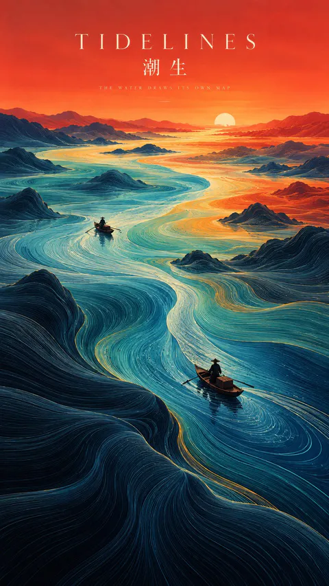
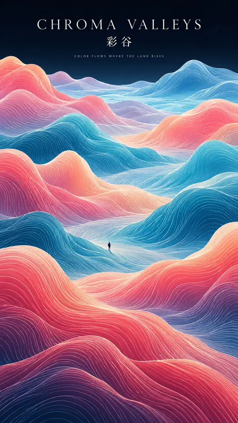
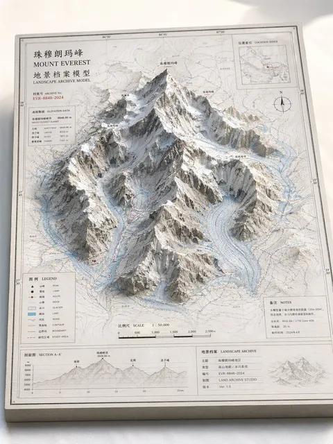
Create a refined vertical art poster that transforms a natural landscape into a flowing topographic world.

Build the terrain from hundreds of long, smooth, continuous contour lines that follow the shape, depth, and movement of the land. The lines should feel like a fusion of topographic maps, silk threads, and abstract Chinese landscape painting — directional, elegant, and highly organized rather than random decorative waves.

Use one strong visual path, such as a river, valley, ridge, cloud road, or negative-space corridor, to guide the eye from foreground to distance.

Keep the natural environment monumental and place only one or two extremely small human figures, boats, or architectural elements as scale anchors.

Use clear spatial hierarchy:
dense flowing lines in the main terrain,
calmer negative space around the visual path,
simpler and softer details in the distance.

Control the palette with 2–4 dominant colors rather than evenly distributed rainbow tones. Use large, clean color fields and let color changes reinforce depth and movement.

Add minimal editorial typography:
[TITLE]
[SUBTITLE]
[SHORT POETIC LINE]

Typography should feel like a contemporary exhibition poster or art-book cover — elegant, widely spaced, restrained, and secondary to the landscape.

The final image should feel poetic, monumental, calm, and highly designed, combining Eastern landscape aesthetics, contour-line abstraction, negative space, and modern editorial composition.
SOURCE & OUTPUT
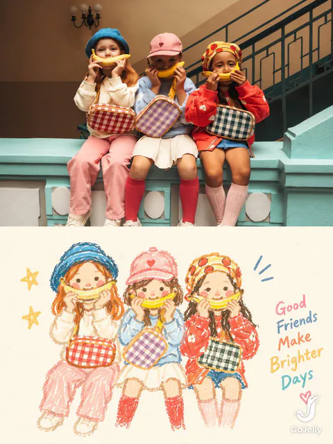
Use each uploaded photo as the sole visual reference. Create one independent, high-end editorial poster per photo and output each separately. Never combine images or create a collage.

FORMAT & LAYOUT
Use a strict vertical 3:4 composition divided into two exactly equal horizontal halves (50/50).

UPPER HALF — ORIGINAL PHOTOGRAPH
Preserve the original photograph faithfully, including the subject’s identity, facial features, structure, pose, proportions, natural texture, lighting, and color atmosphere. Apply only subtle premium editorial color grading for an art-magazine or exhibition-photography aesthetic. If necessary, extend only the surrounding background naturally to fit the frame. Never distort, replace, or redesign the subject.

LOWER HALF — PASTEL CRAYON MEMORY
Reinterpret the photograph as a minimalist, retro paper-texture pastel crayon doodle. Identify the scene’s most memorable subject, pose, relationships, direction, emotional tone, and visual essence. Reconstruct only these defining elements rather than copying every object or illustrating the entire scene.

Use thick, loose, grainy, hand-drawn chalk-and-crayon outlines with dry pigment texture, subtle breaks, faded patches, imperfect edges, slight hand wobble, and naturally rounded stroke endings. Add only a few simple pastel color blocks, stripes, dots, or scribbles to suggest essential details. Avoid realistic volume, detailed rendering, and excessive shading.

COMPOSITION & NEGATIVE SPACE
Keep the illustration small and visually balanced within the lower half, surrounded by generous empty space. Position the subject naturally according to the original photograph, allowing asymmetry, off-center placement, suspended elements, or partial cropping where appropriate.

Include only a few tiny environmental clues or abstract doodles, drawn in the same rough, simplified crayon style. Keep them minimal, imperfect, and contour-based. Prioritize breathing room, scale contrast, visual rhythm, and intentional emptiness. Never overcrowd the composition.

BACKGROUND & COLOR PALETTE
Use a bright, near-white paper background: ivory, cream white, pale off-white, soft apricot white, or very light gray-white. Add only subtle paper fibers and fine grain. Keep the background clean, bright, and clearly lighter than the illustration. Avoid dirty gray, dark yellow, or aged brown paper.

Extract 2–4 defining colors from the original photograph and reinterpret them as fresh, soft pastel crayon tones, such as peach pink, apricot orange, cream yellow, mint green, sky blue, or pale lavender. Use sufficiently distinct coral, blue, blue-green, warm orange, or violet outlines for clear contrast. Maintain a gentle, playful, emotionally warm, and refined palette.

OPTIONAL TEXT
Add only a tiny handwritten note if it genuinely enhances the composition. Keep it sparse, legible, secondary, and unobtrusive. Never use decorative text as filler.

FINAL AESTHETIC
Create a sophisticated editorial poster combining authentic photography above with a reduced, recognizable, hand-drawn memory of the same scene below. The illustration should feel airy, naive without being childish, playful without looking cheap, and minimal without losing the photograph’s identity or emotional meaning. Emphasize expressive linework, selective color, paper texture, asymmetry, and negative space.
【Landscape】[LANDSCAPE]
【Line Structure】[LAYERED / FLOWING / RADIATING / DIRECTIONAL]
【Palette】[COLORS]
【Scale Anchor】[TINY FIGURE / FLAG / BOAT / TENT]
【Aspect Ratio】9:16

Create a refined vertical art poster that transforms the landscape into an abstract **contour-line world**.

Build the terrain primarily from long, smooth, continuous lines that follow its volume, direction, elevation, and movement.

The lines should become the landscape itself, not simply decorate its surface.

Use one clear structural system and strong line-density variation, with dense lines around major forms and more breathing room in calmer areas.

Use 2–5 related colors and let the colors flow naturally along the contour structure.

Keep the landscape monumental and use only one tiny scale anchor.

Add minimal editorial typography:

[TITLE]
[SUBTITLE]
[SHORT POETIC LINE]

High-end exhibition-poster aesthetic, abstract Eastern landscape feeling, strong thumbnail readability, large graphic forms, controlled negative space, and highly visible contour-line structure.