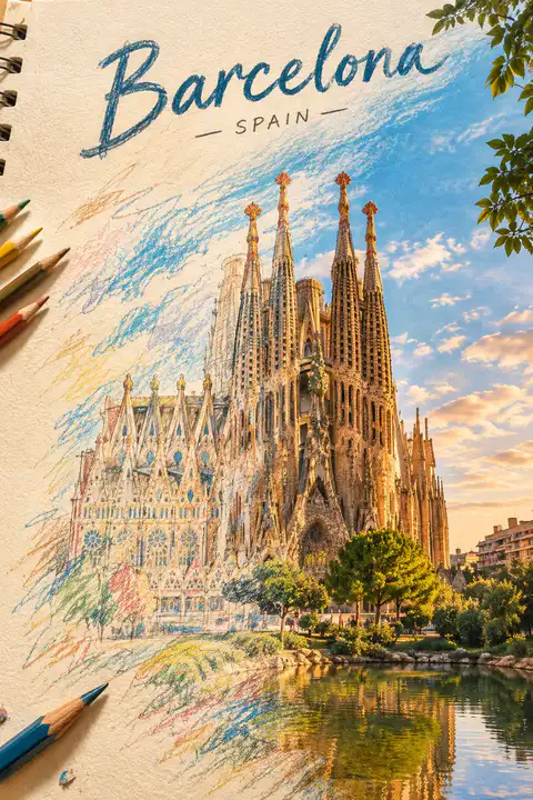
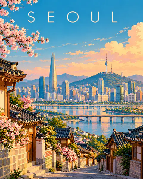
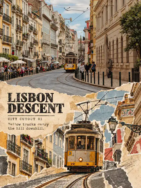
Create a breathtaking artistic composition of [REAL LANDMARK] in [CITY, COUNTRY], where a hand-drawn colored-pencil illustration seamlessly transforms into a beautifully detailed, realistic scene.

On one side, the landmark appears as an intricate drawing on textured ivory sketchbook paper, featuring visible pencil strokes, wax-crayon shading, delicate crosshatching, and imperfect hand-drawn lines. Moving across the composition, the colored strokes gradually evolve into the real landmark, surrounded by its authentic streets, architecture, and recognizable local environment.

Tiny pencil marks transform into real trees, sketchy rooftops become actual buildings, and loose strokes of color turn into the natural sky. The transition must feel fluid and artistic, as if the entire city is being brought to life by an invisible artist.

Preserve the landmark’s exact real-world architecture, proportions, and recognizable details. Use a sophisticated palette of warm terracotta, muted turquoise, golden yellow, deep cobalt blue, and natural earthy tones.

Add subtle paper grain, expressive colored-pencil textures, wax-crayon details, imperfect outlines, and beautiful natural lighting. Keep the composition clean, visually striking, and professionally art-directed, with the landmark as the unmistakable focal point.

Place the real name of the city in elegant, hand-lettered typography at the top, integrated naturally into the artwork.

Style: Contemporary editorial illustration meets realistic colored-pencil and wax-crayon artwork, tactile textures, artistic transformation, premium art-book aesthetic, intricate details, visually captivating composition.
Create a premium FULL-FRAME 4:5 vertical contemporary travel illustration for [COUNTRY / CITY / LOCATION / SUBJECT].

TEXT-TO-IMAGE ONLY — generate everything from the destination name alone. No reference image required.

CORE CONCEPT:
Create an elegant modern European editorial travel poster featuring the destination’s most recognizable landmark, authentic architecture, and surrounding landscape. Use one coherent viewpoint with a clear foreground, beautifully simplified central scene, and spacious background.

STYLE:
Sophisticated geometric illustration, clean architectural shapes, smooth color fields, minimal details, flat shadows, and refined composition. Preserve recognizable local character while simplifying complex scenery into elegant visual forms.

COLOR PALETTE:
Luminous turquoise, powder blue, warm ivory, soft peach, muted coral, sage green, and deep teal. Adapt naturally to the destination.

TYPOGRAPHY:
Place only “[DESTINATION NAME]” near the top in refined, widely spaced contemporary sans-serif lettering.

FINAL AESTHETIC:
Understated elegance, luminous colors, architectural rhythm, generous negative space, and premium collectible travel-poster design.

AVOID:
Photorealism, 3D, fantasy architecture, clutter, heavy outlines, metallic effects, borders, mockups, extra text, logos, and watermarks.

FORMAT: Exact 4:5 vertical aspect ratio, full-bleed artwork, high resolution.
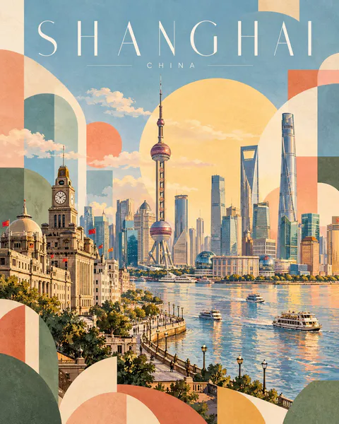
Create a premium 4:5 vertical geometric travel-art poster for [COUNTRY / CITY / LOCATION / SUBJECT].

TEXT-TO-IMAGE ONLY — generate the entire artwork from the written destination or subject alone. Do not request, upload, use, or depend on any reference image. Automatically identify the destination’s iconic landmarks, distinctive architecture, landscape, and cultural identity.

CORE CONCEPT:
Create an elegant travel poster combining approximately 70% recognizable destination illustration with 30% abstract geometric shapes. The landmark and surrounding scenery remain the main focus, while geometric forms add a playful, modern editorial character.

COMPOSITION:
Feature one iconic landmark prominently, surrounded by authentic local architecture, rooftops, hills, mountains, trees, or coastal scenery as appropriate. Arrange the scene in layered depth with simplified architectural details and a clear visual focal point.

Integrate abstract geometric forms into the landscape: overlapping circles, arches, triangles, semicircles, curved blocks, and soft rectangular shapes. Let these forms complement the architecture and scenery rather than obscure the landmark.

TYPOGRAPHY:
Place the destination name prominently across the top in thin, elegant, widely spaced uppercase lettering.

Main title: [LOCATION NAME]
Subtitle: [COUNTRY NAME]

Use refined minimalist typography, generous letter spacing, and a small understated subtitle. Ensure accurate spelling and balanced alignment.

COLOR PALETTE:
Powder blue, muted sage green, soft apricot, dusty blush pink, butter yellow, warm ivory, and light terracotta. Adapt the balance naturally to the destination while maintaining a harmonious, low-saturation palette.

ART STYLE:
Contemporary Scandinavian editorial travel illustration, soft gouache texture, matte painted surfaces, delicate watercolor grain, simplified geometric architecture, clean silhouettes, gentle shadows, and subtle handcrafted imperfections.

LIGHTING & ATMOSPHERE:
Bright, airy daylight with soft atmospheric depth, a pale open sky, warm sunlight, and a calm, optimistic mood. Keep the overall composition light and spacious.

NEGATIVE SPACE:
Preserve generous breathing room around the landmark and title. Avoid excessive detail, dense compositions, harsh outlines, oversaturated colors, glossy effects, photorealism, 3D rendering, unnecessary text, logos, and watermarks.

FINAL AESTHETIC:
Recognizable destination landmarks × modern geometric abstraction × pastel gouache illustration × Scandinavian design × premium collectible travel poster.

FORMAT:
4:5 vertical portrait, landmark-led composition, approximately 70% destination illustration and 30% geometric abstraction, elegant typography, soft matte texture, ultra-high definition.
SOURCE & OUTPUT
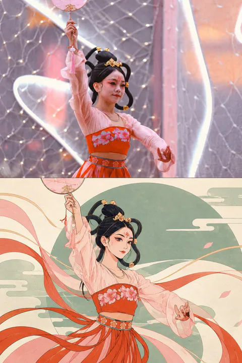
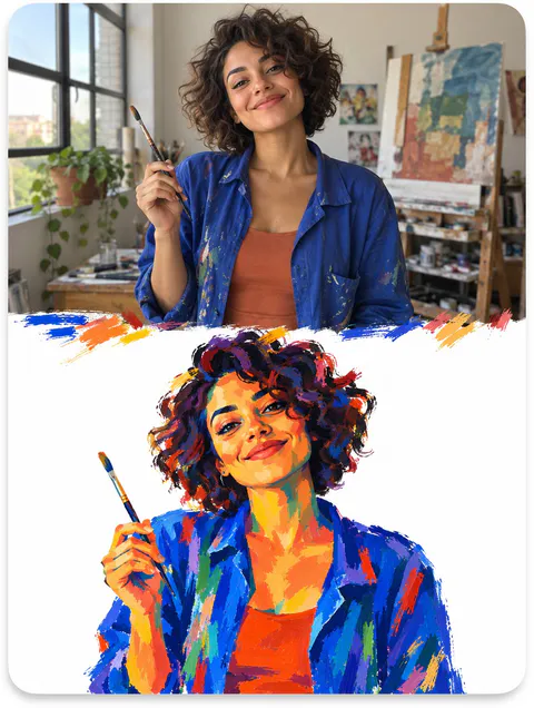
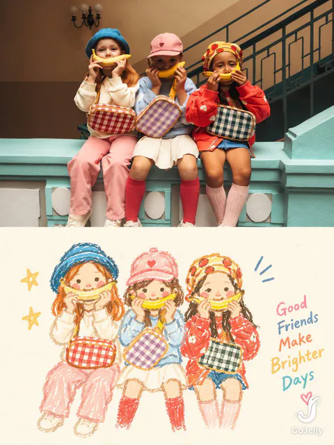
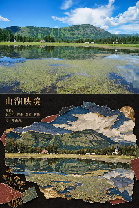
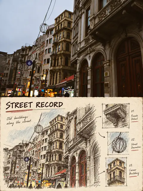
Use each uploaded photo as the sole visual reference. Create one independent, high-end editorial poster per photo and output each separately. Never combine images or create a collage.

FORMAT & LAYOUT
Use a strict vertical 3:4 composition divided into two exactly equal horizontal halves (50/50).

UPPER HALF — ORIGINAL PHOTOGRAPH
Preserve the original photograph faithfully, including the subject’s identity, facial features, structure, pose, proportions, natural texture, lighting, and color atmosphere. Apply only subtle premium editorial color grading for an art-magazine or exhibition-photography aesthetic. If necessary, extend only the surrounding background naturally to fit the frame. Never distort, replace, or redesign the subject.

LOWER HALF — PASTEL CRAYON MEMORY
Reinterpret the photograph as a minimalist, retro paper-texture pastel crayon doodle. Identify the scene’s most memorable subject, pose, relationships, direction, emotional tone, and visual essence. Reconstruct only these defining elements rather than copying every object or illustrating the entire scene.

Use thick, loose, grainy, hand-drawn chalk-and-crayon outlines with dry pigment texture, subtle breaks, faded patches, imperfect edges, slight hand wobble, and naturally rounded stroke endings. Add only a few simple pastel color blocks, stripes, dots, or scribbles to suggest essential details. Avoid realistic volume, detailed rendering, and excessive shading.

COMPOSITION & NEGATIVE SPACE
Keep the illustration small and visually balanced within the lower half, surrounded by generous empty space. Position the subject naturally according to the original photograph, allowing asymmetry, off-center placement, suspended elements, or partial cropping where appropriate.

Include only a few tiny environmental clues or abstract doodles, drawn in the same rough, simplified crayon style. Keep them minimal, imperfect, and contour-based. Prioritize breathing room, scale contrast, visual rhythm, and intentional emptiness. Never overcrowd the composition.

BACKGROUND & COLOR PALETTE
Use a bright, near-white paper background: ivory, cream white, pale off-white, soft apricot white, or very light gray-white. Add only subtle paper fibers and fine grain. Keep the background clean, bright, and clearly lighter than the illustration. Avoid dirty gray, dark yellow, or aged brown paper.

Extract 2–4 defining colors from the original photograph and reinterpret them as fresh, soft pastel crayon tones, such as peach pink, apricot orange, cream yellow, mint green, sky blue, or pale lavender. Use sufficiently distinct coral, blue, blue-green, warm orange, or violet outlines for clear contrast. Maintain a gentle, playful, emotionally warm, and refined palette.

OPTIONAL TEXT
Add only a tiny handwritten note if it genuinely enhances the composition. Keep it sparse, legible, secondary, and unobtrusive. Never use decorative text as filler.

FINAL AESTHETIC
Create a sophisticated editorial poster combining authentic photography above with a reduced, recognizable, hand-drawn memory of the same scene below. The illustration should feel airy, naive without being childish, playful without looking cheap, and minimal without losing the photograph’s identity or emotional meaning. Emphasize expressive linework, selective color, paper texture, asymmetry, and negative space.
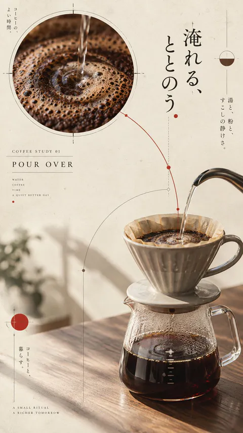
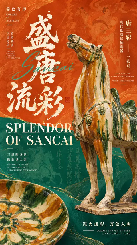
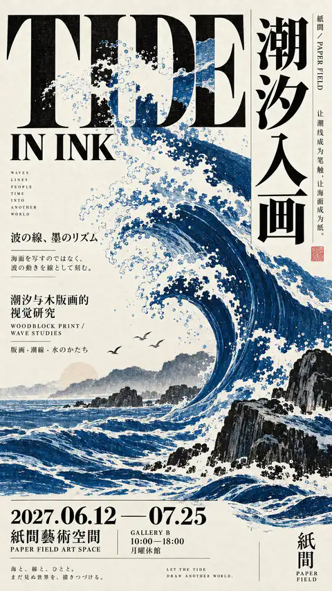
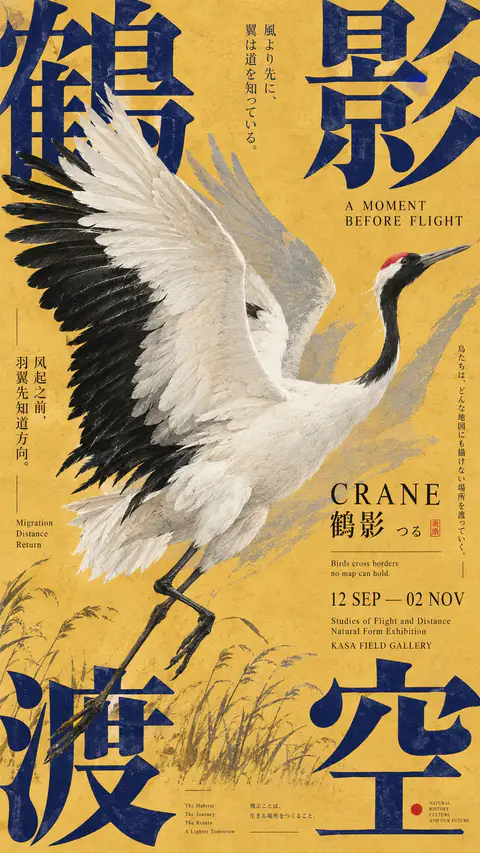
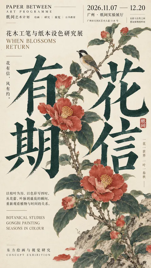
Create a premium 9:16 Japanese-inspired editorial poster using the following creative direction.

Theme: [Your exhibition, cultural event, or artistic concept]
Main Typography: [Large English, Chinese, or Japanese headline]
Visual Subject: [Wildlife, natural elements, printed materials, objects, or abstract forms]
Color Palette: [Choose 2–4 harmonious or contrasting colors]
Supporting Text: [Subtitle, dates, venue, and meaningful multilingual details]

Visual Style & Typography

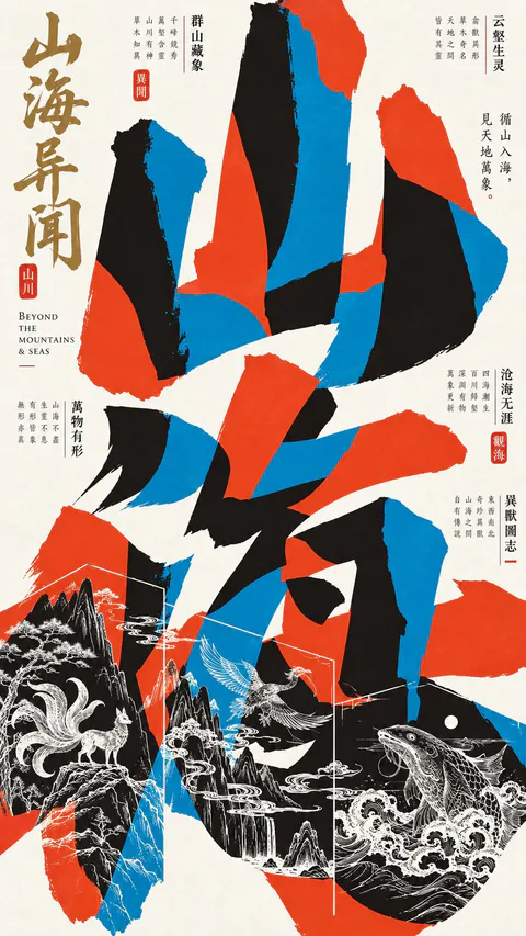
Draw inspiration from Japanese cultural exhibition posters, experimental typography, independent publishing, and contemporary editorial graphic design. Make typography the main visual structure, using oversized letterforms, expressive Kanji, bold cropping, unconventional spacing, and a sophisticated mix of Chinese, Japanese, and English.

Explore dynamic relationships between text and imagery through overlapping, masking, fragmented layouts, negative space, and layered compositions. Depending on the theme, use calligraphic collage, large characters framing illustrations, typography interacting with natural objects, or dense editorial arrangements.

Composition & Information Hierarchy

Build a visually striking yet carefully organized composition. Combine dominant headlines with smaller vertical text columns, exhibition details, dates, poetic phrases, fine rules, and compact information blocks.

Maintain the rich visual density of authentic Japanese art posters. Every element should contribute to the concept, with clear hierarchy, intentional asymmetry, balanced negative space, and strong readability even at thumbnail size.

Imagery & Print Texture

Integrate illustrations, photography, archival fragments, or physical materials naturally into the typography. Objects should interact with letters through meaningful overlap and spatial relationships rather than appearing as separate decorations.

Use subtle paper fibers, offset printing textures, ink grain, restrained registration imperfections, and tactile printed surfaces. Keep colors rich and controlled, with authentic material details and refined editorial craftsmanship.

Final Art Direction

The result should feel like an original poster commissioned by a Japanese art museum, independent publisher, cultural gallery, or design exhibition. Each composition should have its own distinctive visual concept while maintaining a cohesive Japanese editorial aesthetic.
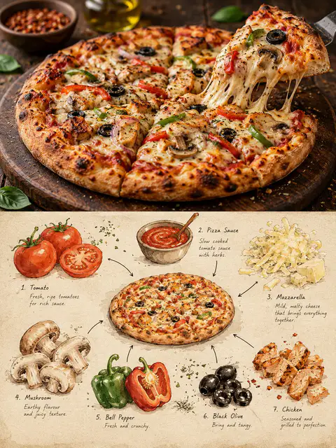
Create a premium 3:4 vertical editorial food-art poster for [COUNTRY / CITY / LOCAL DISH / FOOD SUBJECT].

TEXT-TO-IMAGE ONLY.
Generate the entire composition from the written dish or food subject alone. Do not request, upload, use, or depend on any reference image or existing photograph. Automatically identify the dish’s authentic appearance, ingredients, textures, and cultural identity.

CORE CONCEPT:
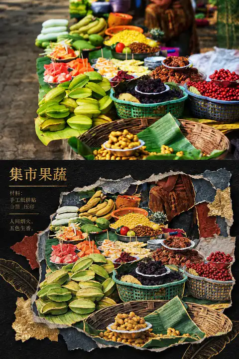
Create one elegant travel-food editorial poster combining realistic food photography in the upper section with a handmade ingredient-observation sketchbook in the lower section. Feature ONE recognizable plate or bowl containing a single dish, with at least three visually distinct ingredients.

UPPER SECTION — REALISTIC FOOD PHOTOGRAPHY:
Occupy approximately 48% of the canvas height. Create a beautifully composed, authentic photographic view of the specified local dish, preserving believable ingredient textures, natural lighting, realistic proportions, and culturally accurate presentation. Use subtle food-magazine color grading and extremely light film grain. Keep the entire plate or bowl visible.

SECTION DIVIDER:
Separate both sections with a straight, clean horizontal boundary. A very thin warm-ivory paper strip is optional. No gradients, blending, or elements crossing the divider.

LOWER SECTION — INGREDIENT OBSERVATION SHEET:
Use warm ivory drawing paper with visible fibers, fine grain, faint smudges, and subtle handmade irregularities. Create a sparse, asymmetrical food-field-note composition rather than repeating the full photographic dish.

Place ONE small, simplified but recognizable illustration of the complete dish near the center. Keep it secondary and compact, occupying approximately one-third of the lower section’s width.

Around it, illustrate 3–6 individually selected ingredients inferred from the dish. Use small watercolor specimens, cut-surface studies, herb sketches, grain clusters, sauce swatches, or distinctive ingredient shapes. Arrange them at varied sizes and angles with generous breathing room.

DRAWING STYLE:
Matte gouache, delicate black-ink outlines, slightly hesitant hand-drawn strokes, dry-brush gaps, uneven pigment coverage, soft watercolor edges, visible paper texture, and restrained natural colors. Keep ingredients recognizable without excessive detail. Add a few fine arrows and small handwritten numbers connecting specimens to the miniature dish.

TYPOGRAPHY:
Use minimal, understated editorial annotations only when helpful. Short ingredient names or tiny handwritten notes are acceptable. Keep all text small and secondary; avoid unnecessary titles or decorative lettering.

COLOR PALETTE:
Derive the colors naturally from the dish, balanced by warm cream, muted earth tones, and subtle ink details.

FINAL AESTHETIC:
Authentic local food photography × handmade ingredient studies × refined travel-food editorial × collectible culinary field notebook.

AVOID:
Multiple dishes, duplicate plates, mixed meals, inaccurate ingredients, excessive garnish, crowded layouts, gradients, bleeding transitions, glossy digital painting, flat vector infographics, 3D rendering, commercial menu styling, excessive text, logos, watermarks, and interface elements.

FORMAT:
3:4 vertical portrait, approximately 48% photographic food scene above and 52% illustrated ingredient-observation sheet below, crisp horizontal separation, generous negative space, premium publication quality, ultra-high definition.
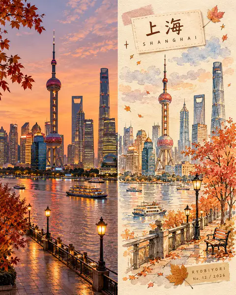
Create a premium 4:5 vertical autumn travel-journal artwork for [COUNTRY / CITY / LOCATION / SUBJECT].

TEXT-TO-IMAGE ONLY — generate every element from the written destination or subject alone. Do not request, upload, use, or depend on any reference image, existing photograph, or source image.

MASTER STYLE LOCK:
Hand-painted autumn watercolor on warm ivory paper, minimalist travel-editorial illustration, transparent watercolor washes mixed with soft gouache, delicate imperfect ink outlines, visible paper grain, natural pigment blooms, soft edges, muted autumn colors, generous negative space, warm nostalgic atmosphere, premium handcrafted art-book aesthetic.

COMPOSITION:
Divide the vertical canvas into two equal halves using a precise 50/50 left-right split.

LEFT HALF — REALISTIC DESTINATION:
Generate an original, natural-looking photograph-style scene of [COUNTRY / CITY / LOCATION / SUBJECT]. Automatically determine its recognizable architecture, scenery, atmosphere, and natural lighting. Preserve realistic textures, authentic colors, and believable perspective. Keep this entire half clean, with no text, labels, illustrations, borders, or decorative elements.

RIGHT HALF — AUTUMN WATERCOLOR JOURNAL:
Reimagine the same destination as a delicate, handmade autumn watercolor illustration. Use simplified rounded architecture, warm glowing windows, a small tree with dusty rose, apricot, and amber foliage, a few drifting leaves, and subtle watercolor clouds. Include only a few meaningful local details, keeping the composition airy and uncluttered.

COLOR PALETTE:
Caramel brown, dusty rose, apricot orange, creamy yellow, muted maple red, warm ivory, and faint lavender-grey shadows. Use soft, low-saturation afternoon light. No neon colors or harsh black.

HANDMADE DETAILS:
Add one or two narrow kraft-brown or dusty-pink washi tape strips, a small pressed autumn leaf, and a few delicate hand-drawn stars or arrows. Integrate these details naturally without overcrowding the illustration.

DESTINATION LABEL:
Place a small cream-colored paper label near the upper-left corner of the RIGHT HALF.

Main title: [LOCATION NAME]
Subtitle: [ENGLISH LOCATION NAME]

Use rounded, handwritten Japanese-inspired lettering for the main title and smaller, widely spaced handwritten English lettering for the subtitle. Keep spelling accurate and typography legible.

SIGNATURE LABEL:
Near the bottom-right corner of the RIGHT HALF, add a small kraft-paper label with exactly this text:

RYOBIYORI
No. [NUMBER] / [YEAR]

Use subtle, fine dark-brown lettering.

STRICT LAYOUT RULES:
All text, labels, washi tape, and decorative elements must remain entirely within the right half. The left half must contain only the original generated realistic destination scene. Never reproduce or modify an existing photograph.

PAPER & FINISH:
Warm ivory watercolor-paper texture, delicate fibers, subtle grain, organic pigment edges, and a carefully assembled travel-journal feeling.

FINAL AESTHETIC:
Realistic destination imagery × autumn watercolor illustration × handmade travel journal × nostalgic seasonal palette × premium editorial design.

AVOID:
Reference-image requests, image-editing instructions, existing-photo preservation, unequal panel widths, text crossing the center divider, excessive decoration, oversaturated colors, glossy digital painting, 3D rendering, misspelled text, extra logos, watermarks, and interface elements.

OUTPUT:
4:5 vertical portrait, exact 50/50 left-right composition, realistic generated destination scene on the left, watercolor travel-journal illustration on the right, ultra-high definition.
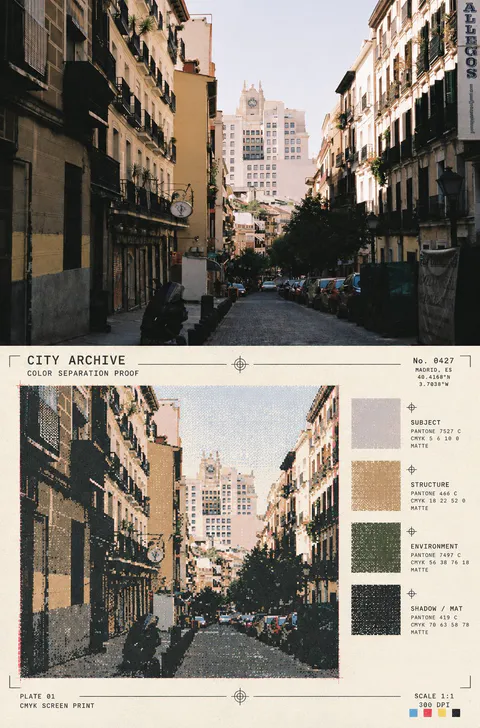
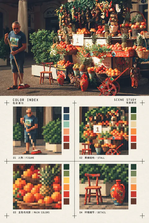
使用一张真实照片作为唯一内容来源,制作一张竖版上下对比编辑海报。上半部完整保留输入照片的真实摄影质感、主体身份、数量、姿态、空间关系、光线和构图,不把照片画成插画;下半部为同一照片的风格化转绘区:在暖白纸面上,把画面提炼成四个等大的方形像素色块索引,分别对应照片中最有辨识度的主体轮廓、建筑或物体结构、主色与光影关系、一个环境细节。每格使用有限色数的硬边像素块和低分辨率网格感,保留可追溯的形体,不做随机马赛克。四格排列为2×2,周围留出充足纸面;用细黑色十字裁切/定位标记框住索引区域,加入极少量小型双语标题与字段,例如“COLOR INDEX / SCENE STUDY”,文字克制、清晰、像印刷校样标注,不喧宾夺主。下半区必须像一张经过设计的色彩索引卡,而不是滤镜、普通像素化或重复照片;不增加无关物件,不改变照片主题。上下区域约各占一半,水平边界清楚;禁止左右并排、禁止多图拼贴、禁止“原图/AI图”角标、禁止水印和品牌标志。所有颜色从输入照片提取并压缩,四格内容随照片主体变化,适用于人物、动物、建筑、街景、自然、室内、食物和物件等任何照片。
 GPT Image 23