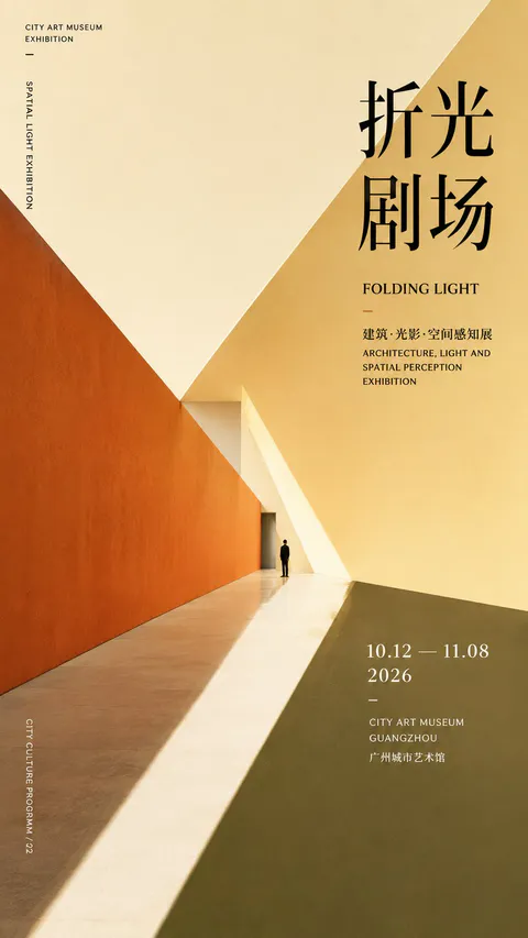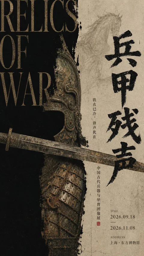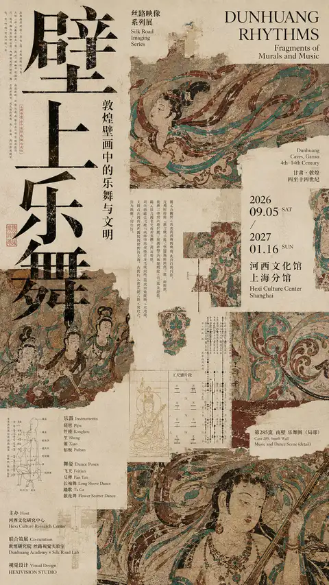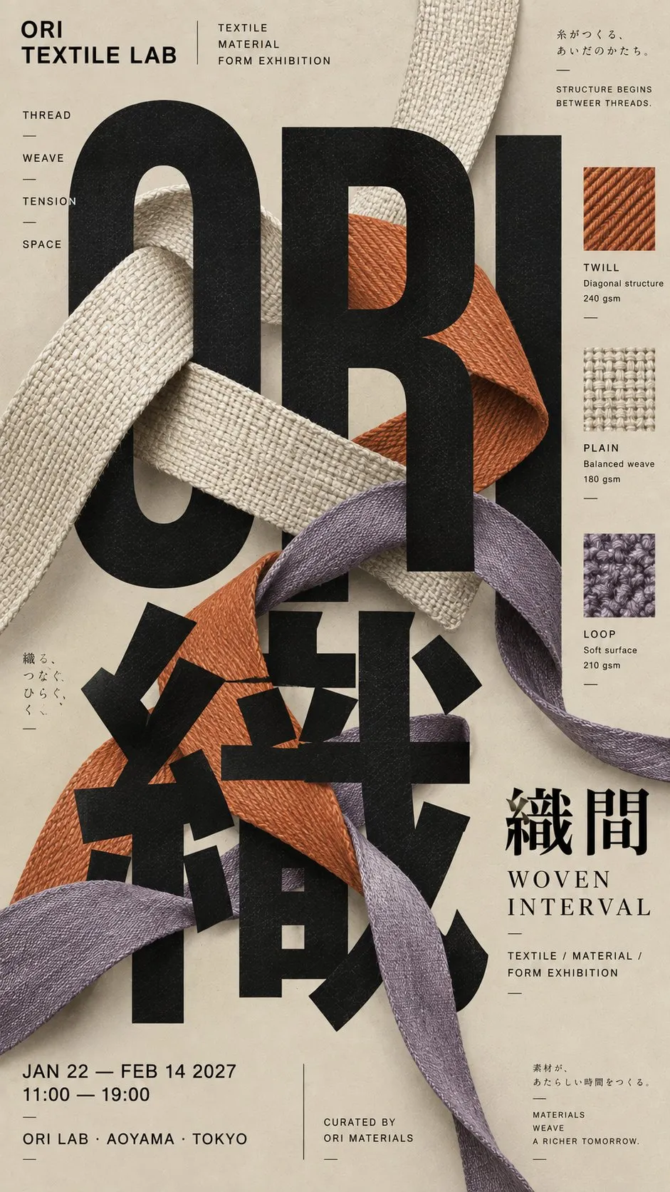
日本風のタイポグラフィポスターデザイン
【主题 / 项目名】:{填写,例如展览、音乐活动、出版物、品牌视觉}
【主标题 / 巨型文字】:{填写中文、英文或日文主标题}
【核心主体】:{填写,例如人物、黑胶、织物、书页、产品、器物}
【图文互动方式】:{遮挡 / 穿插 / 编织 / 折射 / 裁切 / 前后叠层}
【主色调】:{填写 1 个主色}
【辅助色】:{填写 1–2 个辅助色}
【活动 / 品牌信息】:{品牌名、日期、地点、副标题、关键词等}
【画幅比例】:{默认 9:16}

生成一张高级日式 Editorial Typography 海报。核心不是“图片上加文字”,而是让巨型 Typography 本身成为画面的主要结构,再让【核心主体】真正进入文字内部,与字形发生清楚、可信的遮挡、穿插和前后层级。主标题需要足够巨大,允许超出版心、局部裁切和错位排列,使文字首先成为几何大形,其次才被阅读为内容。

使用严格但不可见的编辑网格组织版面,整体不对称但必须保持明确秩序。主体可以跨越文字、从笔画后方穿出、压在部分字形前方,或通过真实物理关系与 Typography 结合。避免简单的“主体放中间、标题放旁边”,画面需要有明显的图文互动和空间感。

色彩控制在有限的 3–5 个核心颜色内,以【主色调】为基础,搭配【辅助色】,强调完整、饱满、干净的印刷色面。使用高质量哑光艺术纸、轻微纸纤维和克制胶版印刷质感,不要明显复古做旧、刮痕、黄斑、重颗粒或廉价滤镜。

建立真实完整的信息系统:主标题负责一级视觉,品牌名 / 项目名 / 副标题负责二级信息,日期、地点、类别、创作者、关键词和简短说明负责三级信息。小字不要全部集中在底部,也不要排成 UI 卡片,可以沿版面边缘、字形结构或主体周围自然分布,形成文化刊物、展览海报和独立出版物的编辑感。

整体信息密度中高,但保持明确层级。远看首先看到巨型文字、核心主体和主色块;中距离看到图文之间的遮挡和穿插;近看才阅读完整的小型信息与印刷细节。最终效果应该像当代日本或东亚设计事务所制作的真实文化海报,而不是 AI 海报模板。

避免:普通居中排版、主体和文字毫无关系、无意义英文、Lorem Ipsum、所有小字堆在一起、过度极简导致画面空、过度拼贴导致混乱、UI 卡片、圆角模块、廉价 3D、霓虹渐变、过度做旧、四角星芒、sparkle、No.01、Vol.01 或其他编号式系列标记。
[Topic / Project Name]: {Fill in, e.g., exhibition, music event, publication, brand visual}
[Main Title / Giant Typography]: {Fill in Chinese, English, or Japanese main title}
[Core Subject]: {Fill in, e.g., figure, vinyl, fabric, book pages, product, artifact}
[Graphic Interaction Mode]: {Occlusion / Intertwining / Weaving / Refraction / Cropping / Layering}
[Primary Color]: {Fill in 1 primary color}
[Secondary Colors]: {Fill in 1–2 secondary colors}
[Event / Brand Information]: {Brand name, date, venue, subtitle, keywords, etc.}
[Aspect Ratio]: {Default 9:16}
Generate a sophisticated Japanese Editorial Typography poster. The core is not simply 'adding text onto an image', but allowing the giant typography itself to form the primary graphic structure, with the [Core Subject] authentically entering within the text structure—interacting with the letterforms through clear, plausible occlusion, intertwining, and depth layering. The main title must be immense, allowing bleed off the edges, partial cropping, and offset alignment so that the typography functions first as bold geometric forms and secondarily as legible text.
Employ a strict yet invisible editorial grid to organize the layout; asymmetrical overall but maintaining definitive order. The subject can traverse letters, emerge from behind strokes, overlay typography, or integrate physically. Avoid generic setups where the subject is centered and title is placed aside; ensure dynamic graphic interaction and spatial tension.
Limit colors to 3–5 core hues based on [Primary Color] accented by [Secondary Colors], emphasizing clean, saturated offset print surfaces on high-grade matte art paper with subtle paper fibers, avoiding heavy distress, scratches, yellowing, or cheap filters.
Establish a comprehensive information hierarchy: main title for primary visual impact; project name and subtitles for secondary tier; dates, locations, creators, and notes for tertiary details. Spread minor text organically along edges, contours, or subjects rather than clustering into cards or footers.
Maintain moderate-to-high information density with distinct visual hierarchy, evoking the feel of a contemporary Japanese or East Asian graphic design studio culture poster.Negative prompt
普通居中排版、主体和文字毫无关系、无意义英文、Lorem Ipsum、所有小字堆在一起、过度极简导致画面空、过度拼贴导致混乱、UI 卡片、圆角模块、廉价 3D、霓虹渐变、过度做旧、四角星芒、sparkle、No.01、Vol.01 或其他编号式系列标记。
提示词出处:@Larus Canus (@MrLarus) 的原帖评论 ↗
| モデル | GPT Image 2 |
|---|---|
| 比率 | 9:16 |
| スタイル | 海报设计 |
| 作者 | Larus Canus (@MrLarus) |
| 元投稿 | X の原文を見る |
日本の現代グラフィックデザインのタイポグラフィを取り入れ、巨大なフォントとリボン、ページ、ダンサーなどの要素を交差・重なり合わせ、奥行きと空間の緊張感に満ちた文化展示ポスターを構築します。
このプロンプトの使い方
- 上の原文プロンプトをコピーします。
- GPT Image 2 に貼り付けます。
- 比率 9:16 で生成します。
Posted on X by @MrLarus. PromptGallery only indexes it. Copyright stays with the author.