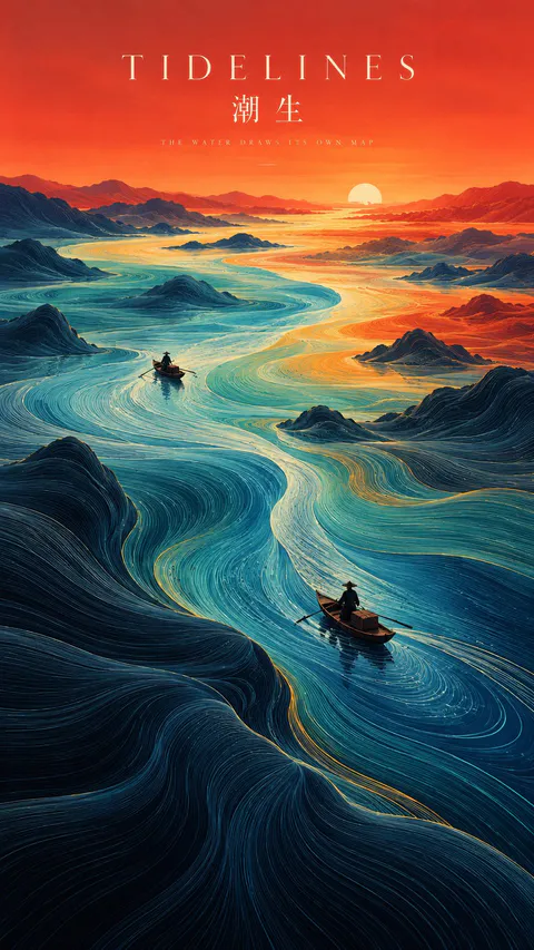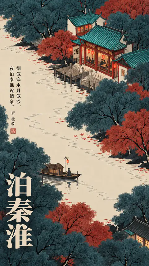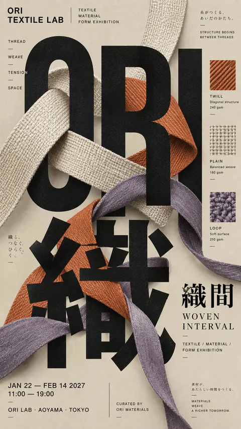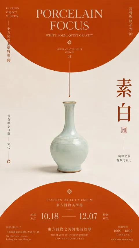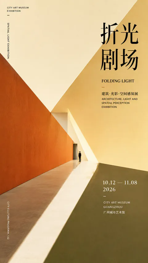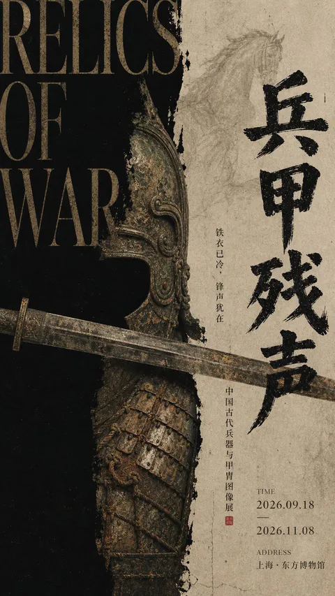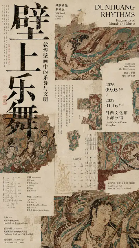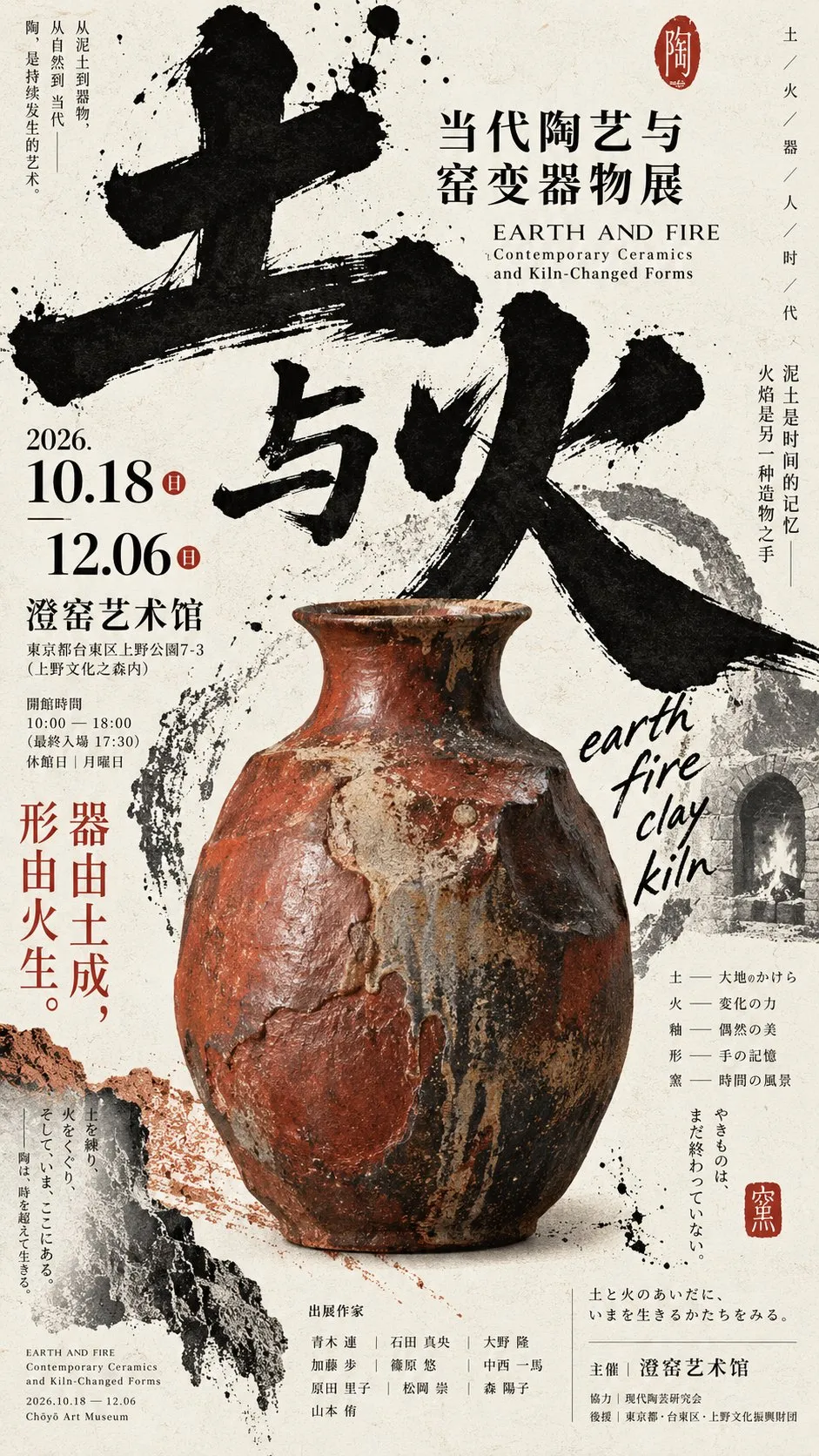
高密度な和風文化展ポスターと野性味あるタイポグラフィ
【主题】{填写主题}
【中文主标题】{2–4 个字}
【英文标题】{简短英文标题}
【核心主体】{人物 / 陶器 / 青铜器 / 乐器 / 面具 / 工艺品等}
【视觉冲突】{例如:稳重主体 × 狂放书写 / 精细图像 × 巨型粗字}
【辅助素材】{制作照片 / 草图 / 历史影像 / 局部纹样等 1–3 个}
【主色调】{填写}
【强调色】{填写}
【画幅】9:16

生成一张具有日本文化展览海报、艺术出版物与 Editorial Graphic Design 气质的高密度图文海报。先建立一个足够有重量的【核心主体】,主体不要规整居中,可大胆放大、裁切、偏置或从边缘进入,让它成为稳定的视觉锚点。

Typography 必须成为构图本身。将【中文主标题】拆成不同尺度与位置的巨大文字,可使用粗犷书写感、巨型汉字、高对比字体或具有强烈人格的文化字体;允许文字出界、压住主体、被主体遮挡、进入图像和负空间,不使用普通“标题在上、图片在下”的结构。围绕【视觉冲突】只建立一个最强设计动作,让整张海报具有明显记忆点。

加入 1–3 个很小的【辅助素材】,例如制作手部、工艺草图、历史照片、材料记录或局部结构,不做规则网格和卡片。日期、地点、英文副题、工艺关键词与 Micro Typography 可横排、竖排、斜排或沿主体与巨大字体自然生长,形成局部高密度,而不是平均铺满整个版面。

建立“巨大标题 × 重量感主体 × 小型档案图像 × 极小信息文字”的尺度反差。允许轻微墨迹、干笔边缘、纸张纤维、套印偏差和手作印刷痕迹,但保持高级、清楚、乱中有序;粗粝感不能演变成脏污、严重做旧或满屏噪点。配色控制在 2–4 个主要色系内,用【强调色】制造少量视觉爆点,主体材质必须真实、完整、有重量。

最终效果应像真正经过艺术指导的日本文化机构、美术馆、工艺馆或设计博物馆展览主视觉:强主体、野 Typography、高信息密度、图字纠缠,每张图本身都是一件完整作品,而不是同一模板替换内容。
[Topic] {Topic}
[Chinese Main Title] {2-4 characters}
[English Title] {Short English title}
[Core Subject] {Figure / Pottery / Bronze / Musical instrument / Mask / Craft, etc.}
[Visual Conflict] {e.g., Solid subject × Wild calligraphy / Detailed imagery × Giant bold characters}
[Supporting Material] {1-3 items such as production photos / sketches / historical archival images / localized patterns}
[Primary Palette] {Fill in}
[Accent Color] {Fill in}
[Aspect Ratio] 9:16
Generate a high-density graphic poster with the aesthetic qualities of a Japanese cultural exhibition poster, art publication, and editorial graphic design. First, establish a weighty [Core Subject]; rather than neatly centered, boldly scale, crop, offset, or enter from the edge to create a stable visual anchor.
Typography must become the composition itself. Break down the [Chinese Main Title] into gigantic characters across varied scales and positions. Utilize raw brush calligraphy, colossal kanji, high-contrast fonts, or culturally expressive typefaces. Allow text to bleed off edges, overlay the subject, be obscured by the subject, or merge into imagery and negative space—avoiding basic 'title on top, image on bottom' layouts. Center around the [Visual Conflict] with a singular powerful design action to form a distinct focal memory.
Integrate 1-3 tiny [Supporting Materials]—such as craftsman hands, process sketches, historical photography, material notes, or partial structural details—avoiding regular grid cards. Arrange dates, locations, English subtitles, craft keywords, and micro-typography in horizontal, vertical, angled, or organically growing layouts along the subject and massive glyphs, forming localized high-density pockets rather than uniform spread.
Establish scale contrast: 'Giant Title × Weighty Subject × Small Archival Images × Micro Informational Text'. Allow subtle ink splashes, dry-brush edges, paper grain, misregistration, and handcrafted printing traces, maintaining sophistication and orderly chaos without turning into grime or excessive noise. Keep the color palette to 2-4 primary tones, using the [Accent Color] for subtle visual impact. The subject material must appear authentic, tactile, and heavy.
The final output should resemble an art-directed key visual for a Japanese cultural institution, art gallery, craft museum, or design archive: dominant subject, wild typography, dense information, and intertwined graphics.Negative prompt
规则网格、卡片 UI、PPT 式信息模块、左右对称、普通标题栏、主体完整居中陈列、过度干净的模板感、无意义英文、随机乱码、严重做旧、满屏墨点、CG 光效、编号 01 / 02 / Vol.、四角星芒和 sparkle。
提示词出处:@Larus Canus (@MrLarus) 的原帖评论 ↗
| モデル | GPT Image 2 |
|---|---|
| 比率 | 9:16 |
| スタイル | 海报设计 |
| 作者 | Larus Canus (@MrLarus) |
| 元投稿 | X の原文を見る |
高密度な日本のエディトリアルデザイン風の文化展ポスタープロンプト。力強い墨文字、重厚な文化財や楽器、手作りのアーカイブ断片や細密なタイポグラフィを組み合わせ、圧倒的な視覚的インパクトと出版物のような洗練された質感を演出します。
このプロンプトの使い方
- 上の原文プロンプトをコピーします。
- GPT Image 2 に貼り付けます。
- 比率 9:16 で生成します。
Posted on X by @MrLarus. PromptGallery only indexes it. Copyright stays with the author.