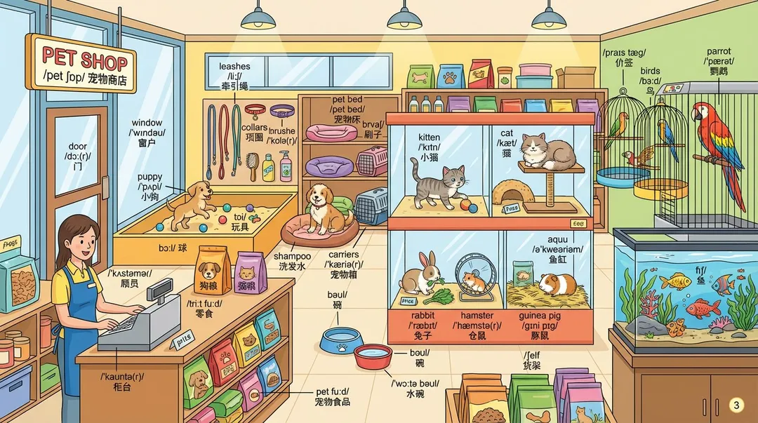
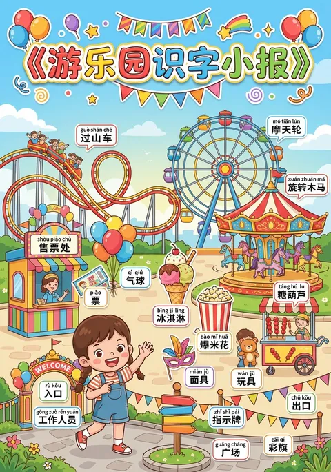
Draw a detailed {{pet shop}} scene for me

and label all objects with their English words,

Label format: Line 1: English word
Line 2: Phonetic transcription (International Phonetic Alphabet IPA format)
Line 3: Chinese translation
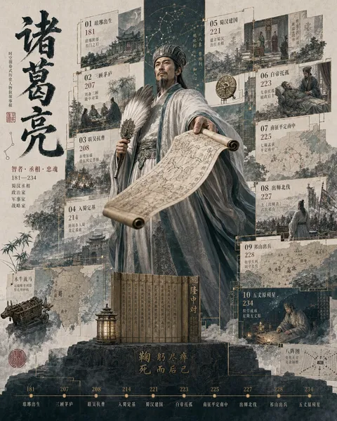
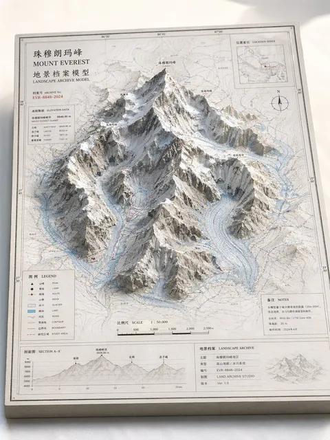
[Image X/N] [Chinese Module Name] — [Subject Name]

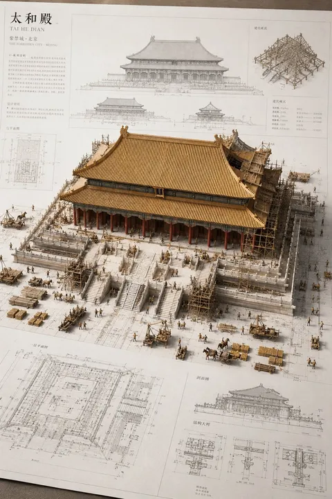
SCENE:
[3D visual perspective] of [subject English name],
photorealistic CGI scientific visualization,
[isometric / diagonal cutaway / aerial view / front-facing section / exploded view / dynamic vortex view / cosmic scale view],
designed as a premium natural science infographic poster.

TITLE SYSTEM:
- Main title (Chinese): "[中文主标题]"
- Subtitle (Chinese): "[认知颠覆副标题]"
- English label: "[UPPERCASE ENGLISH TITLE]"

VISUAL CONTENT:
- [Core visual element 1, 20-40 English words]
- [Core visual element 2, 20-40 English words]
- [Core visual element 3, 20-40 English words]
- [Core visual element 4, 20-40 English words]
- [Core visual element 5, optional, 20-40 English words]

ANNOTATION LABELS (Chinese):
[中文标注1], [中文标注2], [中文标注3], [中文标注4], [中文标注5], [中文标注6]

SPECIAL EFFECTS:
[Subject-specific visual effects, such as underwater caustics, volcanic glow, ice refraction, gravitational lensing, spiral airflow, sediment layers, electric discharge, mist, heat shimmer, magnetic field lines.]

LIGHTING:
[Lighting direction and mood, consistent with the whole series.]

SUMMARY (Chinese, bottom):
"[核心科学结论]"

FOOTER:
"— [系列名] · 第X页 / 共N页 —"

STYLE DNA:
photorealistic CGI render, museum-quality scientific illustration,
warm parchment beige background (#F0EDE6), matte linen surface texture,
DK encyclopedia aesthetic, natural history atlas style,
Chinese educational poster format, 3:4 portrait ratio,
annotation lines with small white dot anchor markers,
navy blue Chinese label text (#1A2E4A),
large Chinese Song-style bold main title at top,
wide-spaced uppercase English subtitle below,
small centered Chinese summary sentence at bottom,
subtle designed series footer only, no external watermark, no logo, no UI chrome,
deep ocean blue, geological brown, moss green, mineral gray natural palette,
ultra-detailed 8K textures, dramatic natural lighting,
consistent camera language, consistent lighting direction, same visual seed,
--ar 3:4 --v 6.1 --q 2 --s 80 --seed 24680
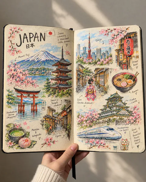
Create a beautiful, highly detailed, handmade travel sketchbook spread inspired by an artist’s personal travel journal. Show an open sketchbook with warm ivory paper, slightly imperfect edges, and visible paper texture, filled with intricate hand-drawn illustrations of [COUNTRY / CITY].
The two-page spread should feel like a collection of little memories gathered during a journey, with famous landmarks, traditional architecture, charming streets, cultural symbols, local food, nature, and tiny everyday details arranged organically across both pages.
Use fine black ink linework, delicate cross-hatching, loose pencil strokes, architectural doodles, handwritten labels, tiny arrows, and small notes pointing toward the illustrated places. Let the drawings feel authentic and handmade, like a real artist sketched them while travelling.
🌈 The Special Touch — Selective Beautiful Colors
Keep most of the artwork in elegant black-and-white ink, but bring selected elements to life with beautiful, carefully placed splashes of color.
🗻 Mountains and landscapes with soft watercolor blues, sage greens, and snowy whites.
🏯 Famous landmarks with subtle terracotta, warm beige, and muted golden tones.
🌸 Flowers and leaves with delicate pinks, coral, and fresh greens.
🍜 Local food illustrated in appetizing, vibrant colors.
🏮 Traditional lanterns, cultural objects, or street signs highlighted with rich reds and warm amber.
🌊 Rivers, lakes, or ocean views accented with dreamy turquoise and soft blue.
🚌 Tiny travel details featuring unexpected pops of mustard yellow, dusty orange, and pastel colors.
Important: The colors should appear selectively, as if the artist used watercolor and colored pencils to highlight their favorite memories. Some illustrations should remain completely monochrome, while others should be partially or beautifully colored. The contrast between black ink and colorful details should make the artwork visually captivating without overwhelming the page.
✍️ Composition & Atmosphere
Include the country name in large, artistic handwritten lettering, accompanied by a tiny national flag. Add a mixture of large landmark sketches and smaller doodles, creating a rich yet balanced composition.
Allow some drawings to overlap slightly or extend toward the edges of the pages. Include spontaneous pencil marks, unfinished outlines, tiny stars, handwritten location names, and subtle artistic imperfections.
Show the sketchbook as a real physical object, opened in someone's hand against a simple, softly lit background. Use a close-up perspective, natural daylight, realistic paper texture, and gentle shadows.
Art style: Travel journal meets architectural ink illustration meets selective watercolor sketching. Sophisticated, cozy, artistic, nostalgic, and irresistibly beautiful.
Aspect ratio: 4:5 vertical composition.
Final result: A stunning, realistic travel sketchbook that looks handmade rather than digitally designed, with intricate black ink drawings and strategically placed bursts of beautiful color that make every page feel like a treasured travel memory.
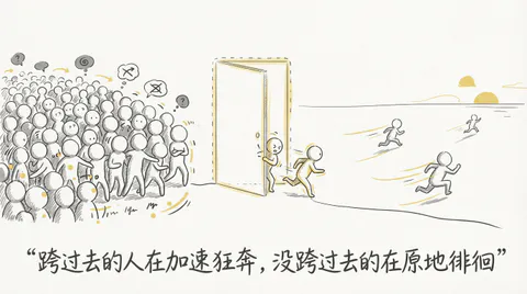
Minimal hand-drawn illustration, off-white paper background, dark gray sketch lines, muted umbrella yellow as the only accent color, lots of negative space, Notion-like doodle aesthetic, faceless round-headed human figure, clean editorial composition, conceptual rather than literal, simple background, no realism, no 3D, no painterly texture, no high saturation, no complex scene, no photographic detail. Add one short Chinese quote in a natural handwritten style near the bottom. The overall mood is restrained, lucid, slightly ironic, and emotionally calm. Keep the whole series visually consistent. Use Chinese wherever possible for any visible language or textual content, unless a proper noun, technical term, or special usage is better kept in its original form.
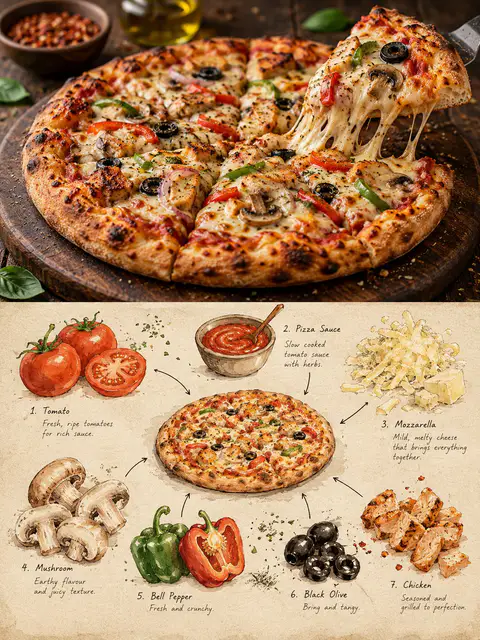
Create a premium 3:4 vertical editorial food-art poster for [COUNTRY / CITY / LOCAL DISH / FOOD SUBJECT].

TEXT-TO-IMAGE ONLY.
Generate the entire composition from the written dish or food subject alone. Do not request, upload, use, or depend on any reference image or existing photograph. Automatically identify the dish’s authentic appearance, ingredients, textures, and cultural identity.

CORE CONCEPT:
Create one elegant travel-food editorial poster combining realistic food photography in the upper section with a handmade ingredient-observation sketchbook in the lower section. Feature ONE recognizable plate or bowl containing a single dish, with at least three visually distinct ingredients.

UPPER SECTION — REALISTIC FOOD PHOTOGRAPHY:
Occupy approximately 48% of the canvas height. Create a beautifully composed, authentic photographic view of the specified local dish, preserving believable ingredient textures, natural lighting, realistic proportions, and culturally accurate presentation. Use subtle food-magazine color grading and extremely light film grain. Keep the entire plate or bowl visible.

SECTION DIVIDER:
Separate both sections with a straight, clean horizontal boundary. A very thin warm-ivory paper strip is optional. No gradients, blending, or elements crossing the divider.

LOWER SECTION — INGREDIENT OBSERVATION SHEET:
Use warm ivory drawing paper with visible fibers, fine grain, faint smudges, and subtle handmade irregularities. Create a sparse, asymmetrical food-field-note composition rather than repeating the full photographic dish.

Place ONE small, simplified but recognizable illustration of the complete dish near the center. Keep it secondary and compact, occupying approximately one-third of the lower section’s width.

Around it, illustrate 3–6 individually selected ingredients inferred from the dish. Use small watercolor specimens, cut-surface studies, herb sketches, grain clusters, sauce swatches, or distinctive ingredient shapes. Arrange them at varied sizes and angles with generous breathing room.

DRAWING STYLE:
Matte gouache, delicate black-ink outlines, slightly hesitant hand-drawn strokes, dry-brush gaps, uneven pigment coverage, soft watercolor edges, visible paper texture, and restrained natural colors. Keep ingredients recognizable without excessive detail. Add a few fine arrows and small handwritten numbers connecting specimens to the miniature dish.

TYPOGRAPHY:
Use minimal, understated editorial annotations only when helpful. Short ingredient names or tiny handwritten notes are acceptable. Keep all text small and secondary; avoid unnecessary titles or decorative lettering.

COLOR PALETTE:
Derive the colors naturally from the dish, balanced by warm cream, muted earth tones, and subtle ink details.

FINAL AESTHETIC:
Authentic local food photography × handmade ingredient studies × refined travel-food editorial × collectible culinary field notebook.

AVOID:
Multiple dishes, duplicate plates, mixed meals, inaccurate ingredients, excessive garnish, crowded layouts, gradients, bleeding transitions, glossy digital painting, flat vector infographics, 3D rendering, commercial menu styling, excessive text, logos, watermarks, and interface elements.

FORMAT:
3:4 vertical portrait, approximately 48% photographic food scene above and 52% illustrated ingredient-observation sheet below, crisp horizontal separation, generous negative space, premium publication quality, ultra-high definition.