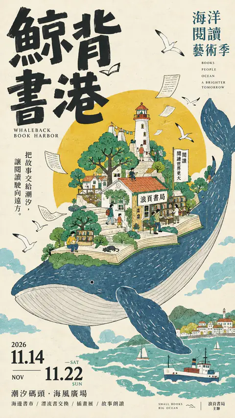
[Poster Theme]: {Fill in theme}
[Chinese Main Title]: {Fill in title}
[English Title]: {Fill in English name}
[Core Visual Concept]: {e.g., giant whale carrying a book harbor, tea leaves turning into tea mountains, umbrella holding up a city}
[Key Elements]: {architecture, nature, characters, plants, objects, etc.}
[Color Palette]: {primary, secondary, accent colors}
[Event Information]: {date, location, subtitle, event details, etc.}
[Aspect Ratio]: 9:16

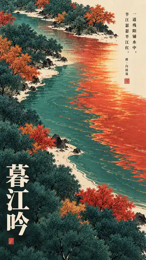
Create a cultural event art poster featuring East Asian vintage hand-drawn aesthetics, integrating the visual languages of Japanese and Taiwanese independent cultural exhibition posters, retro picture book illustration, traditional printmaking, and experimental editorial design.

Visual Concept & Composition:
Create an imaginative miniature world around the theme. Integrate everyday objects, architecture, flora, natural landscapes, and figures through scale distortion, morphing, or surreal combinations into a unique visual metaphor. The subject must have a bold silhouette and clean contours with rich interior details, maintaining natural negative space.

Hand-Drawn Style & Colors:
Use loose, hand-drawn ink linework with 2D flat color fills and fine linework. Off-white ivory paper texture base with retro natural tones (moss green, lake teal, terracotta orange, mustard yellow, charcoal black), highlighting visual focus with an accent color.

Typography & Layout:
Bold expressive Chinese brush typography paired with retro English serif fonts and organized event details in an asymmetric, editorial rhythmic layout.

Overall Quality:
Mature independent illustrator aesthetic, avoiding 3D miniature, CG render, photorealism, heavy gradients, or generic commercial styles. Output a finished 9:16 vertical art poster.
[Customize]
 Food: [Real food or ingredient]
 Subject: [Handdrawn animal, person, or object]
 Creative Interaction: [How the food becomes part of the illustration]
 Magazine Title: [Original Japanese magazine name]
 Headline: [Short Japanese feature title]
 Caption: [Short supporting Japanese text]
 Color Palette: [Muted background + food accent colors]
 Aspect Ratio: 9:16

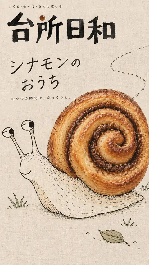
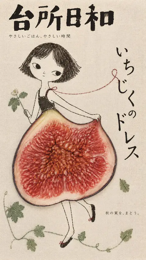
Create an original Japanesestyle food magazine cover combining whimsical handdrawn illustrations, realistic food photography, subtle embroidery, and natural linen textures.

Visual Concept:
Transform [Food] into an unexpected but recognizable part of [Subject], following [Creative Interaction].

The food should feel naturally integrated into the illustration, with believable scale, positioning, and connections. Preserve authentic food textures, colors, and details.

Illustration Style:
Naive black ink drawings, irregular pencil strokes, playful proportions, charmingly imperfect characters, and occasional delicate stitched details.

Keep the illustration simple, expressive, and full of personality. Avoid overly polished digital artwork or uniform embroidery textures.

Composition & Typography:
Use one oversized illustrated subject, a striking realistic food element, generous negative space, and an asymmetrical Japanese editorial layout.

Place a bold magazine title at the top. Integrate the headline and minimal supporting text naturally around the illustration, allowing typography and handdrawn lines to interact.

Texture & Color:
Soft linen paper, subtle fabric fibers, matte printing, muted earthy colors, and gentle natural lighting. Let the realistic food provide the strongest color accent.

Art Direction:
Whimsical, nostalgic, handcrafted, slightly eccentric, yet sophisticated.

Prioritize visual surprise, clear silhouettes, expressive linework, and thoughtful negative space.

Avoid glossy CGI, vector cartoons, excessive decorations, dense text, random lettering, cluttered backgrounds, copied branding, artist signatures, and watermarks.

Generate one complete, original 9:16 magazine cover.
[Customize]
 Food: [Real fruit, vegetable, or ingredient]
 Subject: [Handdrawn character, animal, or object]
 Creative Interaction: [How the food transforms into part of the illustration]
 Magazine Title: [Original Japanese magazine name]
 Headline: [Short Japanese feature title]
 Caption: [Short supporting Japanese text]
 Color Palette: [Soft background + contrasting food colors]
 Aspect Ratio: 9:16

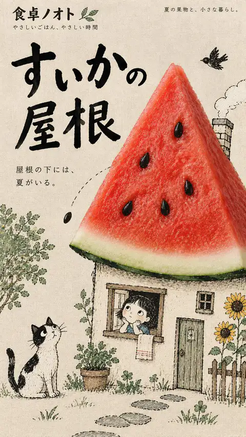
Create an original Japanesestyle editorial magazine cover blending realistic food photography, whimsical handdrawn illustrations, subtle embroidery, and natural linen textures.

Visual Concept:
Transform [Food] into an imaginative part of [Subject] through [Creative Interaction].

The food should become a functional element of the illustrated world—a rooftop, hairstyle, slide, musical instrument, or another unexpected object.

Preserve authentic photographic food textures, natural colors, and realistic lighting. Ensure seamless visual integration with the illustration, not a pastedon collage.

Illustration Style:
Naive black ink drawings, loose irregular strokes, playful asymmetrical proportions, delicate pencil marks, and occasional handmade stitching.

Characters should feel quirky, expressive, and full of life. Keep the linework imperfect, organic, and charming.

Composition & Typography:
Use one strong visual concept, an oversized subject, generous negative space, and a playful asymmetrical editorial layout.

Integrate Japanese typography naturally into the composition. Vary the scale and placement of the magazine title and main headline, allowing handwritten lines, shapes, and text to interact.

Keep supporting text minimal, meaningful, and readable.

Colors & Textures:
Soft linen paper, subtle fabric fibers, matte printing, muted earthy backgrounds, and natural lighting.

Let the realistic food provide the strongest color accent and visual contrast.

Art Direction:
Whimsical, handcrafted, slightly eccentric, nostalgic, yet sophisticated.

Prioritize visual surprise, expressive linework, clear silhouettes, and creative interaction between photography, illustration, and typography.

Avoid glossy CGI, vector cartoons, excessive embroidery, cluttered layouts, dense text, generic decorations, copied branding, artist signatures, and watermarks.

Generate one complete, original 9:16 magazine cover.
[Customize]
 Food: [Real food or ingredient]
 Subject: [Handdrawn person, animal, or object]
 Creative Interaction: [How the food transforms into part of the illustration]
 Magazine Title: [Original Japanese magazine name]
 Headline: [Short Japanese headline]
 Caption: [Short supporting text]
 Color Palette: [Muted background + accent colors]
 Aspect Ratio: 9:16

Create a whimsical Japanese editorial magazine cover combining naive handdrawn illustrations, delicate embroidery, natural linen textures, and realistic food photography.

Visual Concept:
The real food becomes an unexpected but natural part of the illustrated world—a dress, horn, umbrella, light, or another imaginative object.

Preserve authentic photographic details in the food while keeping the surrounding illustration simple, imperfect, and expressive.

Illustration Style:
Loose black ink outlines, irregular handdrawn strokes, subtle pencil marks, occasional stitched details, and playful asymmetrical proportions. Characters should feel charming, quirky, and full of personality.

Composition & Typography:
Use an oversized illustrated subject, one striking food element, generous negative space, and a flexible Japanese editorial layout.

Place a bold magazine title at the top, with a short headline and minimal supporting text naturally integrated into the illustration.

Texture & Color:
Warm linen paper, subtle fabric fibers, muted earthy colors, soft matte printing, and natural food textures. Let the food provide the strongest color accent.

Art Direction:
Playful yet sophisticated, nostalgic, handcrafted, and visually surprising. Every element should feel intentionally connected.

Create one complete, original 9:16 magazine cover.