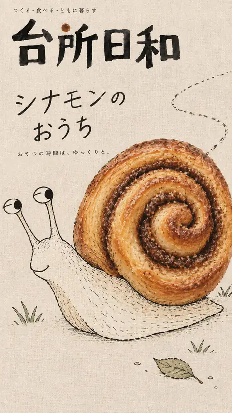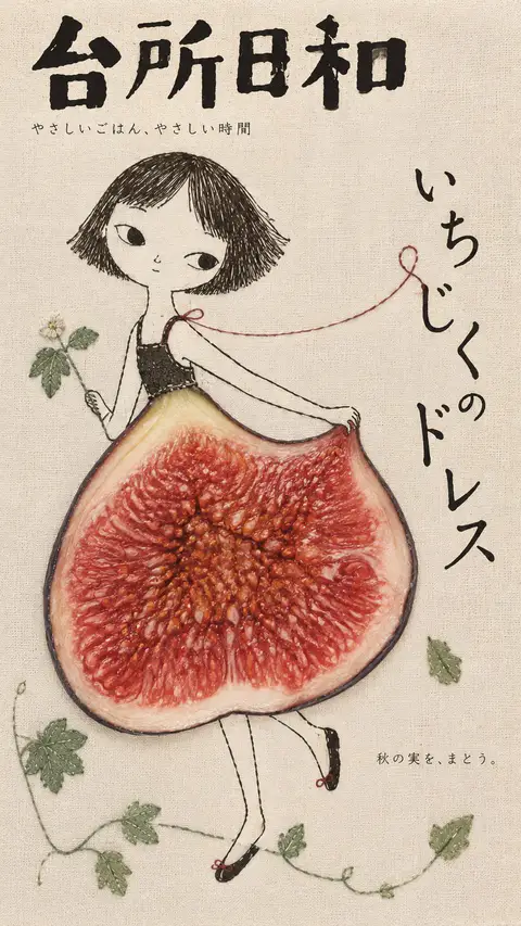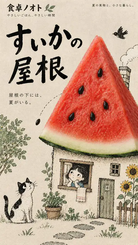
日系手绘拼贴创意杂志封面
[Customize]
 Food: [Real fruit, vegetable, or ingredient]
 Subject: [Handdrawn character, animal, or object]
 Creative Interaction: [How the food transforms into part of the illustration]
 Magazine Title: [Original Japanese magazine name]
 Headline: [Short Japanese feature title]
 Caption: [Short supporting Japanese text]
 Color Palette: [Soft background + contrasting food colors]
 Aspect Ratio: 9:16

Create an original Japanesestyle editorial magazine cover blending realistic food photography, whimsical handdrawn illustrations, subtle embroidery, and natural linen textures.

Visual Concept:
Transform [Food] into an imaginative part of [Subject] through [Creative Interaction].

The food should become a functional element of the illustrated world—a rooftop, hairstyle, slide, musical instrument, or another unexpected object.

Preserve authentic photographic food textures, natural colors, and realistic lighting. Ensure seamless visual integration with the illustration, not a pastedon collage.

Illustration Style:
Naive black ink drawings, loose irregular strokes, playful asymmetrical proportions, delicate pencil marks, and occasional handmade stitching.

Characters should feel quirky, expressive, and full of life. Keep the linework imperfect, organic, and charming.

Composition & Typography:
Use one strong visual concept, an oversized subject, generous negative space, and a playful asymmetrical editorial layout.

Integrate Japanese typography naturally into the composition. Vary the scale and placement of the magazine title and main headline, allowing handwritten lines, shapes, and text to interact.

Keep supporting text minimal, meaningful, and readable.

Colors & Textures:
Soft linen paper, subtle fabric fibers, matte printing, muted earthy backgrounds, and natural lighting.

Let the realistic food provide the strongest color accent and visual contrast.

Art Direction:
Whimsical, handcrafted, slightly eccentric, nostalgic, yet sophisticated.

Prioritize visual surprise, expressive linework, clear silhouettes, and creative interaction between photography, illustration, and typography.

Avoid glossy CGI, vector cartoons, excessive embroidery, cluttered layouts, dense text, generic decorations, copied branding, artist signatures, and watermarks.

Generate one complete, original 9:16 magazine cover.
[自定义]
 食材:[真实水果、蔬菜或配料]
 主体:[手绘角色、动物或物体]
 创意互动:[食物如何转化为插画的一部分]
 杂志标题:[原创日文杂志名称]
 大标题:[简短日文专题标题]
 说明文字:[简短辅助日文文本]
 配色方案:[柔和背景 + 对比鲜明的食物色彩]
 画幅比例:9:16

创作一张原创日系编辑杂志封面,巧妙融合写实食物摄影、异想天开的手绘插画、细微刺绣以及天然亚麻纹理。

视觉概念:
通过[创意互动]将[食材]转化为[主体]富有想象力的一部分。

食物应成为插画世界的功能性元素——屋顶、发型、滑梯、乐器或其他意想不到的物体。

保留食物真实的摄影质感、自然色彩与逼真光影。确保与插画天衣无缝地融合,而非生硬拼贴。

插画风格:
朴拙黑墨线条、松散不规则笔触、趣味不对称比例、精致铅笔痕迹及偶尔的手工缝线痕迹。

角色应显得古灵精怪、富有表现力且充满生机。保持线条不完美、有机而迷人。

构图与排版:
运用单一强烈的视觉概念、夸张的主体、充裕的留白以及趣味的不对称编辑排版。

将日文排版自然融入画面中。灵活调整杂志名称与主标题的大小和位置,让手写线条、形状与文字产生互动。

辅助文字保持精炼、有意义且易读。

色彩与质感:
柔软亚麻纸、细腻织物纤维、哑光印刷、柔和大地色背景以及自然光线。

让真实的食物成为最强烈的色彩点缀与视觉对比。

艺术指导:
异想天开、手工温润感、略带奇特古怪、怀旧而富有格调。

注重视觉惊喜、富有表现力的线条、清晰轮廓以及摄影、插画和排版之间的创意互动。

避免光泽CG感、矢量卡通、过多刺绣、拥挤排版、密集的文字、通用装饰、抄袭品牌、艺术家签名及水印。

生成一张完整的原创 9:16 杂志封面。
提示词出处:@Larus Canus (@MrLarus) 的原帖评论 ↗
| 模型 | GPT Image 2 |
|---|---|
| 比例 | 9:16 |
| 风格 | 海报设计 |
| 作者 | Larus Canus (@MrLarus) |
| 原帖 | 查看 X 原文 |
结合真实食材摄影与稚拙黑白墨线手绘插画的日系杂志封面模板。将西瓜、西兰花、香蕉等食材巧妙转化为屋顶、发型或滑梯,质感温暖手作,适合海报排版与包装设计。
怎么用这条提示词
- 复制上面的原文提示词。
- 粘贴到 GPT Image 2。
- 按 9:16 生成。
图片与提示词由 @MrLarus 发布于 X,本站仅做收录整理,版权归原作者。