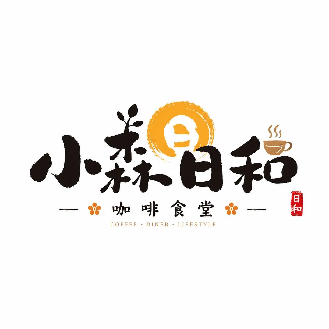
和風の筆文字店舗ロゴマーク
请根据用户输入的【品牌名 / 项目名】【类型 / 行业】【品牌定位】【核心关键词】【情绪气质】【版式方向】【主色调】【辅助色】【画幅比例】,设计一个高完成度的「日式书写商铺字标 / Japanese Brush Shop Wordmark」。

注意:这次要做的是一个真正可商用的店铺 Logo,而不是普通字体排版、海报标题或纯书法作品。请以毛笔书写感为核心,让主体文字具有明显粗细变化、提按顿挫、轻微飞白和自然笔势,同时保持清晰可读和强识别度。

【主体文字要求】
1. 以品牌名为核心主体,字形采用毛笔手写感处理;
2. 笔画应有明显粗细变化、提按顿挫、轻微飞白、墨感和呼吸感;
3. 某些关键笔画可适度夸张,形成记忆点;
4. 字体风格不必规整标准,可略带自然变形和店招个性;
5. 重点是“商铺书写字标”,不要做成传统书法展作品。

整体要有明显的和风商铺 / 门头招牌 / 暖帘店招气质,可适度加入小红印章、小号竖排说明字、少量假名 / 拼音 / 英文、红底白字块等元素作为点缀,但必须克制。背景保持简洁,主体 Logo 清晰突出。最终结果应像一家真实日料店、居酒屋、茶菓铺、食堂或和风生活方式品牌可以直接使用的高识别字标。
Please design a high-finish "Japanese Brush Shop Wordmark" based on the user's input: [Brand Name / Project Name], [Type / Industry], [Brand Positioning], [Core Keywords], [Mood & Vibe], [Layout Direction], [Primary Color], [Secondary Color], and [Aspect Ratio].

Note: The goal is to create a truly commercially viable storefront logo, rather than generic typography, poster titles, or pure traditional calligraphy. Center the design around authentic brush stroke aesthetics, ensuring the primary characters exhibit dynamic line weight, modulated stroke rhythms, subtle dry-brush friction marks (feibai), and natural movement, while remaining legible and highly recognizable.

[Main Typography Requirements]
1. The brand name serves as the primary focal point, rendered with a handcrafted brush calligraphy feel;
2. Strokes must feature deliberate variations in thickness, natural pressure variation, light dry-brush texture, rich inking, and breathing room;
3. Key strokes can be subtly exaggerated to establish distinctive brand memory points;
4. Letterforms do not need to be rigidly aligned; natural stylization and shop sign character are encouraged;
5. Focus on a "commercial storefront wordmark", avoiding the appearance of a museum calligraphy exhibition piece.

Overall, the design must evoke the aesthetic of Japanese storefront signboards and noren curtains. Sparingly incorporate tasteful embellishments such as a small red seal stamp, tiny vertical explanatory text, subtle kana / pinyin / English subtitles, or small red badge blocks. Keep the background clean and minimalist so the primary logo stands out. The final output should look like a ready-to-use, distinctive wordmark for an authentic Japanese diner, izakaya, tea house, wagashi shop, or Japanese-style lifestyle brand.
提示词出处:@Larus Canus (@MrLarus) 的原帖评论 ↗
| モデル | GPT Image 2 |
|---|---|
| 比率 | — |
| スタイル | 海报设计 |
| 作者 | Larus Canus (@MrLarus) |
| 元投稿 | X の原文を見る |
和食店、居酒屋、茶室などの和風ブランド向け筆文字ロゴデザインプロンプト。かすれ、落款印、サブタイトルなど暖簾や看板の要素を含み、商業的な視認性と親しみやすさを両立し、本格的な和の美意識を表現します。
このプロンプトの使い方
- 上の原文プロンプトをコピーします。
- GPT Image 2 に貼り付けます。
- 比率 — で生成します。
Posted on X by @MrLarus. PromptGallery only indexes it. Copyright stays with the author.