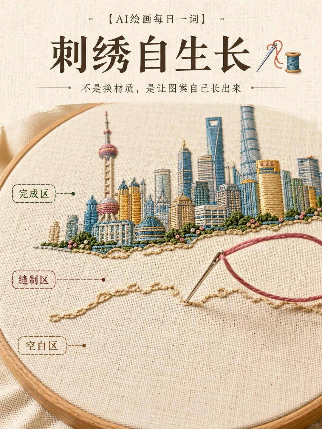
Create a single 3:4 vertical 'self-growing embroidery' visual for [City Landmark / Chinese Character / Brand Logo / Character / Food].

A warm ivory natural linen cloth is stretched tightly in a round wooden embroidery hoop, three-quarters high-angle macro photography. The upper part of the image features the finished [Core Pattern], the middle part is at the growing edge currently being stitched, and the lower part retains a large area of unembroidered blank fabric.

A real metal embroidery needle emerges from the fabric surface, with colored silk thread passing through clearly visible needle holes and taut thread loops, extending along a continuous path. Contours, color blocks, and textures are formed stitch by stitch where the needle passes; complete patterns must not appear prematurely in areas where the needle has not yet passed.

Employ long and short stitch, satin stitch, chain stitch, and French knots according to the structure: chain stitch for contours, unidirectional satin stitch for main color blocks, and French knots for subtle highlights. Each thread must connect to real needle entry points, exhibiting realistic tension, thickness, occlusion, and contact shadows.

The pattern retains its planar embroidery characteristics, allowing only localized thread knots to create subtle low relief, without turning buildings, figures, or flowers into 3D models rising from the cloth.

Natural side lighting illuminates the luster of silk threads, needle holes, fabric weave, and the wear on the wooden hoop. Restrict colors to four to six tones, with the core pattern being the most vibrant, subtle loose thread loops at the growing edge, and the blank area kept restrained.

Avoid flat tiled finished embroidery, generic wool filters, floating threads without needle holes, threads appearing out of nowhere, multiple embroidery hoops, split-screen collages, plastic textures, incorrect Chinese characters, random text, and tangled thread messes.
A macro visual template capturing the living process of hand embroidery on linen within a wooden hoop. It showcases finished areas, an active stitched boundary, and untouched blank fabric, highlighting realistic needlework, stitch tension, and tactile handcrafted textures.
How to use this prompt
Copy the original prompt.
Paste it into 通用 / 未注明.
Generate at 3:4.
Posted on X by @derek_wall90176. PromptGallery only indexes it. Copyright stays with the author.
FAQ
Which AI model is this prompt for?
The author generated it with 通用 / 未注明. The recommended ratio is 3:4. Similar models can run the same prompt, with different results.
How do I use this prompt?
Copy the prompt, replace any placeholder such as the subject in “Self-Growing Embroidery Process Macro Art”, and paste it into 通用 / 未注明.
Who owns this image and prompt?
They belong to Derek Wen|德里克文 (@derek_wall90176). Original post: https://x.com/derek_wall90176/status/2094246418303312239. Contact the author before commercial use.
【Title】[TITLE]
【Subtitle】[SUBTITLE]
【Landscape】[canyon / river / cloud mountains / glacier / desert / coast]
【Main Palette】[PRIMARY COLORS]
【Scale Anchor】[tiny traveler / canoe / boat / small building]
【Visual Destination】[moon / distant light / horizon / mountain pass]
【Aspect Ratio】9:16

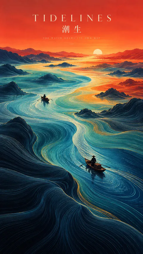
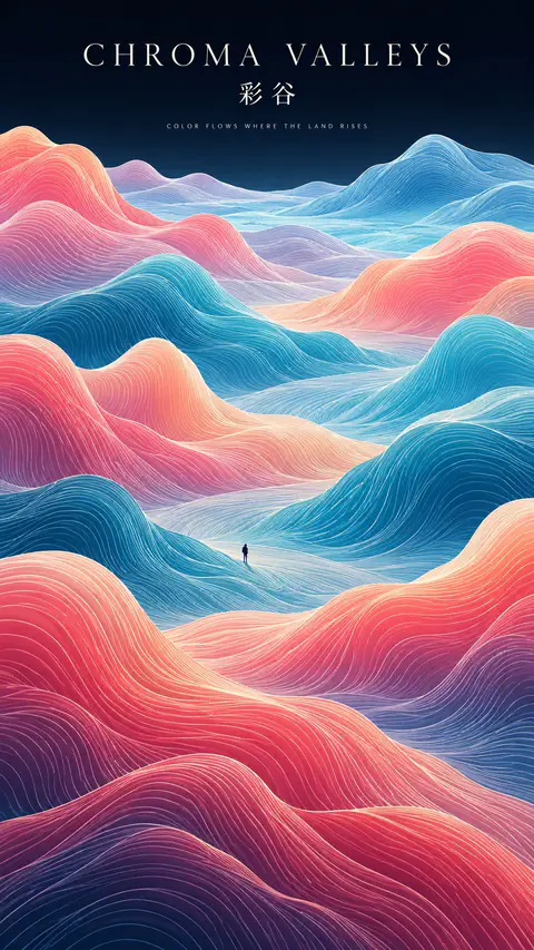
Create a refined vertical art poster that transforms a natural landscape into a flowing topographic world.

Build the terrain from hundreds of long, smooth, continuous contour lines that follow the shape, depth, and movement of the land. The lines should feel like a fusion of topographic maps, silk threads, and abstract Chinese landscape painting — directional, elegant, and highly organized rather than random decorative waves.

Use one strong visual path, such as a river, valley, ridge, cloud road, or negative-space corridor, to guide the eye from foreground to distance.

Keep the natural environment monumental and place only one or two extremely small human figures, boats, or architectural elements as scale anchors.

Use clear spatial hierarchy:
dense flowing lines in the main terrain,
calmer negative space around the visual path,
simpler and softer details in the distance.

Control the palette with 2–4 dominant colors rather than evenly distributed rainbow tones. Use large, clean color fields and let color changes reinforce depth and movement.

Add minimal editorial typography:
[TITLE]
[SUBTITLE]
[SHORT POETIC LINE]

Typography should feel like a contemporary exhibition poster or art-book cover — elegant, widely spaced, restrained, and secondary to the landscape.

The final image should feel poetic, monumental, calm, and highly designed, combining Eastern landscape aesthetics, contour-line abstraction, negative space, and modern editorial composition.
SOURCE & OUTPUT
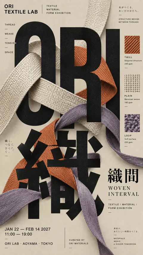
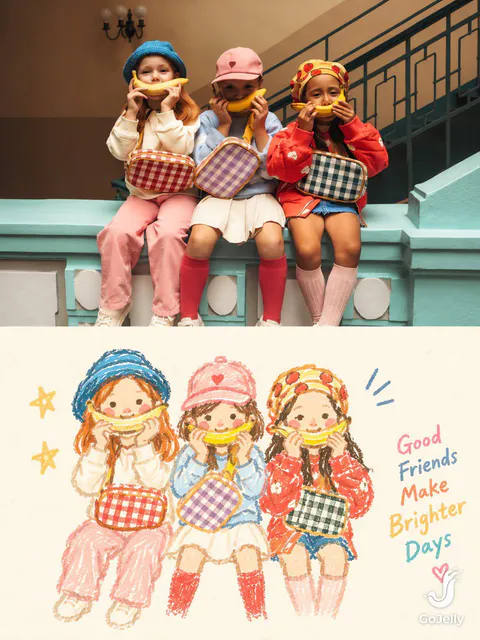
Use each uploaded photo as the sole visual reference. Create one independent, high-end editorial poster per photo and output each separately. Never combine images or create a collage.

FORMAT & LAYOUT
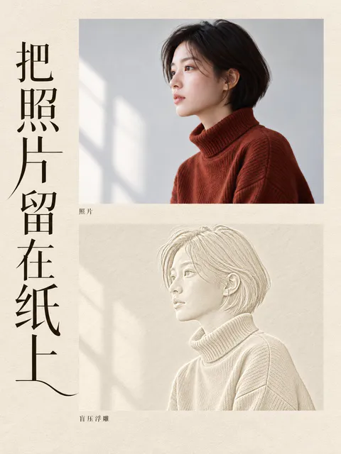
Use a strict vertical 3:4 composition divided into two exactly equal horizontal halves (50/50).

UPPER HALF — ORIGINAL PHOTOGRAPH
Preserve the original photograph faithfully, including the subject’s identity, facial features, structure, pose, proportions, natural texture, lighting, and color atmosphere. Apply only subtle premium editorial color grading for an art-magazine or exhibition-photography aesthetic. If necessary, extend only the surrounding background naturally to fit the frame. Never distort, replace, or redesign the subject.

LOWER HALF — PASTEL CRAYON MEMORY
Reinterpret the photograph as a minimalist, retro paper-texture pastel crayon doodle. Identify the scene’s most memorable subject, pose, relationships, direction, emotional tone, and visual essence. Reconstruct only these defining elements rather than copying every object or illustrating the entire scene.

Use thick, loose, grainy, hand-drawn chalk-and-crayon outlines with dry pigment texture, subtle breaks, faded patches, imperfect edges, slight hand wobble, and naturally rounded stroke endings. Add only a few simple pastel color blocks, stripes, dots, or scribbles to suggest essential details. Avoid realistic volume, detailed rendering, and excessive shading.

COMPOSITION & NEGATIVE SPACE
Keep the illustration small and visually balanced within the lower half, surrounded by generous empty space. Position the subject naturally according to the original photograph, allowing asymmetry, off-center placement, suspended elements, or partial cropping where appropriate.

Include only a few tiny environmental clues or abstract doodles, drawn in the same rough, simplified crayon style. Keep them minimal, imperfect, and contour-based. Prioritize breathing room, scale contrast, visual rhythm, and intentional emptiness. Never overcrowd the composition.

BACKGROUND & COLOR PALETTE
Use a bright, near-white paper background: ivory, cream white, pale off-white, soft apricot white, or very light gray-white. Add only subtle paper fibers and fine grain. Keep the background clean, bright, and clearly lighter than the illustration. Avoid dirty gray, dark yellow, or aged brown paper.

Extract 2–4 defining colors from the original photograph and reinterpret them as fresh, soft pastel crayon tones, such as peach pink, apricot orange, cream yellow, mint green, sky blue, or pale lavender. Use sufficiently distinct coral, blue, blue-green, warm orange, or violet outlines for clear contrast. Maintain a gentle, playful, emotionally warm, and refined palette.

OPTIONAL TEXT
Add only a tiny handwritten note if it genuinely enhances the composition. Keep it sparse, legible, secondary, and unobtrusive. Never use decorative text as filler.

FINAL AESTHETIC
Create a sophisticated editorial poster combining authentic photography above with a reduced, recognizable, hand-drawn memory of the same scene below. The illustration should feel airy, naive without being childish, playful without looking cheap, and minimal without losing the photograph’s identity or emotional meaning. Emphasize expressive linework, selective color, paper texture, asymmetry, and negative space.
【Landscape】[LANDSCAPE]
【Line Structure】[LAYERED / FLOWING / RADIATING / DIRECTIONAL]
【Palette】[COLORS]
【Scale Anchor】[TINY FIGURE / FLAG / BOAT / TENT]
【Aspect Ratio】9:16

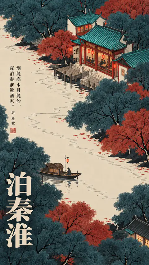
Create a refined vertical art poster that transforms the landscape into an abstract **contour-line world**.

Build the terrain primarily from long, smooth, continuous lines that follow its volume, direction, elevation, and movement.

The lines should become the landscape itself, not simply decorate its surface.

Use one clear structural system and strong line-density variation, with dense lines around major forms and more breathing room in calmer areas.

Use 2–5 related colors and let the colors flow naturally along the contour structure.

Keep the landscape monumental and use only one tiny scale anchor.

Add minimal editorial typography:

[TITLE]
[SUBTITLE]
[SHORT POETIC LINE]

High-end exhibition-poster aesthetic, abstract Eastern landscape feeling, strong thumbnail readability, large graphic forms, controlled negative space, and highly visible contour-line structure.