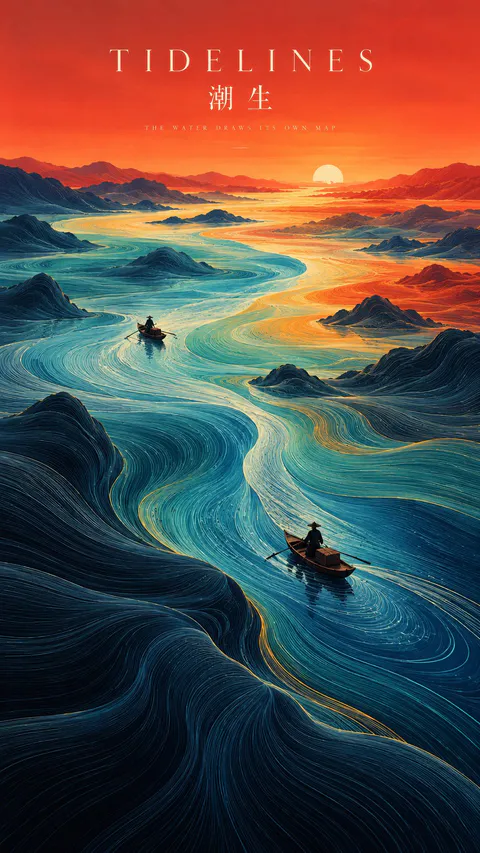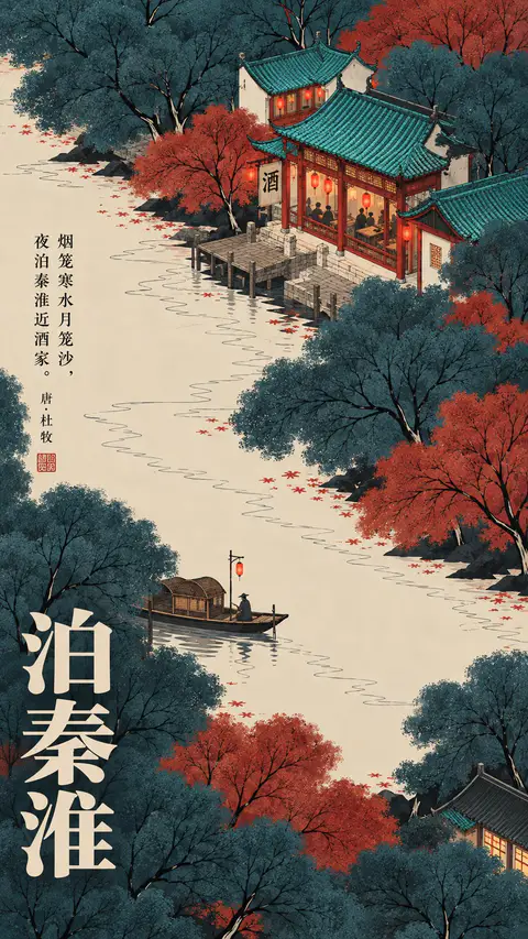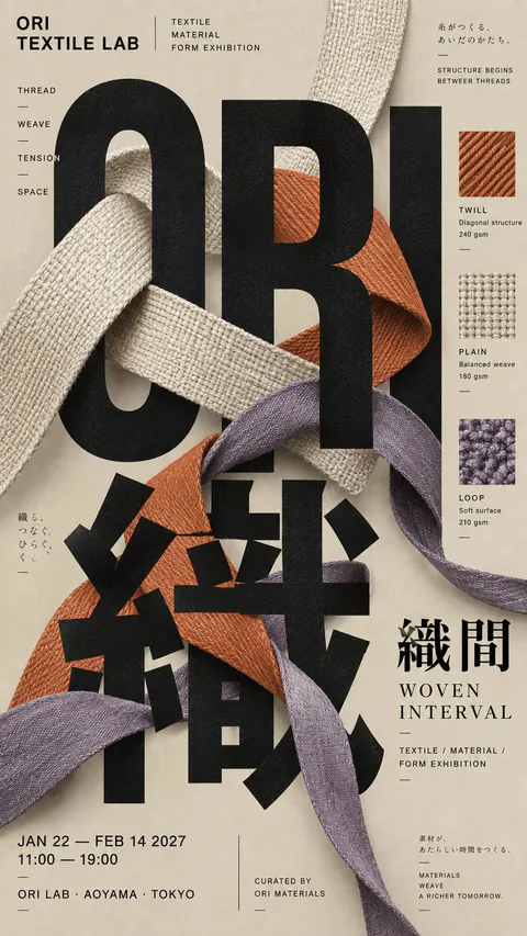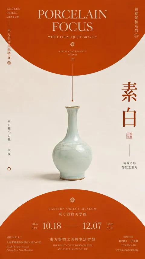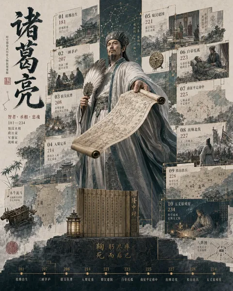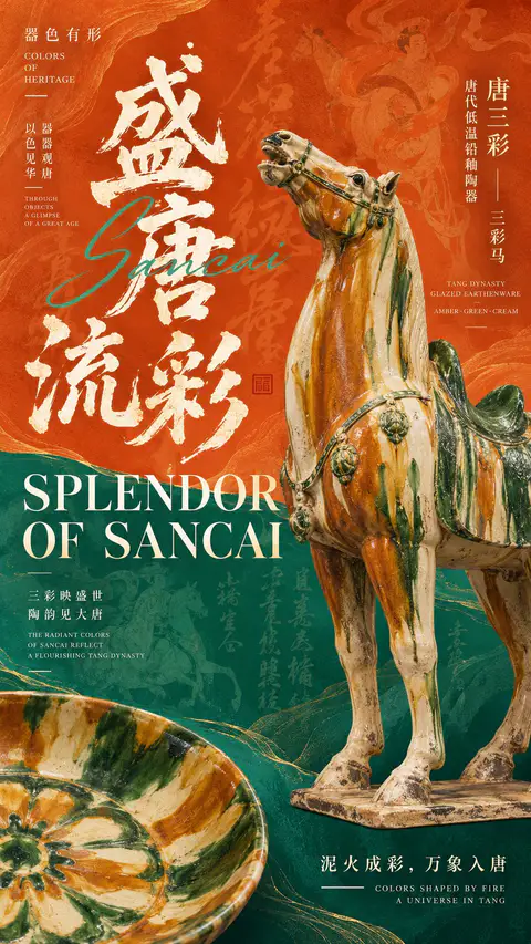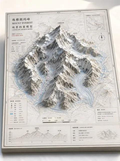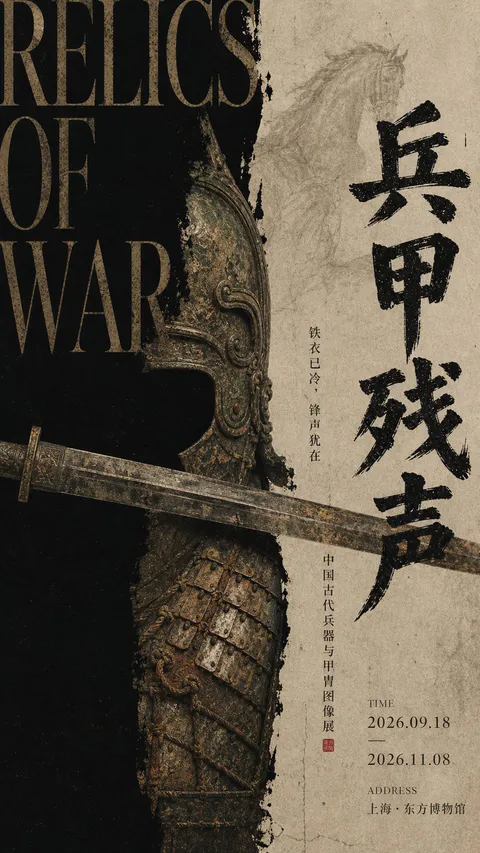
Focal Convergence Exhibition Poster Design Template
【主题 / 作品名】:____
【核心主体】:____
【聚核方式】:人物视线 / 光线空间 / 元素回流 / Typography 密度 / 其他
【中文标题】:____
【英文标题】:____
【视觉风格】:____
【主色调】:____
【辅助色】:____
【画面比例】:9:16

生成一张具有成熟 Editorial Graphic Design 与艺术展览视觉质感的海报。

先确定一个绝对视觉核心,再让画面里的其他力量主动把视线送回这个核心。重点不是简单把主体放在中间,而是建立清晰的“向心关系”。

根据内容选择合适的聚核方式:

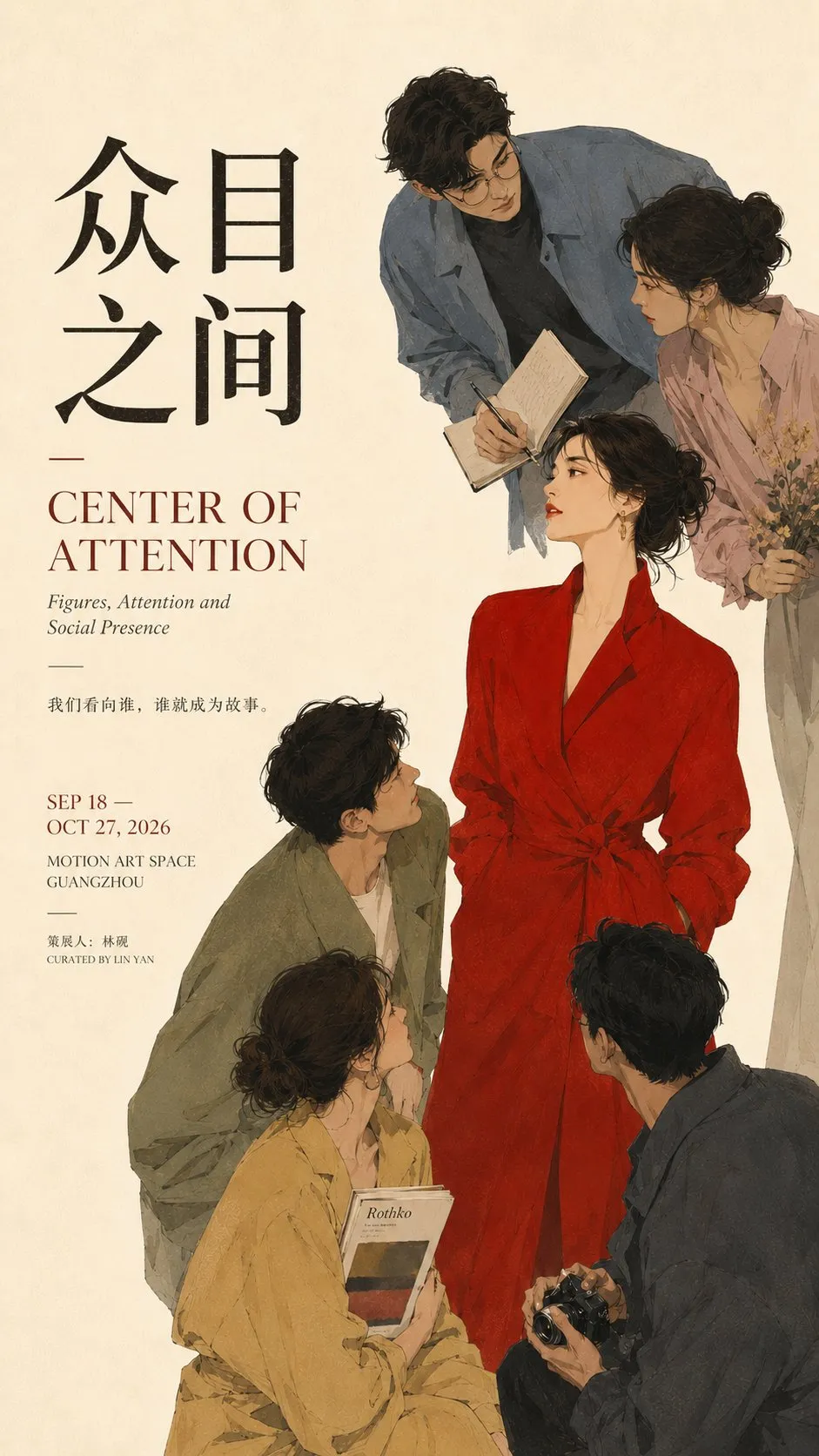
人物类:通过人物视线、头部朝向、身体姿态、手势和道具方向共同指向核心人物,让看不见的视线成为引导线。

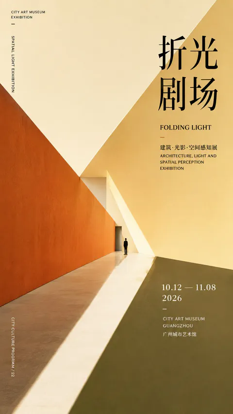
空间类:通过建筑透视、墙体切面、明暗关系和光线方向,把多个空间力量汇聚到同一个焦点;主体即使很小,也能成为第一视觉。

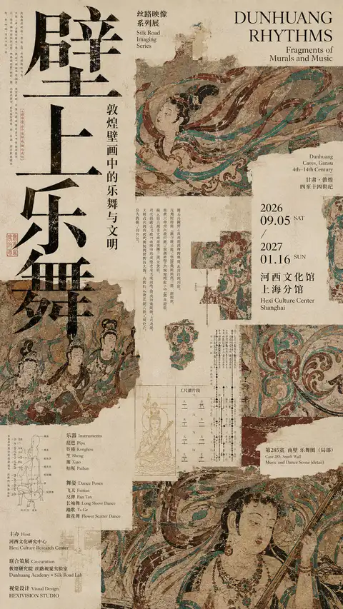
纸本 / 拼贴类:让纸页、图像、文字条和版面碎片形成连续回流路径,外围元素有大小、疏密和方向变化,但最终都回到中央版心或核心对象。

Typography 类:通过字号、字重、字距、密度和方向变化制造向心关系;越靠近核心,文字越强、越密,外围则更轻、更疏。文字本身成为图像,而不是普通信息排版。

整张画面只保留一个主要视觉核。辅助元素只能围绕、指向、托住或平衡它,不能形成第二个同等重量的视觉中心。

Typography 必须与作品主题本身有关,不出现“视觉聚核”“构图案例”“设计研究”等模板化占位文字。让每张海报首先是一件独立成立的作品,再把构图方法藏在设计里面。

控制信息层级:主标题承担主要文字视觉;副标题和作品短句建立内容气质;日期、机构等信息集中在少量区域。避免把小字平均撒满整个版面。

保留足够负空间。可以使用裁切、叠压、透视、回流、密度变化和非对称平衡增强张力,但不要依靠箭头、明显辅助线或无意义装饰去解释构图。

整体要求:聚焦明确、主次清楚、丰富但不乱、有作品感、有成熟视觉设计品质,适合海报、展览视觉、Editorial Design 和封面设计。
[Theme / Artwork Title]: ____
[Core Subject]: ____
[Convergence Method]: Figure Gaze / Light & Space / Element Flow / Typography Density / Other
[Chinese Title]: ____
[English Title]: ____
[Visual Style]: ____
[Primary Color]: ____
[Secondary Color]: ____
[Aspect Ratio]: 9:16

Generate a poster with sophisticated Editorial Graphic Design and artistic exhibition visual quality.

First determine an absolute visual core, then let other forces in the frame actively guide the gaze back to this core. The key is not merely placing the subject in the center, but establishing a clear "centripetal relationship."

Choose the appropriate convergence method according to the content:

Figures: Guide towards the core figure through gaze, head turns, postures, gestures, and prop directions, turning unseen lines of sight into guidance lines.

Space: Converge multiple spatial forces into a single focal point via architectural perspective, wall facets, light-shadow contrast, and directional beams; even if small, the focal point commands primary attention.

Paper / Collage: Create continuous return pathways with paper pages, images, text strips, and layout fragments. Outer elements vary in scale, density, and direction, but ultimately resolve into the center.

Typography: Create centripetal tension through scale, font weight, tracking, density, and directional variation. Closer to the core, text becomes bolder and denser, while outer areas remain lighter and sparser. Typography functions as visual imagery rather than standard typesetting.

Maintain only one primary visual core. Secondary elements must surround, guide, support, or balance it without creating a competing center of equal weight.

Typography must directly relate to the work's theme, avoiding placeholder texts like "Visual Core" or "Composition Study." Let each poster stand as an independent design piece with composition naturally embedded.

Control hierarchy: Main title anchors primary text visuals; subtitle sets tone; logistical text (dates, venues) remains clustered in minimal areas. Avoid scattering small text uniformly.

Preserve sufficient negative space. Employ cropping, layering, perspective, return paths, density shifts, and asymmetrical balance for tension, avoiding literal arrows or gratuitous decorative guides.

Overall requirements: Clear focus, defined hierarchy, rich yet orderly, strong artistic finish, suitable for posters, exhibition visuals, editorial design, and cover art.
Prompt source: reply by @Larus Canus (@MrLarus) ↗
| Model | GPT Image 2 |
|---|---|
| Ratio | 9:16 |
| Style | Poster & Graphic Design |
| Author | Larus Canus (@MrLarus) |
| Original post | View on X |
An editorial graphic design and art exhibition poster prompt template focusing on visual convergence. It utilizes figure gaze, architectural light, and typographic density to guide the viewer's eye to a unified core.
How to use this prompt
- Copy the original prompt.
- Paste it into GPT Image 2.
- Generate at 9:16.
Posted on X by @MrLarus. PromptGallery only indexes it. Copyright stays with the author.