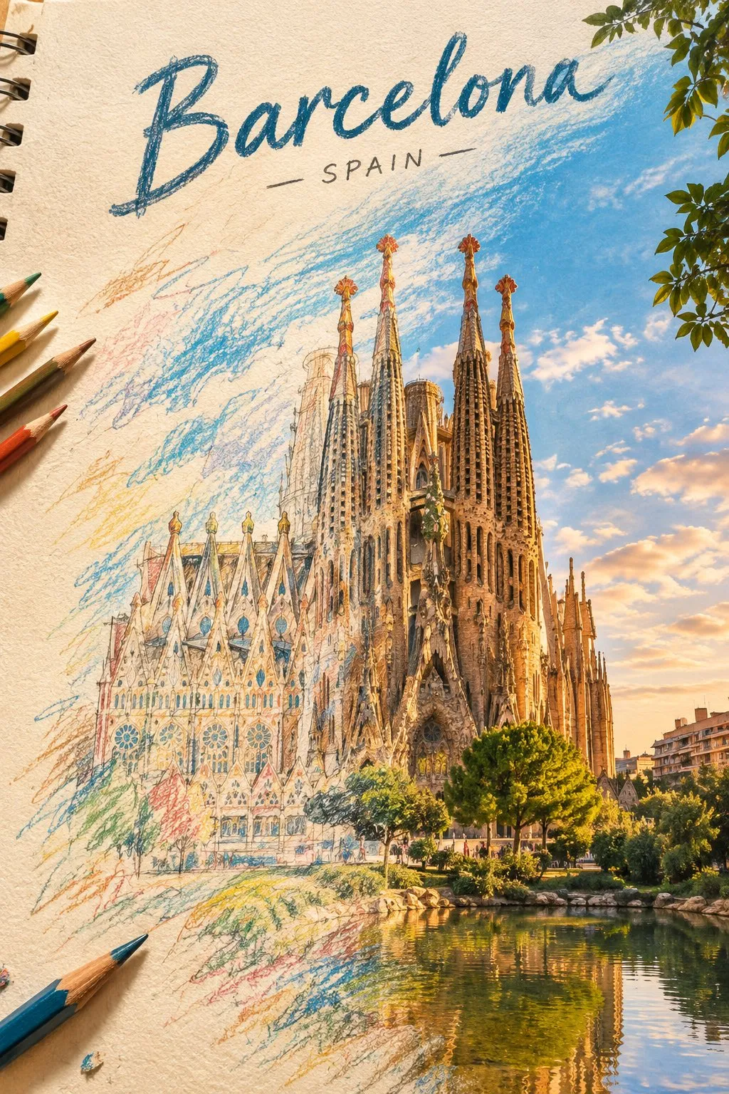
Create a breathtaking artistic composition of [REAL LANDMARK] in [CITY, COUNTRY], where a hand-drawn colored-pencil illustration seamlessly transforms into a beautifully detailed, realistic scene.

On one side, the landmark appears as an intricate drawing on textured ivory sketchbook paper, featuring visible pencil strokes, wax-crayon shading, delicate crosshatching, and imperfect hand-drawn lines. Moving across the composition, the colored strokes gradually evolve into the real landmark, surrounded by its authentic streets, architecture, and recognizable local environment.

Tiny pencil marks transform into real trees, sketchy rooftops become actual buildings, and loose strokes of color turn into the natural sky. The transition must feel fluid and artistic, as if the entire city is being brought to life by an invisible artist.

Preserve the landmark’s exact real-world architecture, proportions, and recognizable details. Use a sophisticated palette of warm terracotta, muted turquoise, golden yellow, deep cobalt blue, and natural earthy tones.

Add subtle paper grain, expressive colored-pencil textures, wax-crayon details, imperfect outlines, and beautiful natural lighting. Keep the composition clean, visually striking, and professionally art-directed, with the landmark as the unmistakable focal point.

Place the real name of the city in elegant, hand-lettered typography at the top, integrated naturally into the artwork.

Style: Contemporary editorial illustration meets realistic colored-pencil and wax-crayon artwork, tactile textures, artistic transformation, premium art-book aesthetic, intricate details, visually captivating composition.
An artistic prompt template seamlessly blending textured colored-pencil sketchbook illustration into a realistic landmark scene, perfect for travel posters, editorials, and postcard designs.
How to use this prompt
Copy the original prompt.
Paste it into GPT Image 2.
Generate at —.
Posted on X by @Naiknelofar788. PromptGallery only indexes it. Copyright stays with the author.
FAQ
Which AI model is this prompt for?
The author generated it with GPT Image 2. The recommended ratio is the original ratio. Similar models can run the same prompt, with different results.
How do I use this prompt?
Copy the prompt, replace any placeholder such as the subject in “Colored Pencil Drawing Transition to Real Landmark”, and paste it into GPT Image 2.
Who owns this image and prompt?
They belong to simeon-sanai (@Naiknelofar788). Original post: https://x.com/Naiknelofar788/status/2109131862455230806. Contact the author before commercial use.
【Title】[TITLE]
【Subtitle】[SUBTITLE]
【Landscape】[canyon / river / cloud mountains / glacier / desert / coast]
【Main Palette】[PRIMARY COLORS]
【Scale Anchor】[tiny traveler / canoe / boat / small building]
【Visual Destination】[moon / distant light / horizon / mountain pass]
【Aspect Ratio】9:16

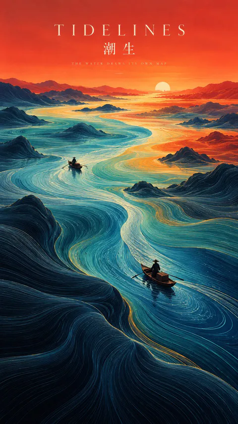
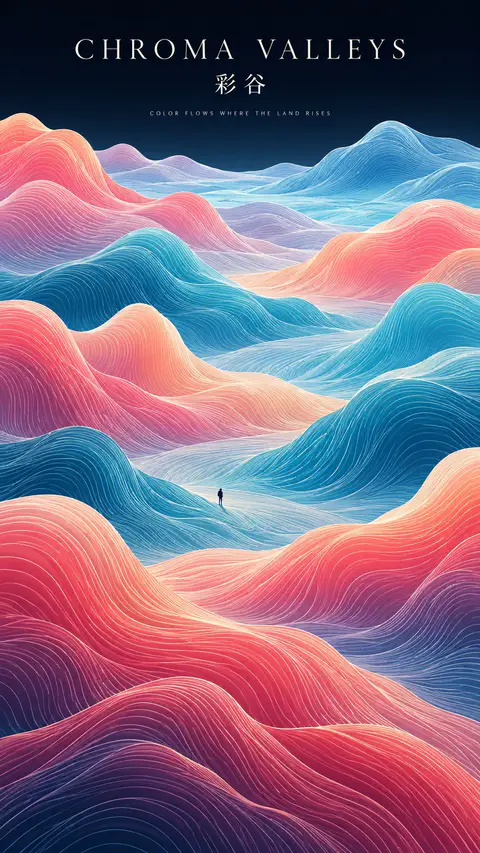
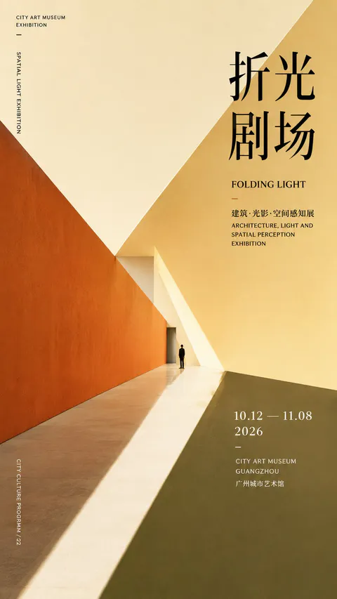
Create a refined vertical art poster that transforms a natural landscape into a flowing topographic world.

Build the terrain from hundreds of long, smooth, continuous contour lines that follow the shape, depth, and movement of the land. The lines should feel like a fusion of topographic maps, silk threads, and abstract Chinese landscape painting — directional, elegant, and highly organized rather than random decorative waves.

Use one strong visual path, such as a river, valley, ridge, cloud road, or negative-space corridor, to guide the eye from foreground to distance.

Keep the natural environment monumental and place only one or two extremely small human figures, boats, or architectural elements as scale anchors.

Use clear spatial hierarchy:
dense flowing lines in the main terrain,
calmer negative space around the visual path,
simpler and softer details in the distance.

Control the palette with 2–4 dominant colors rather than evenly distributed rainbow tones. Use large, clean color fields and let color changes reinforce depth and movement.

Add minimal editorial typography:
[TITLE]
[SUBTITLE]
[SHORT POETIC LINE]

Typography should feel like a contemporary exhibition poster or art-book cover — elegant, widely spaced, restrained, and secondary to the landscape.

The final image should feel poetic, monumental, calm, and highly designed, combining Eastern landscape aesthetics, contour-line abstraction, negative space, and modern editorial composition.
SOURCE & OUTPUT
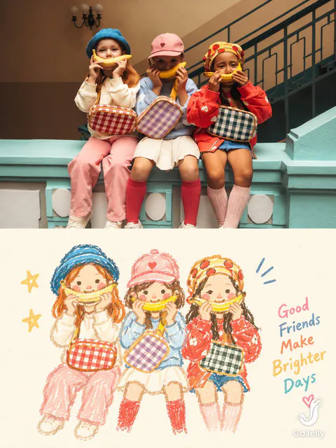
Use each uploaded photo as the sole visual reference. Create one independent, high-end editorial poster per photo and output each separately. Never combine images or create a collage.

FORMAT & LAYOUT
Use a strict vertical 3:4 composition divided into two exactly equal horizontal halves (50/50).

UPPER HALF — ORIGINAL PHOTOGRAPH
Preserve the original photograph faithfully, including the subject’s identity, facial features, structure, pose, proportions, natural texture, lighting, and color atmosphere. Apply only subtle premium editorial color grading for an art-magazine or exhibition-photography aesthetic. If necessary, extend only the surrounding background naturally to fit the frame. Never distort, replace, or redesign the subject.

LOWER HALF — PASTEL CRAYON MEMORY
Reinterpret the photograph as a minimalist, retro paper-texture pastel crayon doodle. Identify the scene’s most memorable subject, pose, relationships, direction, emotional tone, and visual essence. Reconstruct only these defining elements rather than copying every object or illustrating the entire scene.

Use thick, loose, grainy, hand-drawn chalk-and-crayon outlines with dry pigment texture, subtle breaks, faded patches, imperfect edges, slight hand wobble, and naturally rounded stroke endings. Add only a few simple pastel color blocks, stripes, dots, or scribbles to suggest essential details. Avoid realistic volume, detailed rendering, and excessive shading.

COMPOSITION & NEGATIVE SPACE
Keep the illustration small and visually balanced within the lower half, surrounded by generous empty space. Position the subject naturally according to the original photograph, allowing asymmetry, off-center placement, suspended elements, or partial cropping where appropriate.

Include only a few tiny environmental clues or abstract doodles, drawn in the same rough, simplified crayon style. Keep them minimal, imperfect, and contour-based. Prioritize breathing room, scale contrast, visual rhythm, and intentional emptiness. Never overcrowd the composition.

BACKGROUND & COLOR PALETTE
Use a bright, near-white paper background: ivory, cream white, pale off-white, soft apricot white, or very light gray-white. Add only subtle paper fibers and fine grain. Keep the background clean, bright, and clearly lighter than the illustration. Avoid dirty gray, dark yellow, or aged brown paper.

Extract 2–4 defining colors from the original photograph and reinterpret them as fresh, soft pastel crayon tones, such as peach pink, apricot orange, cream yellow, mint green, sky blue, or pale lavender. Use sufficiently distinct coral, blue, blue-green, warm orange, or violet outlines for clear contrast. Maintain a gentle, playful, emotionally warm, and refined palette.

OPTIONAL TEXT
Add only a tiny handwritten note if it genuinely enhances the composition. Keep it sparse, legible, secondary, and unobtrusive. Never use decorative text as filler.

FINAL AESTHETIC
Create a sophisticated editorial poster combining authentic photography above with a reduced, recognizable, hand-drawn memory of the same scene below. The illustration should feel airy, naive without being childish, playful without looking cheap, and minimal without losing the photograph’s identity or emotional meaning. Emphasize expressive linework, selective color, paper texture, asymmetry, and negative space.
【Landscape】[LANDSCAPE]
【Line Structure】[LAYERED / FLOWING / RADIATING / DIRECTIONAL]
【Palette】[COLORS]
【Scale Anchor】[TINY FIGURE / FLAG / BOAT / TENT]
【Aspect Ratio】9:16

Create a refined vertical art poster that transforms the landscape into an abstract **contour-line world**.

Build the terrain primarily from long, smooth, continuous lines that follow its volume, direction, elevation, and movement.

The lines should become the landscape itself, not simply decorate its surface.

Use one clear structural system and strong line-density variation, with dense lines around major forms and more breathing room in calmer areas.

Use 2–5 related colors and let the colors flow naturally along the contour structure.

Keep the landscape monumental and use only one tiny scale anchor.

Add minimal editorial typography:

[TITLE]
[SUBTITLE]
[SHORT POETIC LINE]

High-end exhibition-poster aesthetic, abstract Eastern landscape feeling, strong thumbnail readability, large graphic forms, controlled negative space, and highly visible contour-line structure.
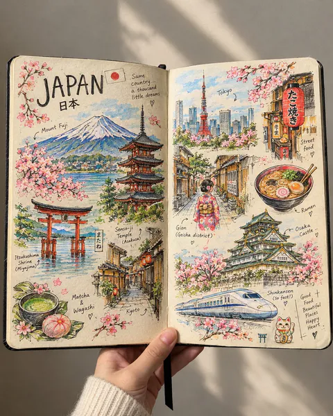
Create a beautiful, highly detailed, handmade travel sketchbook spread inspired by an artist’s personal travel journal. Show an open sketchbook with warm ivory paper, slightly imperfect edges, and visible paper texture, filled with intricate hand-drawn illustrations of [COUNTRY / CITY].
The two-page spread should feel like a collection of little memories gathered during a journey, with famous landmarks, traditional architecture, charming streets, cultural symbols, local food, nature, and tiny everyday details arranged organically across both pages.
Use fine black ink linework, delicate cross-hatching, loose pencil strokes, architectural doodles, handwritten labels, tiny arrows, and small notes pointing toward the illustrated places. Let the drawings feel authentic and handmade, like a real artist sketched them while travelling.
🌈 The Special Touch — Selective Beautiful Colors
Keep most of the artwork in elegant black-and-white ink, but bring selected elements to life with beautiful, carefully placed splashes of color.
🗻 Mountains and landscapes with soft watercolor blues, sage greens, and snowy whites.
🏯 Famous landmarks with subtle terracotta, warm beige, and muted golden tones.
🌸 Flowers and leaves with delicate pinks, coral, and fresh greens.
🍜 Local food illustrated in appetizing, vibrant colors.
🏮 Traditional lanterns, cultural objects, or street signs highlighted with rich reds and warm amber.
🌊 Rivers, lakes, or ocean views accented with dreamy turquoise and soft blue.
🚌 Tiny travel details featuring unexpected pops of mustard yellow, dusty orange, and pastel colors.
Important: The colors should appear selectively, as if the artist used watercolor and colored pencils to highlight their favorite memories. Some illustrations should remain completely monochrome, while others should be partially or beautifully colored. The contrast between black ink and colorful details should make the artwork visually captivating without overwhelming the page.
✍️ Composition & Atmosphere
Include the country name in large, artistic handwritten lettering, accompanied by a tiny national flag. Add a mixture of large landmark sketches and smaller doodles, creating a rich yet balanced composition.
Allow some drawings to overlap slightly or extend toward the edges of the pages. Include spontaneous pencil marks, unfinished outlines, tiny stars, handwritten location names, and subtle artistic imperfections.
Show the sketchbook as a real physical object, opened in someone's hand against a simple, softly lit background. Use a close-up perspective, natural daylight, realistic paper texture, and gentle shadows.
Art style: Travel journal meets architectural ink illustration meets selective watercolor sketching. Sophisticated, cozy, artistic, nostalgic, and irresistibly beautiful.
Aspect ratio: 4:5 vertical composition.
Final result: A stunning, realistic travel sketchbook that looks handmade rather than digitally designed, with intricate black ink drawings and strategically placed bursts of beautiful color that make every page feel like a treasured travel memory.